The Context
I’ve been building a web application designed to streamline time management for freelancers, particularly those working from home. One of the key features is displaying monthly aggregates in charts using Chart.js. In a specific scenario, I wanted to show a label in the tooltip of a bar chart that included line breaks. However, I found it challenging to achieve this without using external HTML, as information on this topic was scarce.
In this article, I’ll share how I managed to work around this limitation.
Tooltip Configuration Basics
Tooltips in Chart.js are highly customizable, allowing you to tailor almost every aspect to your specific needs. A typical tooltip may consist of:
- A title
- A body
- A footer
- Other sections between these parts

You can easily tweak the design of a tooltip by setting its properties under the options field of the config object passed to the chart constructor. For example, to remove the color square from the head of the label, you can set displayColors to false:
const config = {
  type: 'line',
  data: data,
  options: {
    plugins: {
      tooltip: {
        displayColors: false,
      }
    }
  }
}
The full list of all possible config options can be found in the documentation.
Customizing the Label
Now that we understand the basics of configuring tooltips, let’s focus on the callback option, which is extremely powerful and flexible.
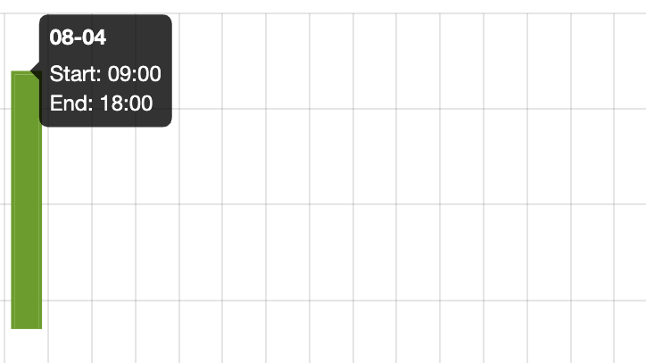
In my case, I wanted the tooltip body to display multiple lines, like this:

Initially, I tried the following approach, which didn’t work:
tooltip: {
  callbacks: {
    label: (context) => {
      // Other code omitted
      return `Start: ${startTime}\nEnd: ${endTime}\n`;
    }
  }
}
The issue is that tooltips in Chart.js are rendered using the Canvas API, which doesn’t support HTML-style line breaks directly.
After some research, I found that the solution was to return an array of strings instead:
tooltip: {
  callbacks: {
    label: (context) => {
      // Other code omitted
      return [
        `Start: ${startTime}`,
        `End: ${endTime}`,
      ];
    }
  }
}
To explore how to customize other sections of tooltips, please check out the documentation.
Conclusion
Customizing tooltips in Chart.js offers a lot of flexibility, but some features, like adding line breaks, aren’t immediately obvious. By returning an array of strings in the label callback, you can easily format tooltip text with multiple lines. This approach enhances the clarity of your charts, making the data more accessible to users. With a bit of experimentation, you can leverage Chart.js’s options to create clear and effective visualizations tailored to your needs.