In this part, I'll share the design strategy and key decisions I implemented to make Perfmate a truly useful and convenient time-tracking tool.
The Big Picture
I started the design process by asking a critical question:
What does an app look like that I would actually want to use?
This brought me back to the goals I defined in the previous part:
- Clean and organized layout: Ensure the interface is intuitive and easy to scan.
- Refined information hierarchy: Prioritize important details so they are clear and accessible.
- Wage management: Include features to track and display earnings over time.
- Enriched productivity tools: Offer functionality that supports focus and efficiency.
- Flexibility and personalization: Allow users to manage records, add or edit entries, and customize settings.
At the same time, I clarified what the app would NOT include (at least for now):
- Features for organizations, such as:
- Human resource management
- Vacation management
- Tax calculation and declaration
- Import and export: Nice to have, but not a priority.
- Invoice management: Again, useful but not essential for the first version.
- User registration: With a free database plan imposing capacity limitations, user registration is deferred until commercialization.
- Project management: Perfmate is a time-tracking app, not a project management tool.
Defining both the inclusions and exclusions helped me focus on the core functionality, keeping the scope realistic and achievable. With this clarity, I was in a strong position to get started.
Getting The Basics Right
One principle I consistently follow in design projects is to get the basics right.
Diving headfirst into complex requirements can quickly become overwhelming, so I prioritized a few fundamental aspects. I reasoned that if I could achieve the following, the app would already deliver a solid experience:
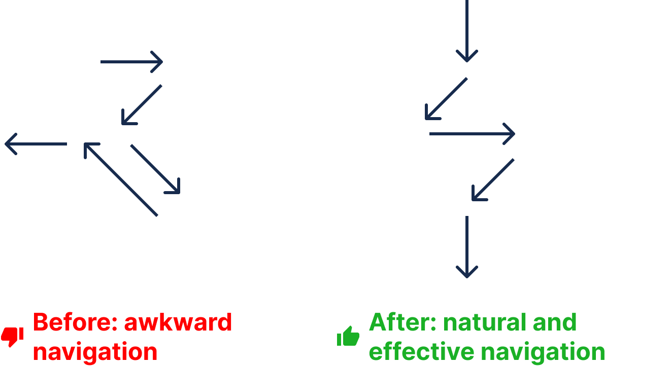
- Easy-to-navigate layout: Respect natural and habitual scanning patterns to improve user experience while reducing eye strain.
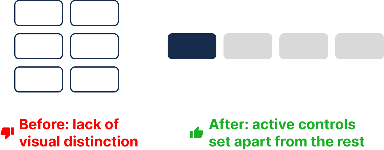
- Intuitive controls and actions: Focus on the most important actions for each page while limiting unnecessary options to reduce cognitive overload.
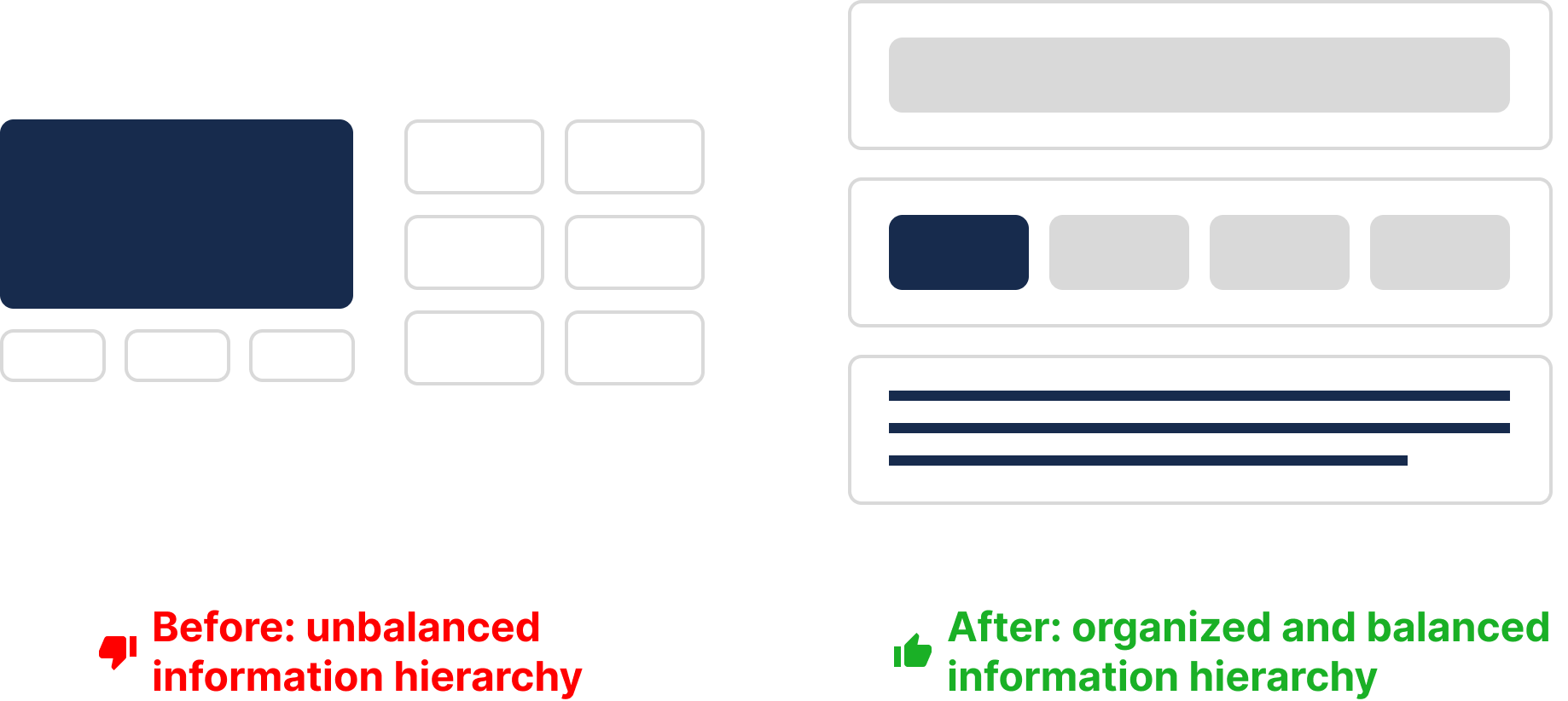
- Organized information: Display the bare minimum necessary information in the right place, at the right time, and in the most accessible style.
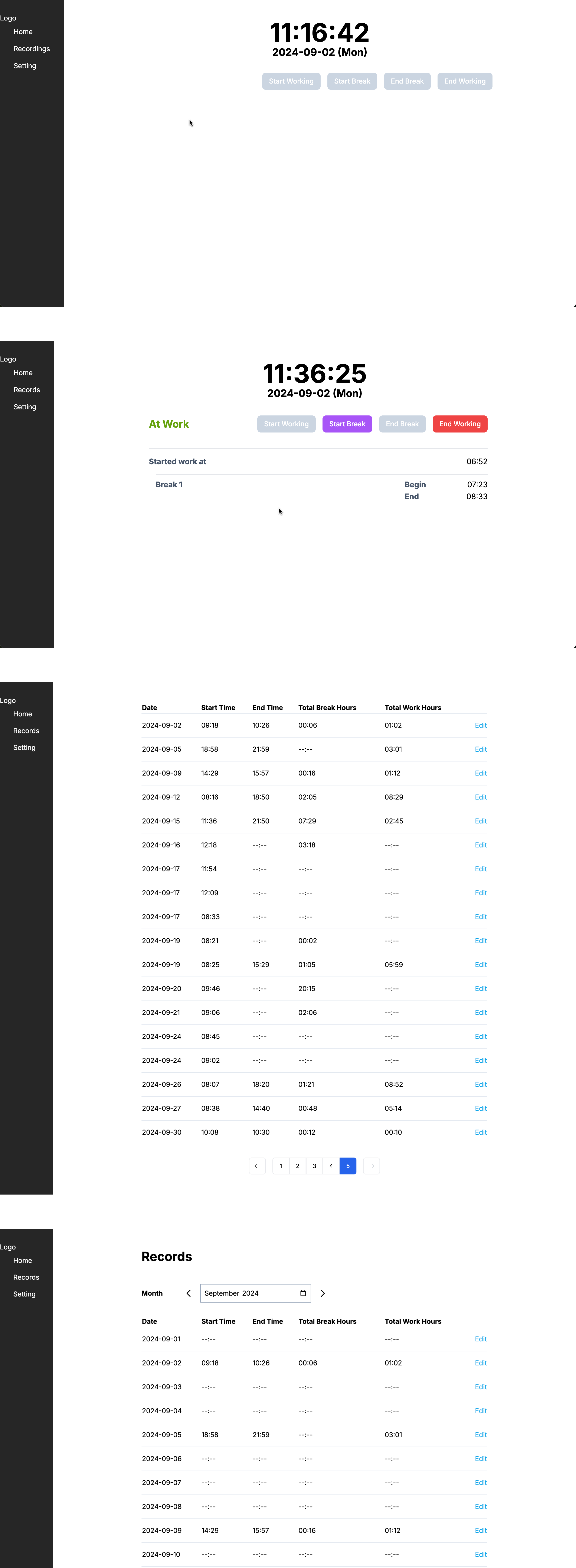
Rapid, Low-fidelity and Frequent Prototyping
Frequent prototyping has been a cornerstone of my design approach. This strategy is particularly effective because:
- It prioritizes action over overthinking, allowing me to kick off a project quickly.
- It provides more opportunities for feedback, learning, and iteration.
- It helps me focus on what’s truly important while ignoring distractions.
- Low-fidelity prototypes are easier, faster, and cheaper to adjust.
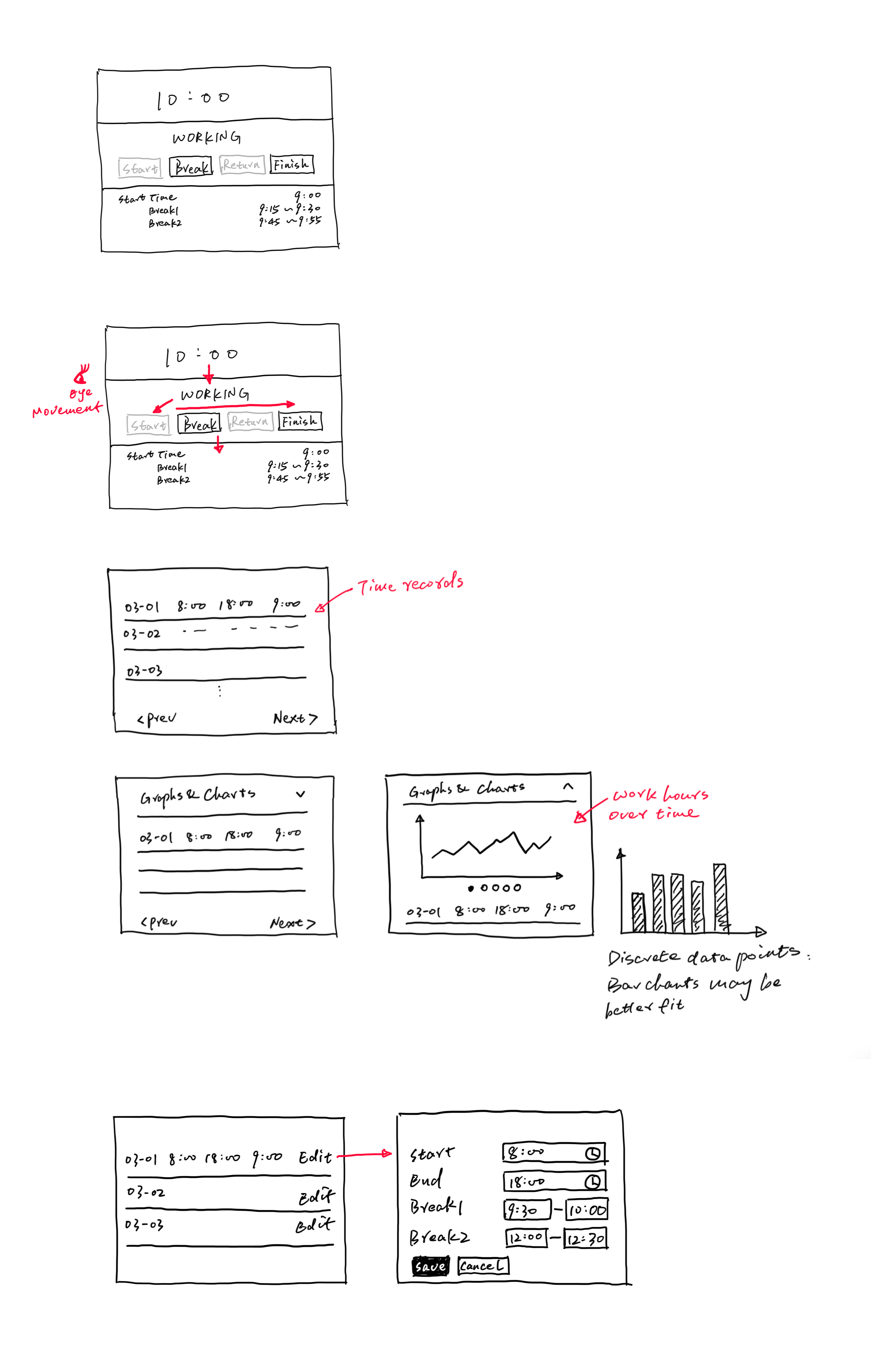
By keeping prototypes low-fidelity, I could iterate rapidly and refine the design incrementally, staying agile throughout the process.
What is Next
In this part, I outlined my design strategy, focusing on getting the basics right and prioritizing rapid, low-fidelity prototyping to refine the user experience.
In the next part, I’ll dive into color usage as a case study, sharing how I applied colors thoughtfully in Perfmate to enhance usability, improve scanning, and reduce cognitive load.