Radio buttons are a fundamental component in UI/UX design, yet it seems that they are often misused, whether it’s on personal websites, small business sites, or even major corporate services.
In this series, we’ll dive deep into the correct usage of radio buttons. In this first part, we’ll define and explore the characteristics of radio buttons, and in Part 2, we’ll examine their usage through various examples.
What is a Radio Button?
A radio button or option button is a graphical control element that allows the user to choose only one of a predefined set of mutually exclusive options.
Wikipedia
All options are displayed at once, and typically, one option is selected by default. They are often used when filling out forms or configuring settings.

Characteristics of Radio Buttons
The main characteristics of radio buttons include:
- Single selection
- Mutual exclusivity
- A default selection
- Unsuitable for many options
- Cannot be nested
- Standardized design
Single Selection
Radio buttons are the recommended way to allow users to make a single selection from a list of options. Only one radio button can be selected at a time.
Material Design
They are not suitable for cases like:
- Switching between ON/OFF states (only one option)
- Allowing multiple selections
- When no selection is necessary
The following examples violate this single-selection rule:

Mutual Exclusivity
Mutual exclusivity means that it’s impossible to select more than one option at a time. This is closely tied to the single-selection characteristic but focuses on the nature of the choices. For example, if you’re asked, “Do you like apples?” and given the choices “Yes” and “No,” it wouldn’t make sense to choose both at the same time. Selecting “Yes” automatically rules out “No.” In such cases, radio buttons are the right choice.
Default Selection
Best practice dictates that radio buttons should always have one option selected by default. According to the Nielsen Norman Group, the reasons are:
- Due to the nature of radio buttons, users cannot “unselect” them. Unlike checkboxes, which can be toggled on and off, once a radio button is selected, it can’t be unselected. If no option is preselected, users might think it’s optional, sending the wrong message. Additionally, users won’t be able to revert to an unselected state after choosing something.

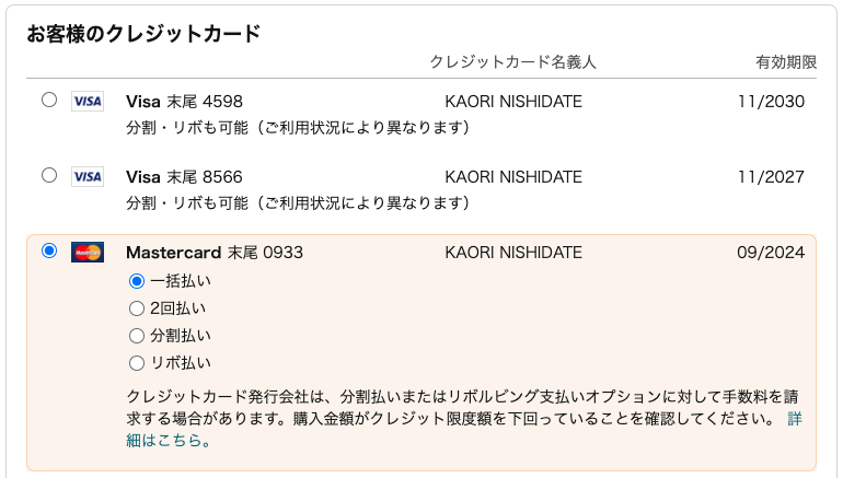
- If the most commonly selected option is preselected, many users won’t need to make any selection at all, speeding up the user flow, like in this example:
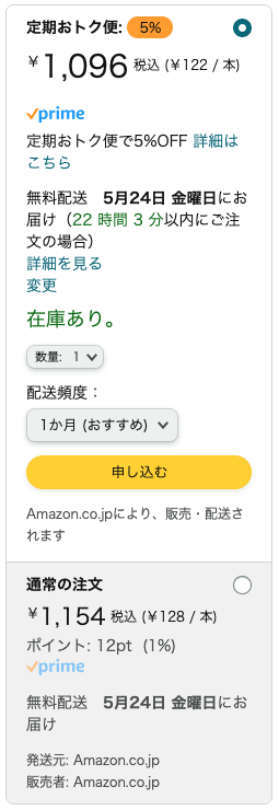
- Preselecting the most beneficial option for your business can also boost business outcomes:
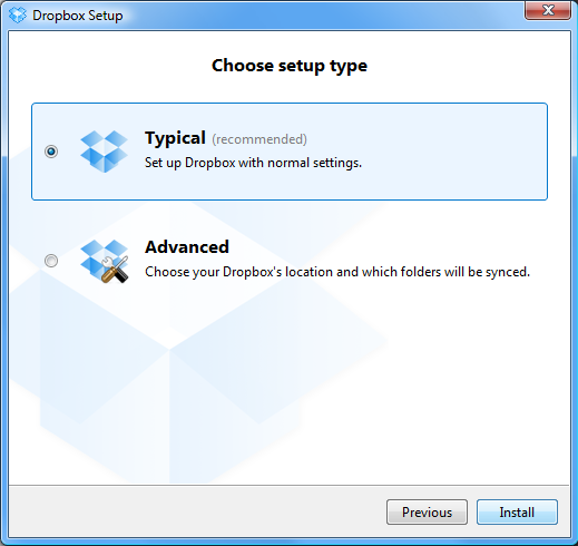
- If users lack sufficient information to make a decision, selecting the most appropriate option for them by default increases the likelihood of making the right choice:
Unsuitable for Many Options
One feature of radio buttons is that all available options are displayed to the user without being hidden. This can make the UI cluttered if there are too many options.
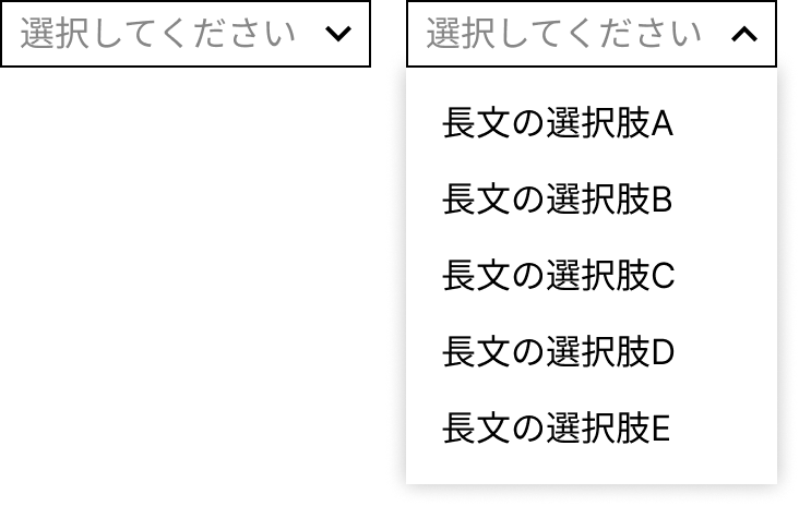
It’s challenging to define exactly how many options are “too many,” but Material Design suggests up to five as a guideline. The length of the options and the available space should also be considered. If the options don’t fit on a single line, using a dropdown might be a cleaner solution.

Cannot Be Nested
Radio buttons cannot be nested within other radio buttons.
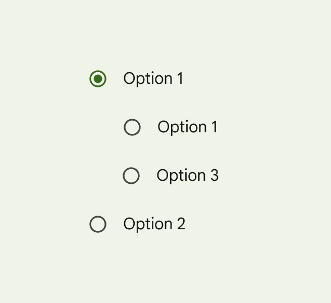
Source: https://m3.material.io/components/radio-button/guidelines#50c7e5ac-024e-49a9-86c1-f5d4f584e77b
Standardized Design
Radio buttons have a standardized design:
- A circular marker with a text label to the right
- Always one selected option
- Selected options are visually distinct from unselected ones
Users are familiar with this design, so while minor adjustments like color or size are fine, drastic changes should be avoided unless there’s a compelling reason.
Radio Buttons vs. Checkboxes
One common issue when using radio buttons is distinguishing them from checkboxes. Even on frequently used websites and apps, you’ll often see cases where checkboxes are used where radio buttons should be, or vice versa. This likely stems from the designer’s insufficient understanding of the differences between the two components.
The key differences are:
-
Radio buttons:
- Single selection
- Mutual exclusivity
- Requires a default option
- Cannot be nested
-
Checkboxes:
- Multiple selections
- No mutual exclusivity
- No default option required
- Can be nested
Checkboxes can also be used as ON/OFF switches, but radio buttons are not suitable for such use.
Conclusion
In this article, we discussed the definition and characteristics of radio buttons, along with their differences from checkboxes. While this post has focused mostly on theory, Part 2 will cover best practices for radio button usage through real-world examples. Stay tuned!