In Part 1 of this series, we discussed the theoretical aspects of radio buttons, such as their definition and characteristics. This time, we’ll explore best practices by reviewing real-world examples of radio button usage.
Case Studies
Before diving into the examples, let’s briefly review the key characteristics of radio buttons:
- Single selection
- Mutual exclusivity
- Default option
- Unsuitable for many options
- Cannot be nested
- Standardized design
Good design incorporates these characteristics to enhance usability, while poor design often ignores or misinterprets them.
Very Good Design Examples
Let’s start by looking at some examples of flawless radio button usage. It may seem daunting to achieve “perfect” design, but as long as you fully understand the characteristics of radio buttons, you can easily apply them correctly. Personal flair or excessive originality can often get in the way, so keeping things simple is key.
Money Forward

Amazon

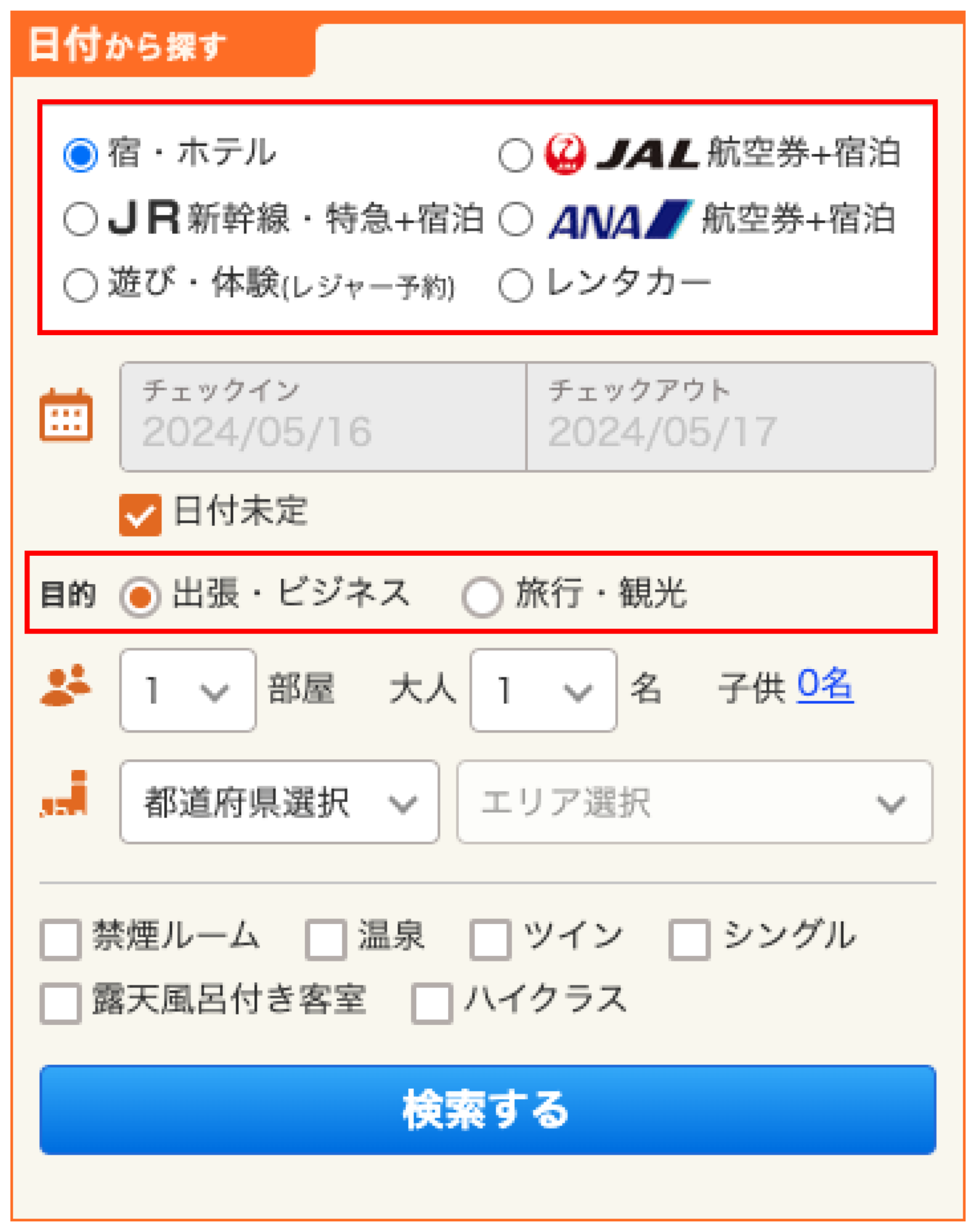
Jalan
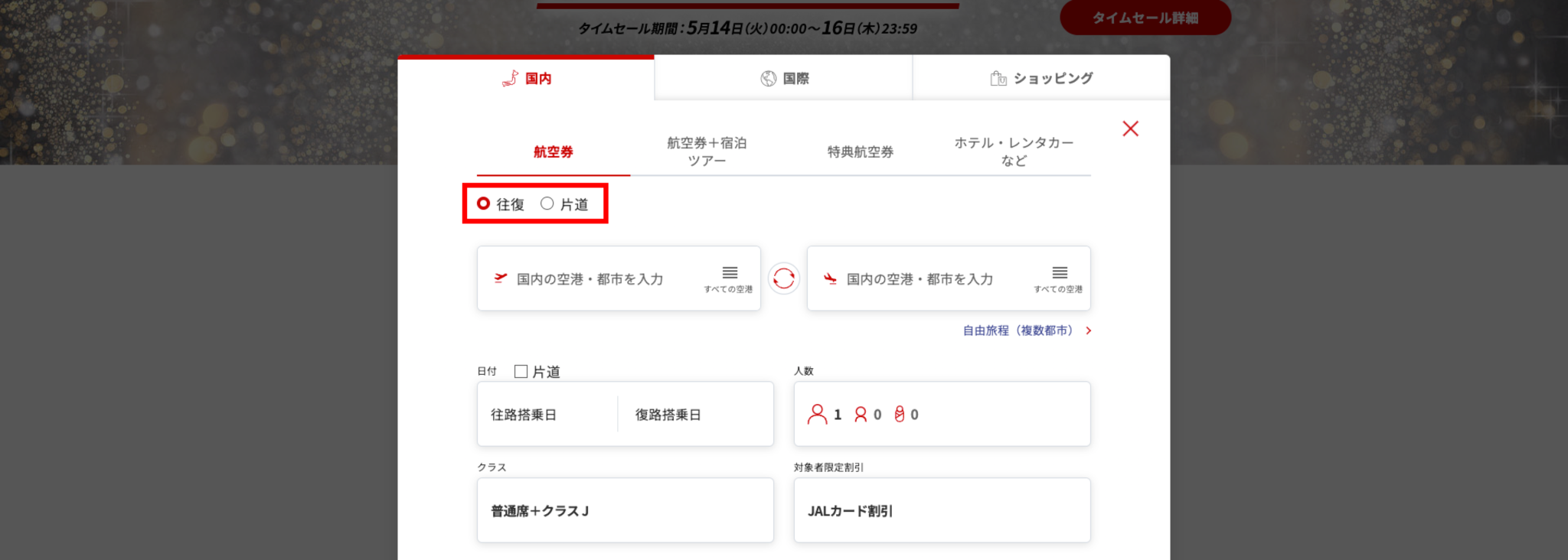
JAL
Good Design Examples
Next, let’s examine a design that performs well but could still use some improvement.
Scoot Airlines
This is its flight change option UI.
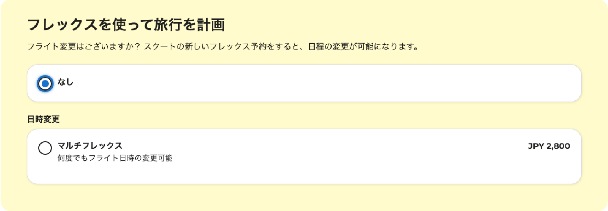
Radio buttons should visually group the question and corresponding options together. In this case, the options are separated by a white box, making it appear as though there are two separate questions with their own options. This creates confusion for the user.
Below is my revised version of the design. The action the user is supposed to take, as well as the information needed to take that action, is now much clearer and better organized.

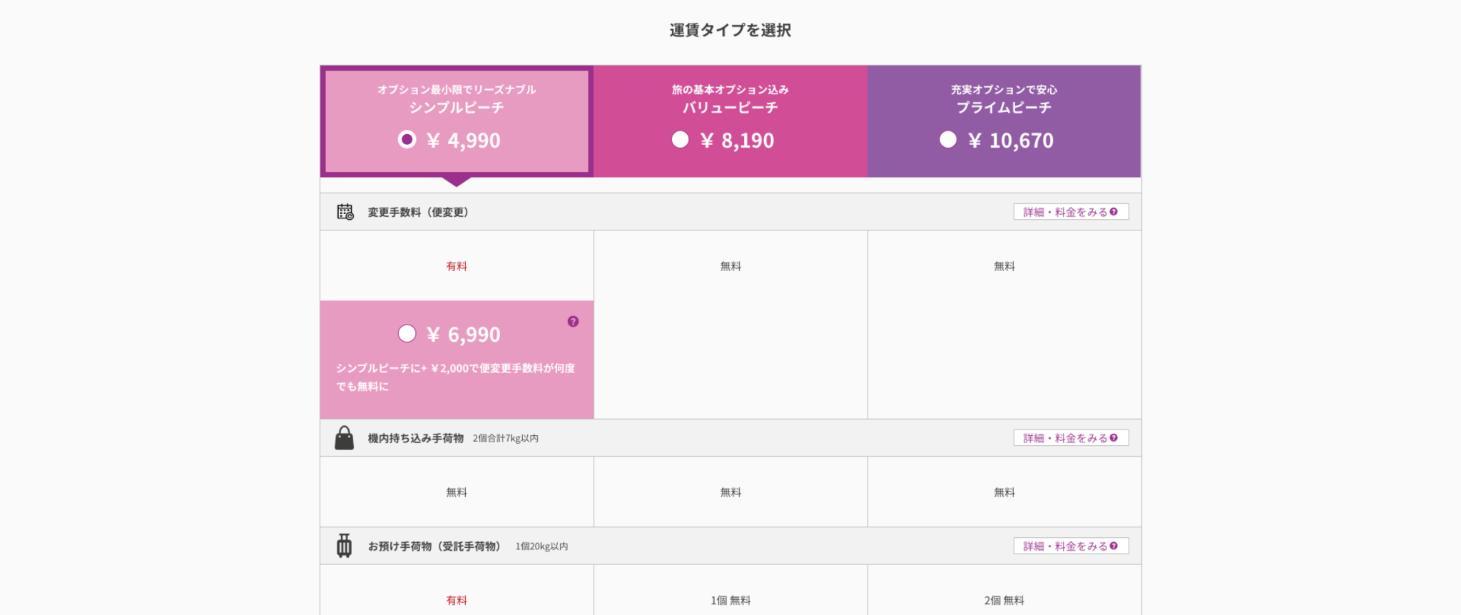
Peach Aviation
This is its booking screen. While the overall layout is clean and information is well organized, the radio buttons’ appearance is an issue. Instead of the expected circular dot when selected, a checkmark appears, which makes it resemble a checkbox—an unnecessary deviation from convention.
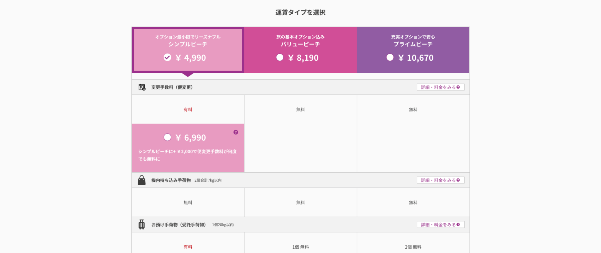
To improve this, I replaced the checkmark with the standard circular dot, as shown below.
Poor Design Examples
The root cause of poor radio button design often stems from a lack of understanding of the fundamental characteristics of radio buttons. Most design issues can be resolved by grasping these basics.
npm
This is the search page of npm.
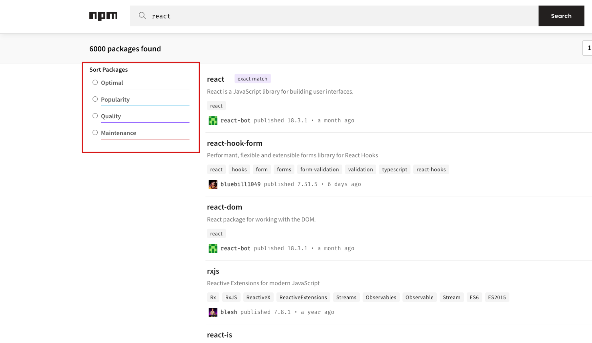
Here, radio buttons are used, but none of the options are selected by default. It’s highly unlikely that the search results are randomly ordered, yet none of the sorting rules are preselected. Since “Best Match” appears to be the most relevant option for most users, it should be selected by default, especially as it’s the first choice.
AmazingTalker
The platform helps users find suitable tutors based on a series of questions.
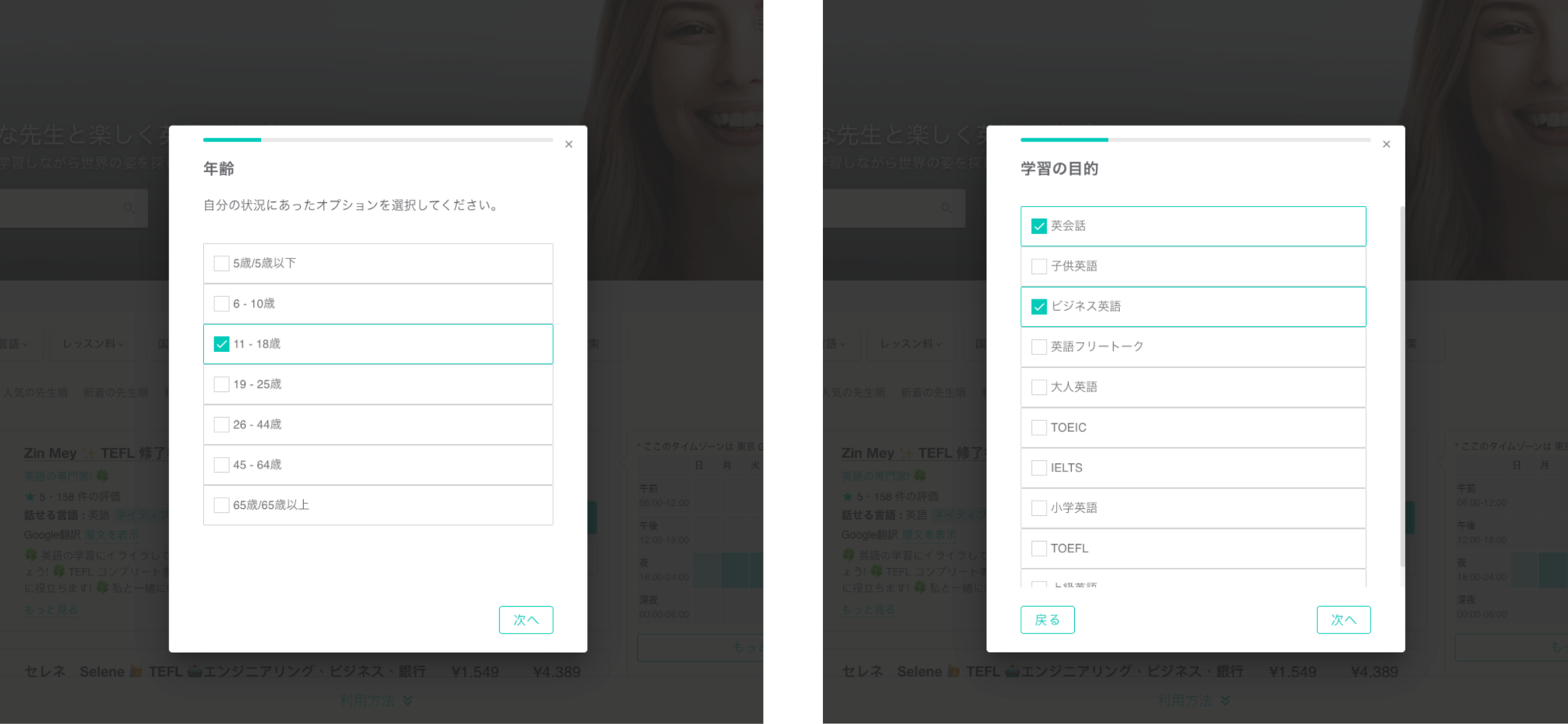
The issue here is that checkboxes are used for both single-selection and multiple-selection questions. For instance, age is clearly a single-selection question, yet checkboxes are used. Since selecting an age range is mandatory, it would be much more natural to use radio buttons with a default option selected.
Conclusion
In this post, we explored various examples to better understand how to properly use radio buttons. Even in cases of poor design, there are often straightforward improvements that can be made. The key is to always keep in mind the fundamental characteristics of radio buttons.
As I worked on this series, I was reminded that the basics are the most important part of UI design (and, indeed, in any field). No matter how visually striking a design is, if the basics aren’t correct, it won’t provide a good user experience.