- The Problems
- The Rise of Password Managers
- Recommended Improvements
- (Update) Confirm Password Field Is Unnecessary
- Final Recommendations
- Conclusion
The Problems
Many sign-up forms still use a password UI pattern like this:
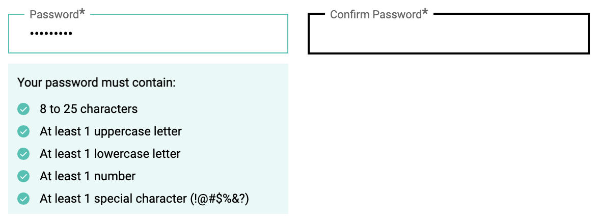
Password inputs without revealing option and that do not allow copy-and-paste for confirmation
While this may seem secure at first glance, this approach is problematic, because:
-
It encourages weak passwords. Users often create short, easy-to-remember passwords to avoid mistyping — especially when they’re forced to confirm it.
-
It leads to password reuse. Because memorizing strong, unique passwords is hard, users tend to reuse the same ones across multiple accounts.
-
It increases the chance of errors. If a user mistypes the password in the confirmation box but can’t see what they wrote, it’s nearly impossible to troubleshoot — especially if the UI doesn’t allow them to reveal the password.
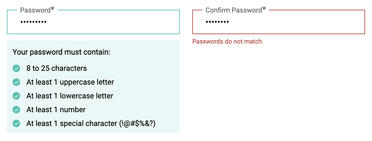
Hard to toubleshoot without the option to reveal the password
-
It disables copy-paste. Many UIs block pasting into the confirmation field, assuming this improves security. In reality, it just breaks compatibility with password managers and reduces accessibility.
-
It drives users away. Frustrated users may abandon the registration process altogether — a clear UX failure.
The Rise of Password Managers
Modern password managers (like Google Password Manager) offer a far safer and more user-friendly approach. They:
- Generate strong passwords.
- Store them securely.
- Auto-fill credentials without user input.
As these tools become standard, UI design must evolve to support this shift toward secure automation — not fight against it.
Recommended Improvements
To make your password input form both secure and user-friendly, apply the following updates:
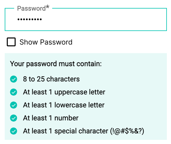
- Allow copy-paste in all password fields — especially the confirmation field, if you use one.
- Provide a show/hide toggle for each password input.
- Minimize friction by aligning with how people actually manage passwords today.
(Update) Confirm Password Field Is Unnecessary
Many design systems now recommend removing the “Confirm Password” field altogether. For example:
-
The GOV.UK Design System advises not using a confirmation field, as it adds unnecessary friction and cognitive burden.
-
The WCAG 2.2 success criterion on accessible authentication states that password inputs must allow copy and paste to reduce user cognitive burden.
-
In short, forcing users to confirm a password — without paste support or visibility — not only harms UX but also fails accessibility standards.
Final Recommendations
To balance security, accessibility, and user experience:
- Remove the "Confirm Password" field altogether.
- Provide a password visibility toggle (default to hidden).
- Support password managers by allowing pasting into all fields.
- Offer passkey-based authentication as a future-proof option (if possible).
Conclusion
Security is not only about strong algorithms — it starts with thoughtful, inclusive user interface design. By removing unnecessary friction and aligning UI with modern tools like password managers and passkeys, we help users stay secure without making the authentication process harder for them.