
- The first half: a language made of assets
- The second half: a language made of intent
- What shipped, and what didn't
- What I'd do differently
- Wrapping up
A note on privacy: As in my design-ops case study, I keep the company and product anonymous, product details general, and every image redacted or redrawn.
When I joined a small energy-tech company at the end of 2022, design didn't exist there yet. Its product, a B2B web app that plans fuel deliveries and monitors tank sensors, had shipped its core features without anyone deliberately designing the interface. There was no design process, no design system, and not even a Figma account. I was the design team, and I was starting from zero.
Over the nearly four years that followed, the most important thing I built wasn't any particular screen. It was a shared design language: a common way for a small team to talk about what we were building and why. I ended up building it twice. In the first half, before AI, it was carried by design assets: Figma screens and a design system that grew with them. In the second half, with AI taking over more of the asset-making, it moved to design intent: the written reasons behind each decision, which the team and an AI agent could both read.
This post is the overview of that work. The deep dives hang off it, starting with the design-ops pipeline.
| Product | B2B web app for fuel-delivery planning and tank-sensor monitoring |
| Company | Pre-IPO energy-tech company, fewer than 50 people |
| My role | First and only product designer: UX/UI, design system, design process and tooling |
| Timeline | Late 2022 to September 2026 |
| Worked with | Engineers, a product manager, customer success and sales, business stakeholders |
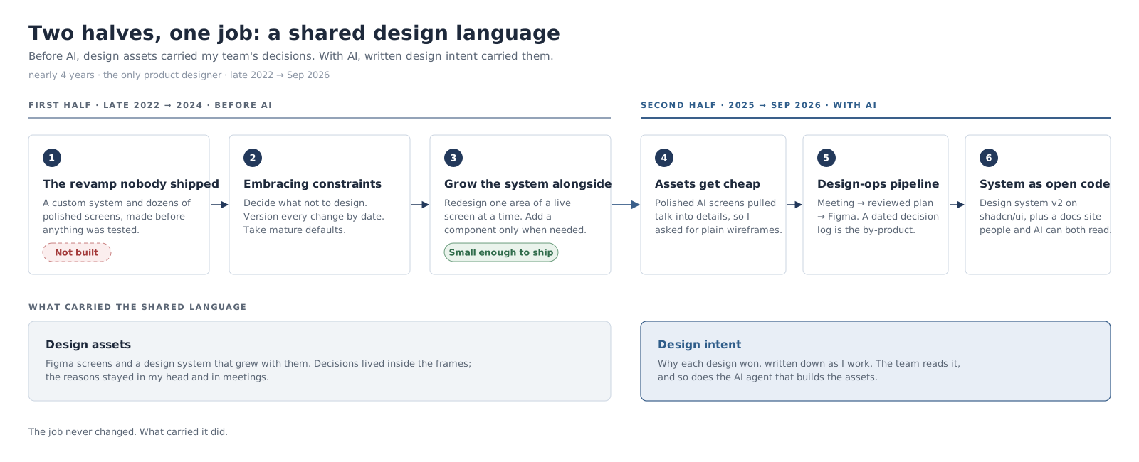
The first half: a language made of assets
The revamp nobody shipped
My first mistake was ambition. The product needed a design sweep, so I planned a big one: a custom design system based on MUI, then dozens of polished Figma screens with the system applied. I spent about a month on the design system alone, before a single screen existed in Figma. When the screens came, the system didn't fit them, and I kept adding the tokens and components they needed and removing the ones they didn't.
The polish was the wrong investment. Some of the screens didn't support the features our enterprise customers actually wanted, and the engineering team couldn't keep up with my pace. When it came to building the revamp, they were reluctant, with good reason: a full redesign risked disrupting a live service and introducing regressions, it rested on little user evidence, and they didn't have the capacity. Most of that work was never built.
The lesson stuck with me. Changes are cheapest when they're small and rough. Polished work spread across a whole product is the most expensive thing to change, and the most painful thing to throw away.
Embracing constraints
The turning point was changing how I approached design, not what I designed. I stopped treating constraints as something to put up with and started using them on purpose, in two ways.
Constraints on what to design. I asked what design actually meant for this product and this company. It didn't mean a visually rich interface, or ease of use in general terms. It meant an interface that looks professional enough for users to trust, focuses on the handful of features they really need, and is easy to use for our audience in particular. That audience was mostly older users with low tech literacy, in an industry slow to digitalise, often working outdoors in the cold, sometimes with gloves on. Knowing that told me as much about what not to design as about what to design.
Constraints on how to design. I set myself a few rules for running the process efficiently:
- Improve the live product one part at a time. I placed screenshots of existing screens in Figma frames and redesigned only the area in question, leaving the rest as it was. Screens ended up with a mix of old and new UI. That cost some consistency, and it was a deliberate trade-off: each change was small enough for engineering to build.
- Version everything by date. Each round of work lived in a date-stamped section that was never edited afterwards, so every change stayed traceable and revertable.
- Take mature defaults wherever possible, such as an established icon set and component library, and customise only where the product needed it.
- Let the design system grow alongside the design, not before it. No component was built until a screen needed it, and I consolidated and decluttered the library regularly so it stayed easy to use.
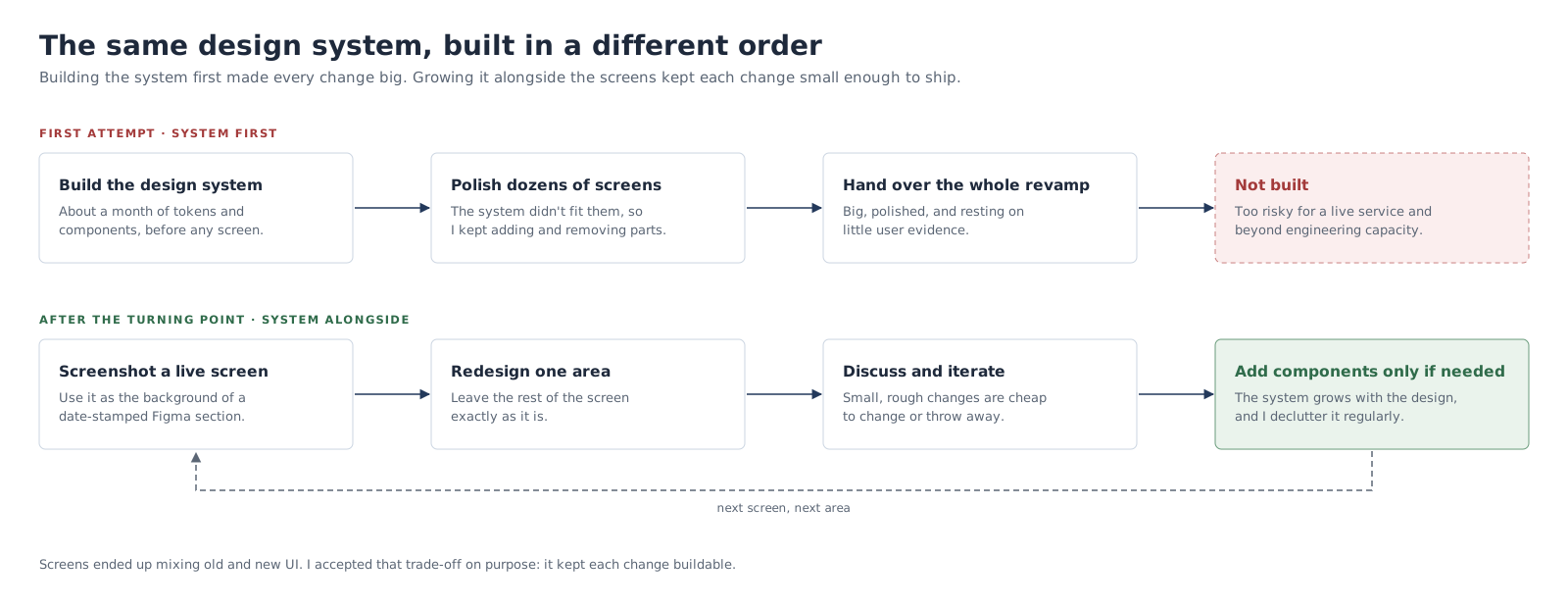
In practice: the customer panel
Here's how those rules played out on the customer screen. Customer details open in a side panel on the right, and my task was to redesign and enrich the scheduling part of it: the next delivery date, fixed delivery dates and the delivery pattern. Following the first rule, I started from a screenshot of the live screen and changed only that block.
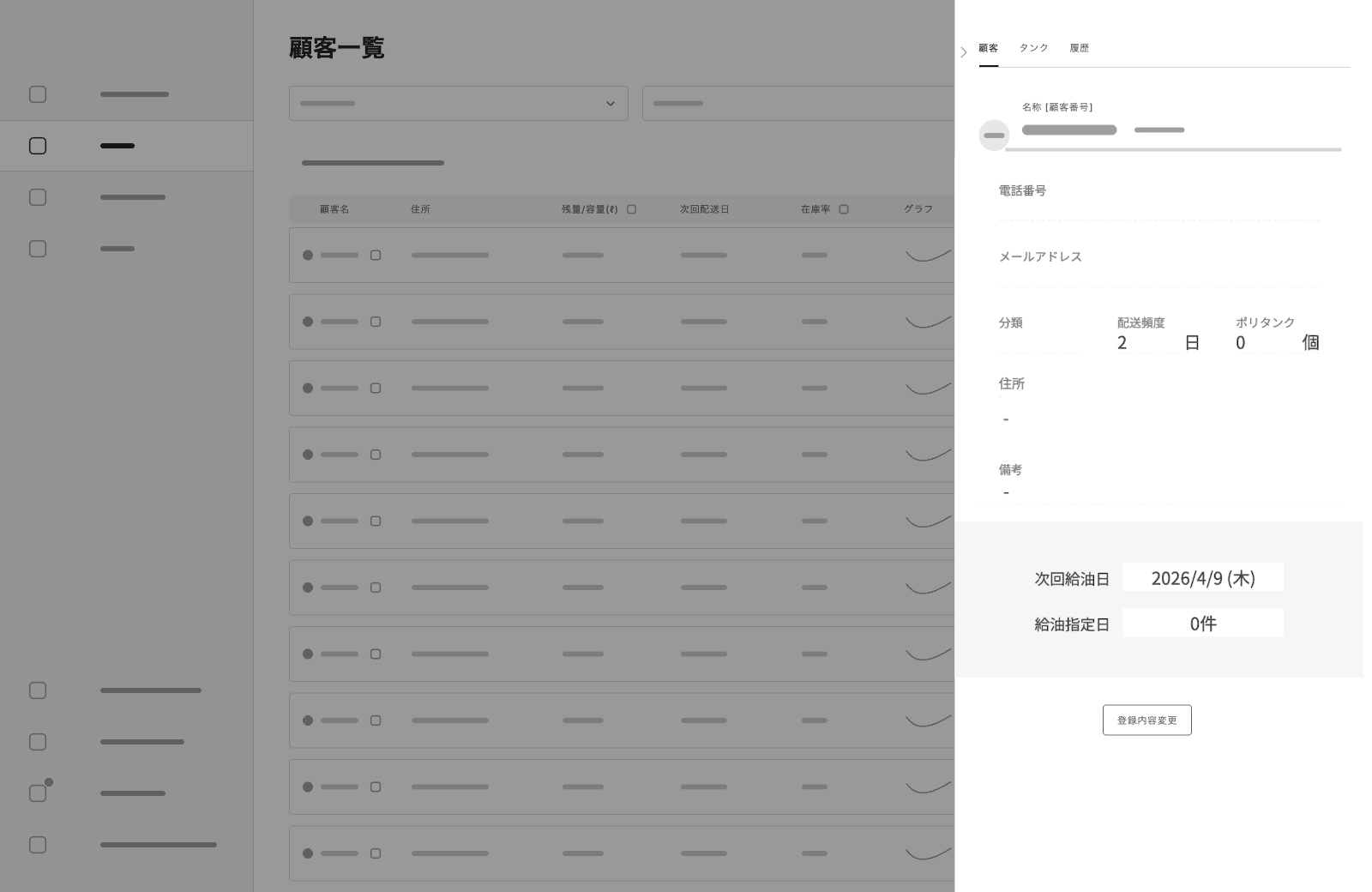
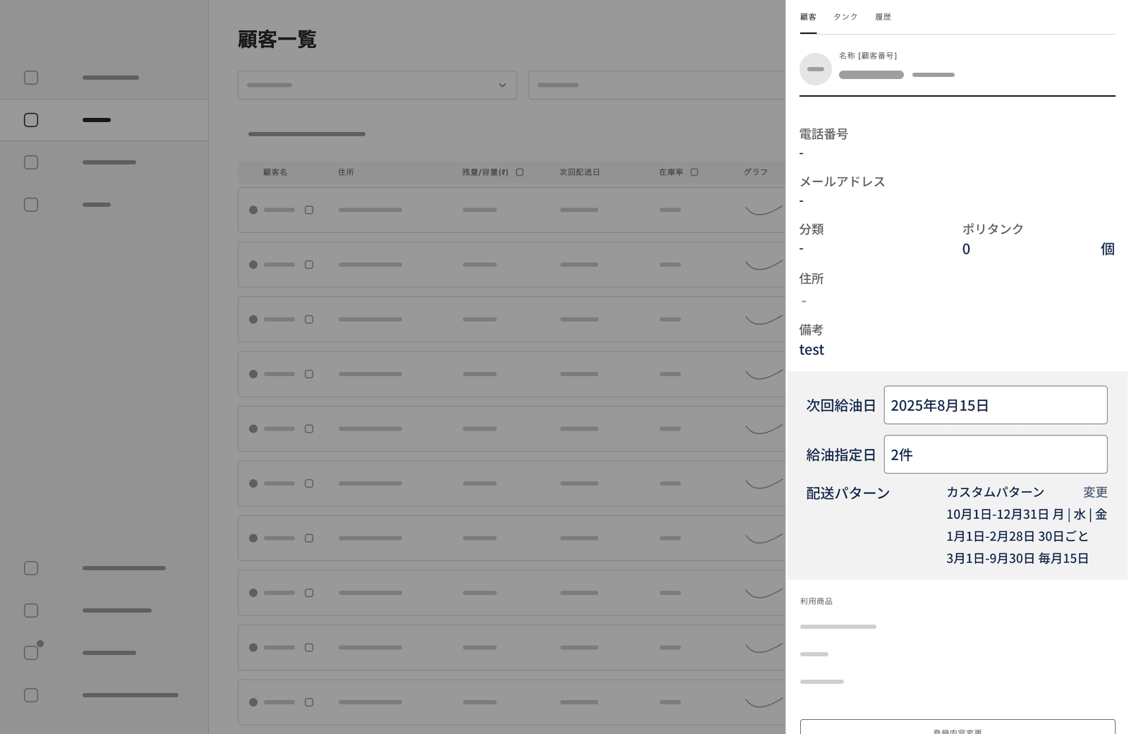
With more information in it, the panel started to feel cramped, so I proposed a second option: the same content in a modal, with room for a two-column layout that's easier to read and work with.
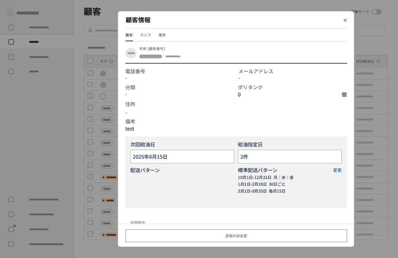
From a UX point of view, the modal was the better design. The team chose the panel anyway: time was tight, and the panel already existed, so building on it needed the fewest changes. That's the kind of trade-off the rules were for: a slightly weaker design that fit the time we had, chosen deliberately and for reasons everyone could see, over a better one that might not ship at all.
The shipped version reused the existing side-panel component and its business logic, with the new scheduling UI added to it.
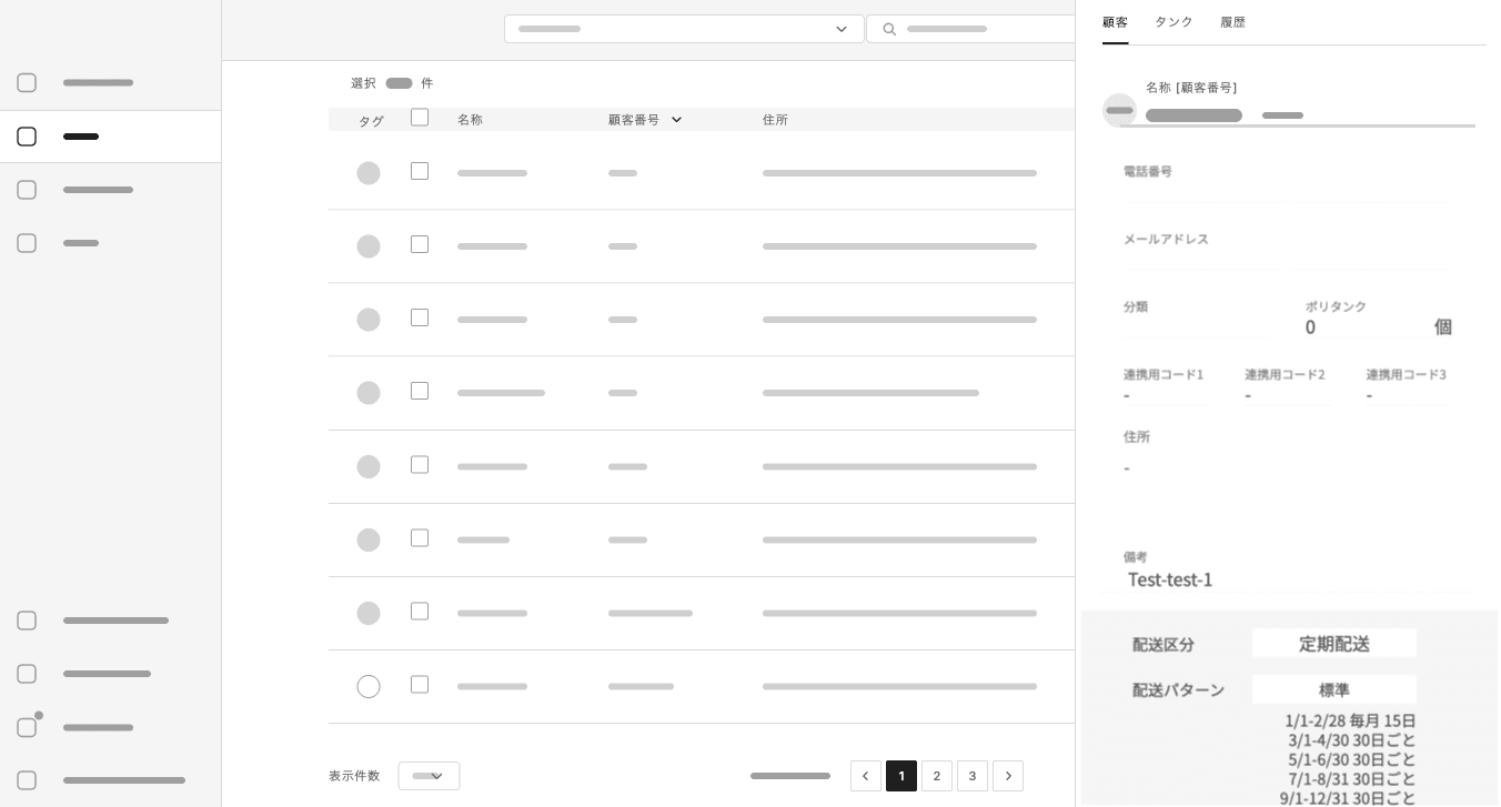
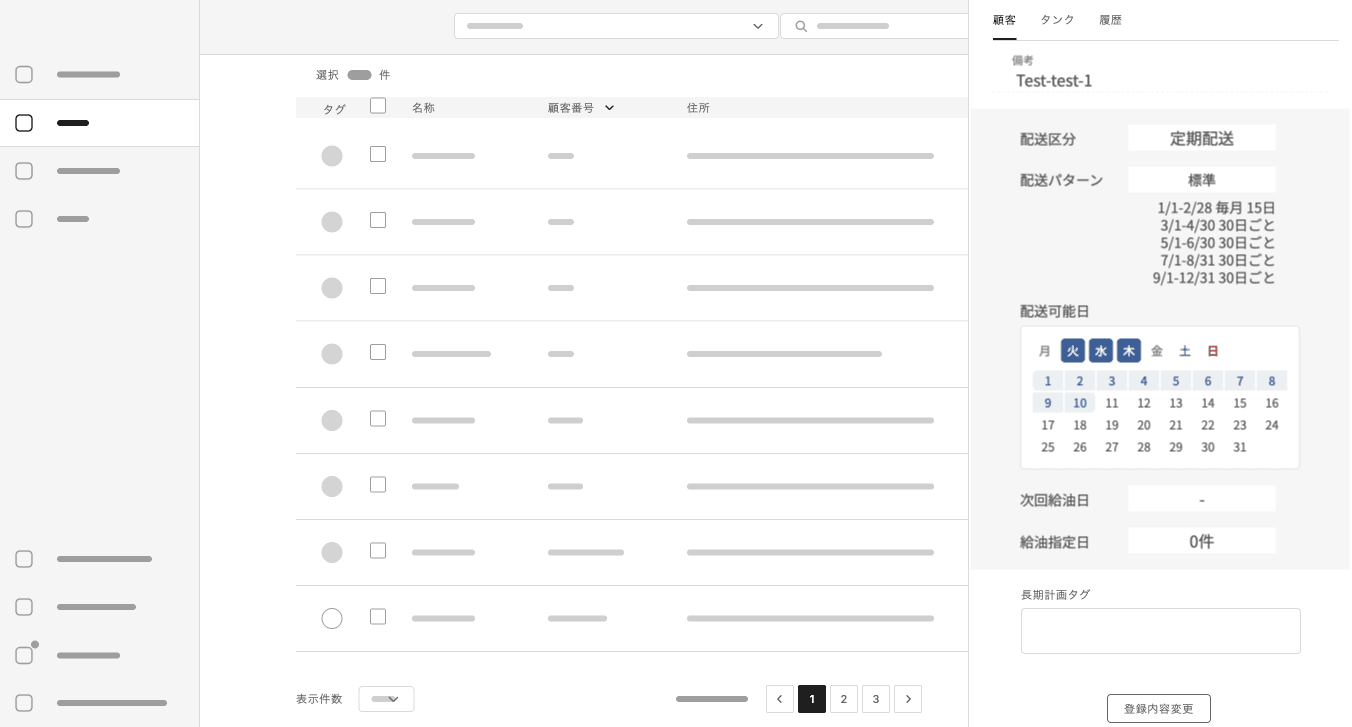
It didn't fully match my design, and that was typical: it's how much of the product's inconsistency crept in. When it happened, I synced Figma with what had shipped in a separate dated section, kept my original design beside it, and noted the gaps between them.
The constraint I couldn't design around
One constraint was out of my hands. With limited engineering capacity, working prototypes in code were rare. My quick prototypes in Figma were used mainly for discussion with the product and business teams, and nothing was implemented in code until its design was finalised. Most validation happened in conversation rather than in use. It's the situation that later pushed me to argue for working from testable assumptions instead of finished requirements, in Stop writing requirements. Start making assumptions.
That made assets the shared design language of the first half. Without something to look at, it was hard to start a conversation about design at all. A screen with the system applied carried its decisions inside it, and it gave the team something concrete to agree or disagree with.
It also had a limit. Every decision lived inside an asset: a frame, a variant, a colour choice. The reasons stayed in my head and in meetings, and documentation always lagged behind the Figma work. When engineers worried about maintainability and keeping the number of components down while I worried about end users, neither side could easily point to why a component had been chosen. As late as July 2026, the team named exactly that as a problem: the design system wasn't developed enough for us to put our reasons for choosing components into words.
Reasons went missing in the other direction too. When a design changed during implementation, as the customer panel did, developers made the call at build time, and their reasons rarely reached me. Over time, engineering and I ended up understanding the same features differently.
The second half: a language made of intent
From making assets to building workflows
AI changed what was scarce. Our first experiments with Figma's AI generation produced polished screens quickly, and that turned out to be part of the problem. The team started debating details instead of goals, and a generated screen a colleague shared could be hard to read because everything on it competed for attention. I ended up asking the AI for plainer, greyscale wireframes. If assets were nearly free, the asset had never been the valuable part. The reasoning behind it was.
So I shifted my effort from making design assets to building design workflows. There were three pieces:
- A design-ops pipeline. It turns a recorded weekly meeting into a reviewed plan, builds the approved tasks in Figma through Claude Code, and leaves a dated decision log behind as a by-product. A human review gate sits in the middle, and nothing gets built while open questions remain. I wrote it up in full in Making the Why a By-Product.
- Design system v2 on shadcn/ui. I ported the Figma designs onto shadcn/ui and built the second version of the design system on top of it. shadcn/ui gives a team the component source code itself rather than a package to override, so it's easier to extend and maintain. The same openness makes it easy for an AI agent to read and change; shadcn/ui's own documentation lists being AI-ready among its principles.
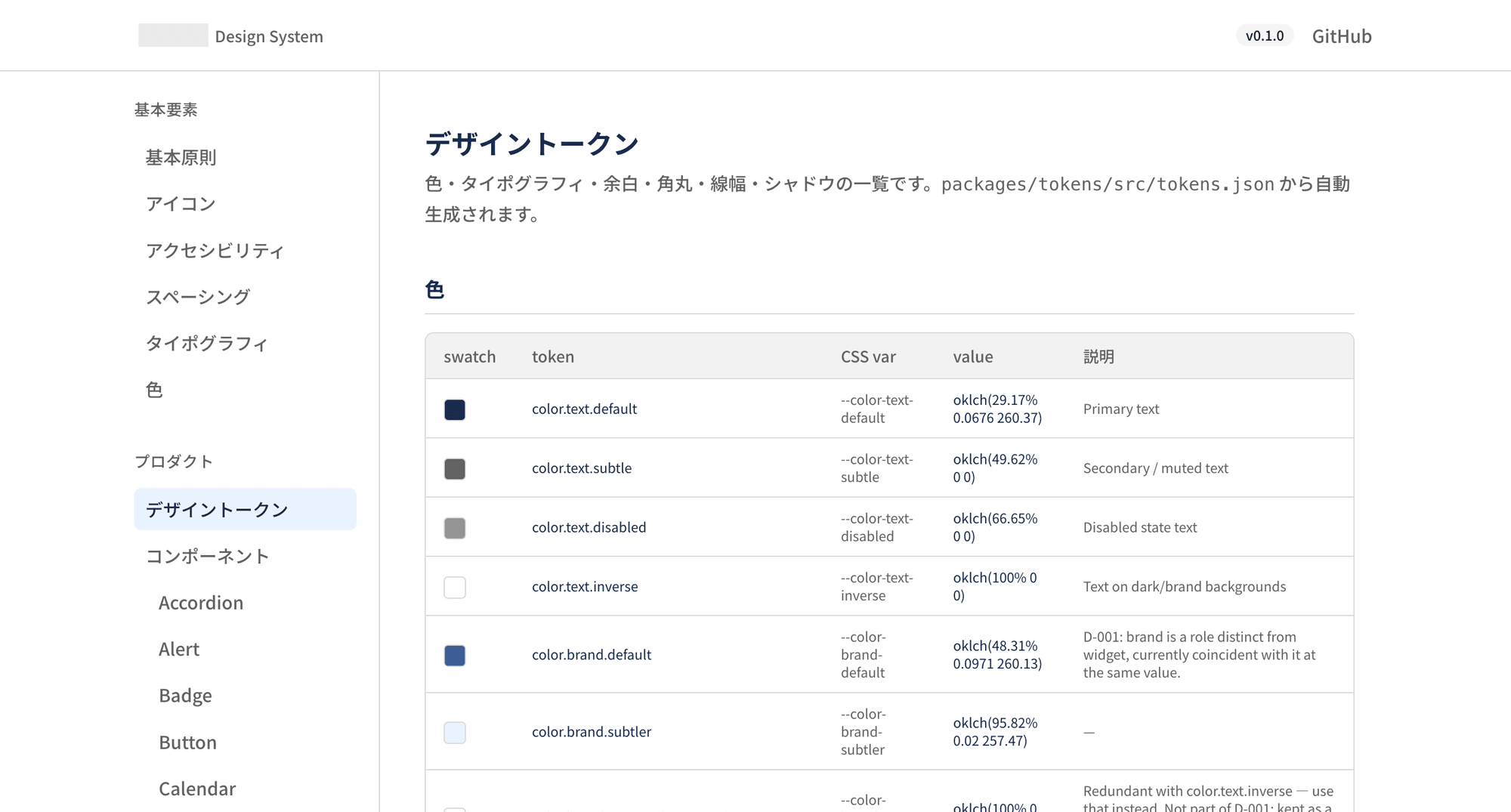
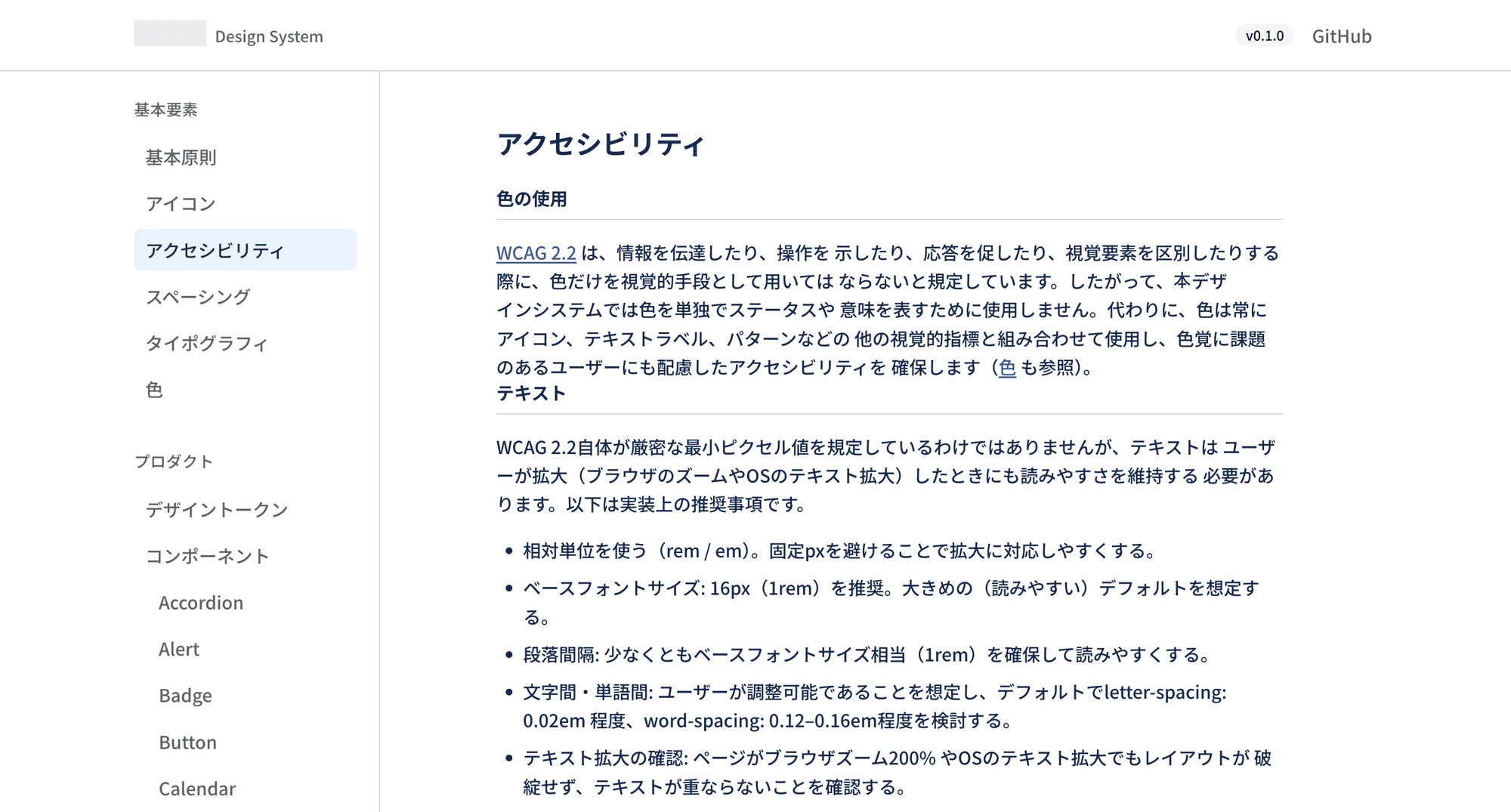
- A documentation site in the spirit of the public SmartHR Design System, pulling its tokens from Figma, so that people and AI could look up the same rules in one place. I demoed it to the team, but it ran only locally and never reached production before my engagement ended.
Intent as the shared language
Before AI, I made the assets and the assets carried the decisions. With AI, the asset-making could be delegated, and what I contributed was the intent: why I made, or asked the AI to make, a particular design, and how it won against the other options. In the design-ops case study, for example, the decision on the 要確認 ("needs confirmation") badge isn't recorded as a final badge. It's recorded as eleven combinations built into a real screen, with a dated note on which one we adopted and why.
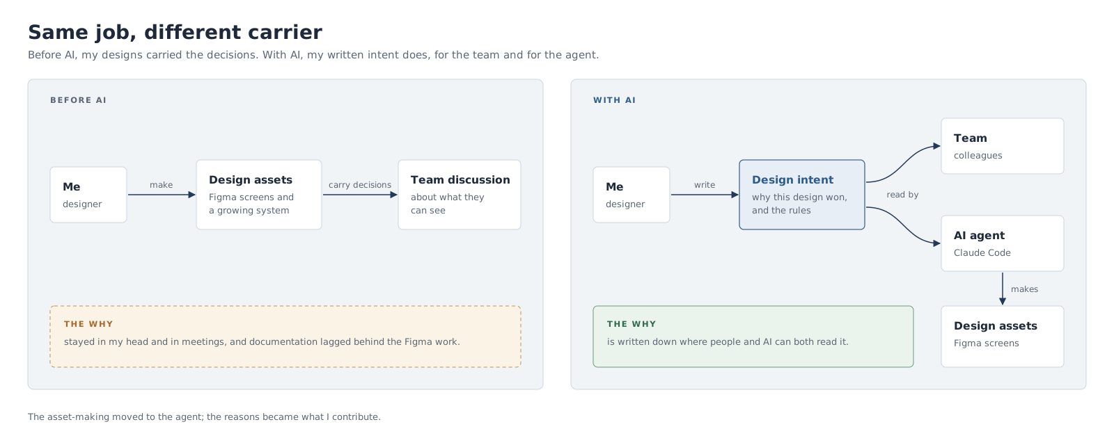
That record turned out to be good design communication in its own right. Colleagues could follow a decision without having been in the room, and the comparisons settled arguments that a single polished screen would have started. The same record served the AI: give the agent the intent and the rules, and it makes the assets for us. The intent became the shared design language, for the team and for the AI working alongside it.
In one of our last design meetings, the team sketched where this could go: anyone in the company prompting Claude against the design system, reusing existing parts wherever they could and creating new ones only when the product truly needed them. That only works if the system's reasons are written down where both people and AI can read them.
What shipped, and what didn't
At a small company, design work is judged by what reaches users, so here's the honest count as of September 2026.
| Work | Status |
|---|---|
| Sensor list with a side panel for alerts | Shipped, using a slightly earlier iteration of my design |
| Customer side panel with bulk actions | Shipped |
| Colour-coded delivery-pattern timeline | Shipped |
| Long-term delivery-plan wizard | Shipped in a simpler form, without the review step I designed |
| Spreadsheet-style customer list with bulk editing | Designed and handed over |
| The first-half revamp | Not built |
| A coded component library in Storybook (2024) | Used by the frontend team as a reference only, never integrated into the codebase |
| Design system v2 on shadcn/ui | The frontend team had started migrating to it when I left |
| Documentation site | Not in production |
The last two rows never reached users, but they're where the second half's intent was meant to live, so they're worth seeing.
What I'd do differently
- Prototype in code from the start. I waited on engineering capacity for working prototypes. With AI, a rough coded prototype is cheap enough that I'd build it myself and test it, rather than letting Figma frames stand in for it.
- Agree a minimum design bar with engineering early. Design and development speed rarely lined up, so some screens shipped as they were. An explicit bar per release would have made that trade-off a decision rather than a default.
- Write the intent down from day one. I only started recording decisions systematically in my final few months, and changes made at build time were hardly recorded at all. The documentation debt from the years before never fully cleared.
- Agree who will use a design system before building it. The frontend team only ever used the coded library I built in Storybook in 2024 as a reference; it never made it into the codebase. Starting from the people who would use it, not from its components, might have changed that.
Wrapping up
When I started, the company had no shared design language, and that was the real gap, more than any missing screen. In the first half, I built one out of assets, because a team needs something to look at before it can talk about design. In the second half, AI made the assets cheap and showed what had been doing the work all along: the reasons. Written down, they outlast the screens they produced, and the next designer, engineer or AI agent can pick them up without me in the room.