- Expectations: AI as a Shortcut
- Reality: AI Logos Fell Short
- Going Back to First Principles
- Key Takeaways
LingoBun is deliberately calm, focused, and serious about learning. Without a logo that reflected those values, the experience felt incomplete. So as the product started to take shape, I decided to design a visual identity for it.
Expectations: AI as a Shortcut
By this point, I had already had some genuinely positive experiences using AI tools in development work, especially for code generation and exploration. They were fast, iterative, and often surprisingly helpful. Naturally, I expected a similar outcome for logo design.
The brief was simple:
- Combine the metaphors of "Lingo" (language) and "Bun" (bunny)
- Keep it modern, minimal, and scalable
- Icon + wordmark (not icon-only or text-only)
I tried multiple AI tools, experimented with different prompt styles, and went through several rounds of refinement.
Reality: AI Logos Fell Short
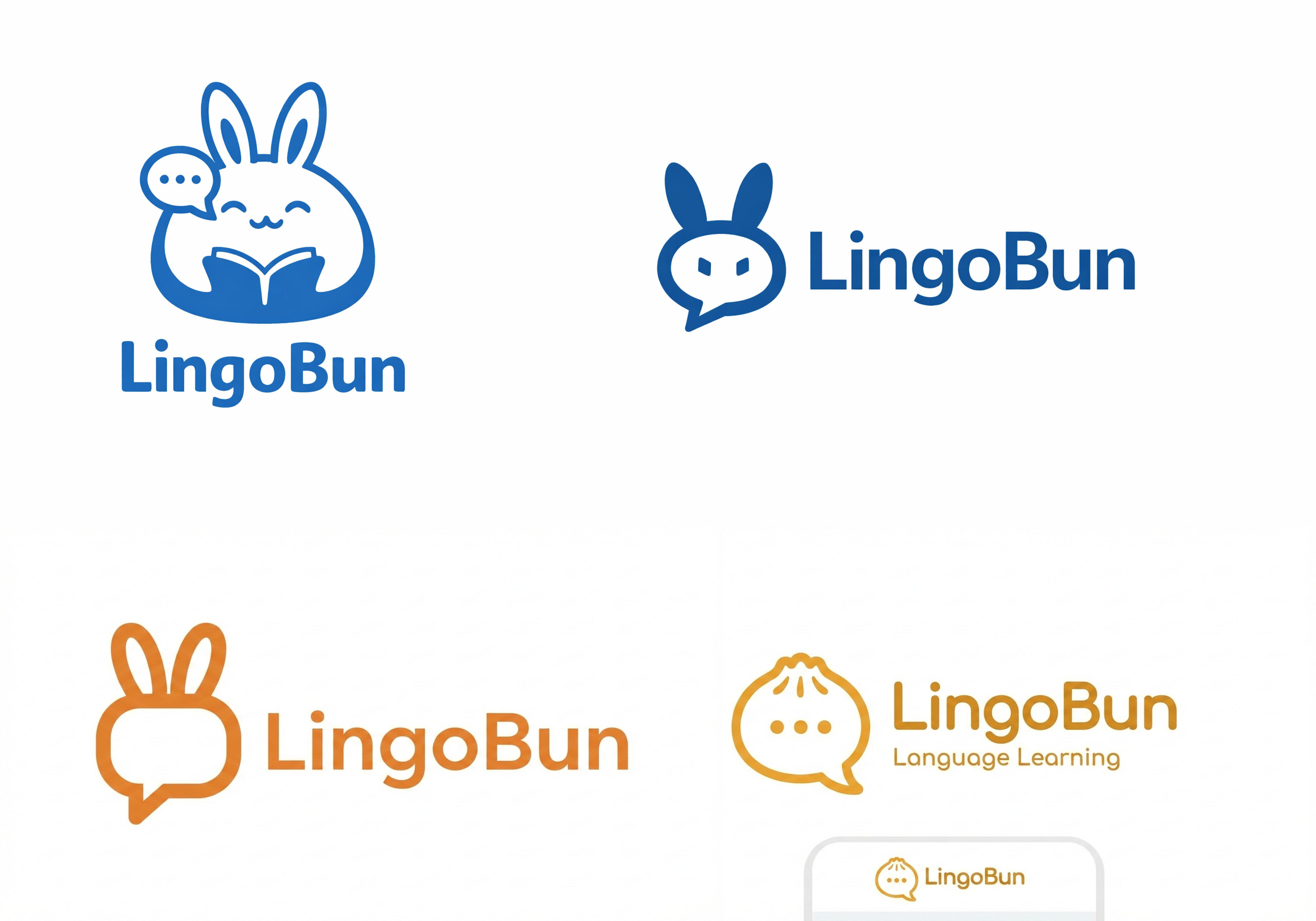
The results were disappointing. Not because they were unusable in a strict sense, but because they didn't align with the values of the product and were of poor quality in general.
Most of the generated logos suffered from these issues:
- Metaphors were literal but not integrated or abstracted
- Shapes felt arbitrary rather than intentional or precise
- Visual balance was inconsistent
- Details didn't survive downscaling
For a product that's explicitly about deliberate practice and clarity, the logo felt misaligned. It looked generated, not designed.

Going Back to First Principles
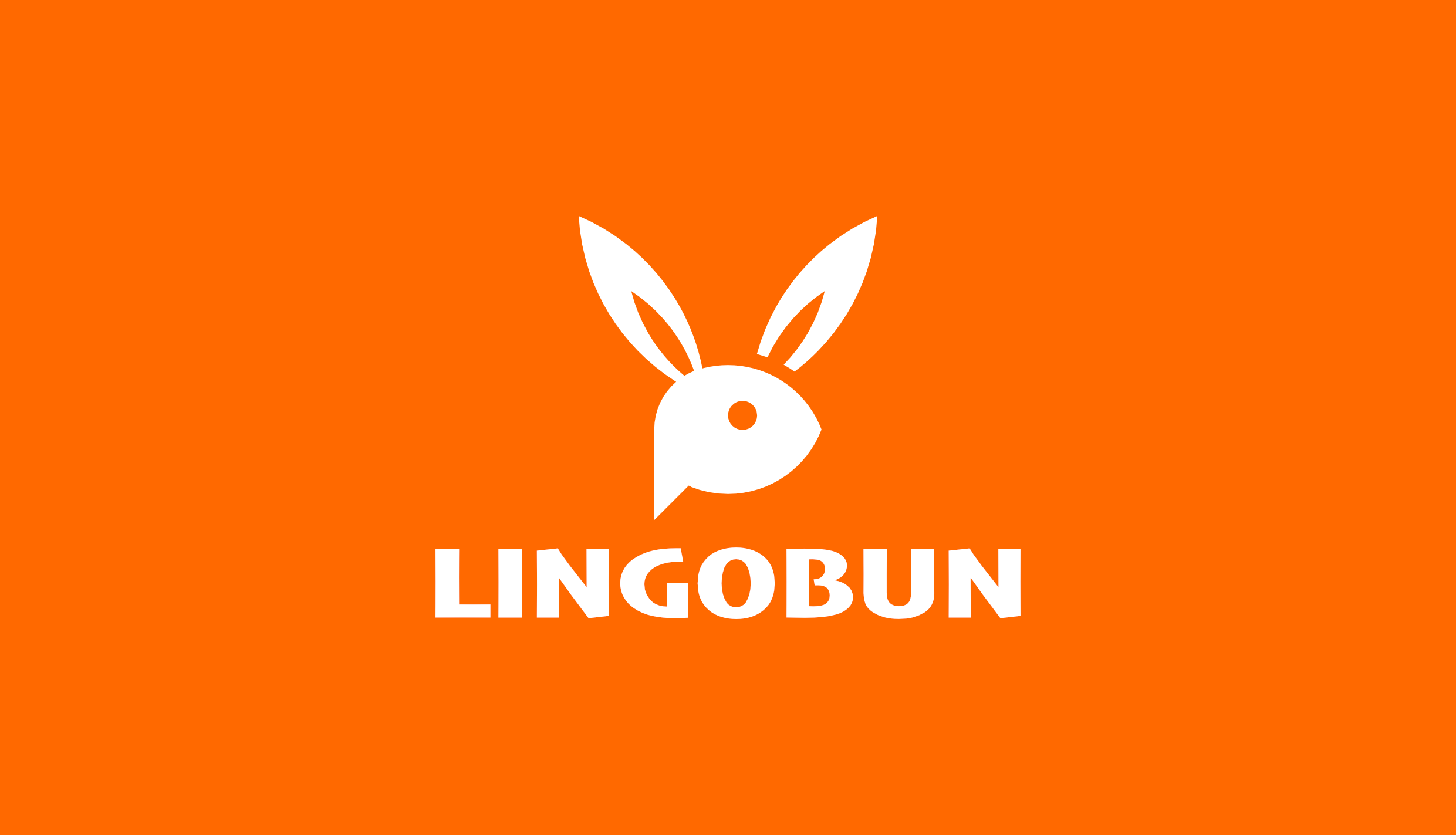
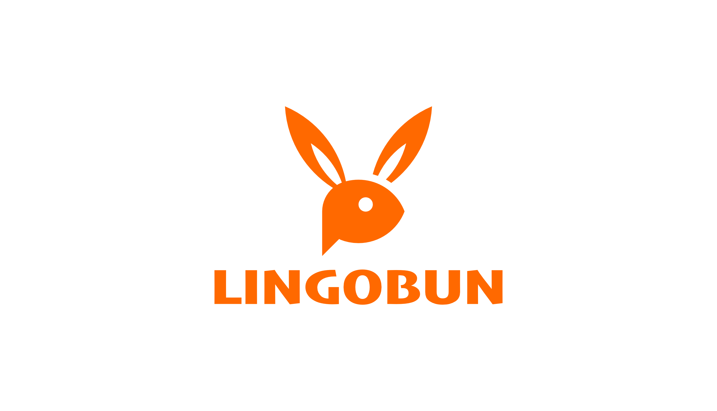
Eventually, I stopped prompting and opened Affinity. I used a geometric construction to combine the two metaphors:
- A speech bubble to represent language and communication
- A bunny silhouette abstracted into a minimal, friendly form
Every curve and angle was intentional. The geometry isn't visible to the user, but it creates a sense of balance and order. This precision is not accidental. It mirrors one of LingoBun's core ideas: learning doesn't have to be flashy to be effective.


Key Takeaways
The experience highlighted some limitations of AI tools in supporting design practice. I realised that AI could be useful for exploring ideas and visual directions, but when it came to making sensible design decisions, it fell short.
The logo was shaped by constraints, trade-offs, and intent. That's still a very human process.