
- The problem I was actually solving
- The pipeline
- A full pass, start to finish
- Where the pipeline hits a wall, and what that tells me
- The governance layer, and where I've had to govern myself
- What the evidence trail actually shows
- Wrapping up
A note on privacy: I follow strict privacy rules in this case study. The company and product names are changed, product details are kept general, and every design image has been redacted or redrawn as a low-fidelity wireframe, so no personal or confidential information appears here. How I redact the images is a project of its own: redacting case-study screenshots without them leaving my Mac.
Design intent, the why behind a decision and not just the what that shipped, is as important as the design output itself. Few people write it down consistently, and this is especially true for smaller teams: when the priority is shipping the next feature, "document the reasoning" is the first thing that gets skipped. It gets skipped quietly enough that nobody notices until eighteen months in, when someone (usually me) can't remember why a decision was made and has to re-litigate it from scratch.
This case study is about a pipeline I built to stop that happening. The setting was weekly design work on a B2B web app that plans fuel deliveries and monitors tank sensors, made by a small energy-tech company. I've changed the names: I'll call the product Tankwise and the company Northwind.
The short version: I didn't just use an AI agent to move faster in Figma. I built and governed a pipeline that turns a recorded weekly meeting into reviewed, on-brand Figma screens, and leaves a dated record of the reasoning behind as a by-product. The AI does the parts of the job that were never the judgement in the first place. The parts that are (what to build, whether the reasoning holds up, when to say no) stay mine.
The problem I was actually solving
AI changes the economics of documentation. If I have to sit down after a meeting and manually write up what we decided and why, that's real, resented overhead: extra work stacked on top of the design work. But if the record is captured as a by-product of a workflow I was already going to run (meeting, transcript, plan, build), the cost drops steeply.
That's the bet this pipeline makes: structure the AI session so that a durable, shareable record is what the session naturally leaves behind, not an extra step I have to remember to do.
The pipeline
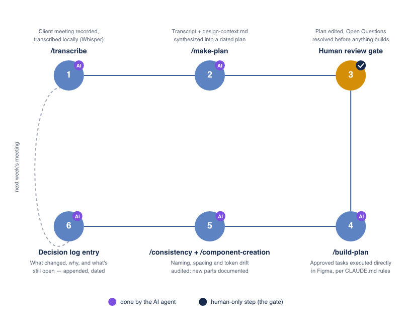
The pipeline runs on Claude Code with a Figma MCP connection and a local Whisper transcription script, driven by a small set of custom slash commands I wrote. It has six steps:
/transcriberuns a local Whisper transcription of the meeting recording into a note file. The recording itself isn't uploaded anywhere, and this step doesn't touch Figma or write a plan./make-planreadsdesign-context.md(the living source of truth for tokens, components and conventions) plus the meeting note, and writes a dated plan,design-plans/YYYY-MM-DD.md, with fixed sections: Source, Summary, Design Tasks, Open Questions and Out of Scope. It deliberately doesn't touch Figma.- Human review is the explicit gate. I read the plan, edit it, resolve ambiguities and decide what's actually in scope this week.
/build-planexecutes each approved task directly in Figma, following the automation rules inCLAUDE.md./consistencyand/component-creationare the governance layer./consistencyaudits a screen or section for non-standard layer names, off-grid spacing and fills that aren't bound to a token, and asks for approval before fixing anything./component-creationformalises new components or variants into the library with documented usage rules, so one-off Figma work doesn't accumulate as untracked debt.- A decision-log entry, dated and narrated, is appended to
design-context.mdby each build session: what was built, what wasn't, why, and the gotchas hit along the way.
Then the cycle repeats the following week, off the next meeting.
Two details matter more than the rest.
The gate is enforced in the command itself. /build-plan is written to stop if the plan still has open questions, so the review isn't a convention I could skip under deadline pressure. This is the whole command:
Generate the Figma designs for a reviewed design plan. $ARGUMENTS can contain:
1. A date (YYYY-MM-DD); if omitted, use the most recent file in design-plans/.
2. Additional instructions and/or context for the build process (e.g., "skip task 3", "use variant B for task 5", reference design links, etc.).

Follow these steps:
1. Read design-context.md to understand the design rules and conventions.
2. Resolve and read the target design-plans/YYYY-MM-DD.md (by $ARGUMENTS date, or the most recent file in design-plans/ if omitted).
3. If ## Open Questions has unresolved items, stop and ask the user before proceeding.
4. For each item in ## Design Tasks, carry out the work directly in Figma, following the design-automation rules in CLAUDE.md (auto-layout, reuse/extend existing components and swap variants instead of detaching, use design tokens, duplicate the closest reference frame for new screens) — using the same approach as /new-screen, /batch-edit, and /component-creation as appropriate per task.
5. Document any new components, variants, or tokens created along the way in design-context.md.
6. Reply with a short summary of what was built vs. skipped, so the plan stays an accurate record.
The decision log is not a changelog. A changelog tells me a button's padding changed on 12 August. The log tells me that two padding candidates were tested in three real-screen contexts, which one shipped, and the exact Figma Plugin API constraint that made shipping it harder than it should have been. That's the part I actually need six months later.
A full pass, start to finish
The clearest single example of the whole loop working is the readability pass on the 要確認 ("needs confirmation") badge. In one meeting, the team flagged that our yellow warning badges, styled after Japanese road-sign yellow, weren't reading clearly enough. An improvised test in the meeting itself, switching the text colour from orange to our standard dark navy, got a "that might work" reaction, but nothing was decided.
/make-plan turned that into a concrete task: build a structured comparison of icon style × text colour combinations, using the badges in real table rows rather than isolated swatches, so the comparison could be judged in context. I reviewed the plan, tightened the task and ran /build-plan.
What came out was seven full-screen clones, each showing one combination applied to all three 要確認 rows of a real screen, arranged in a labelled section so they could be compared side by side. Four more followed later in the same session, after I added two new icon variants.
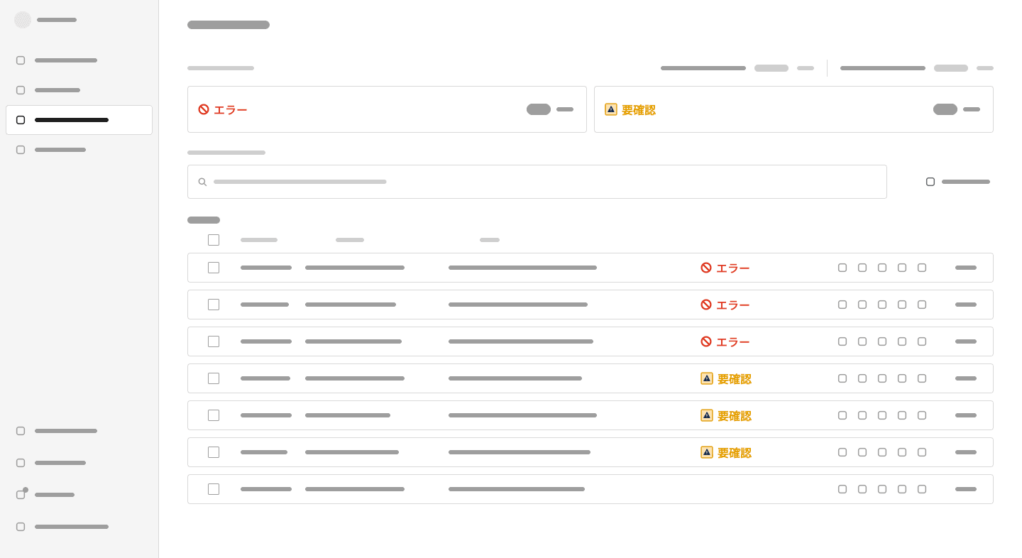
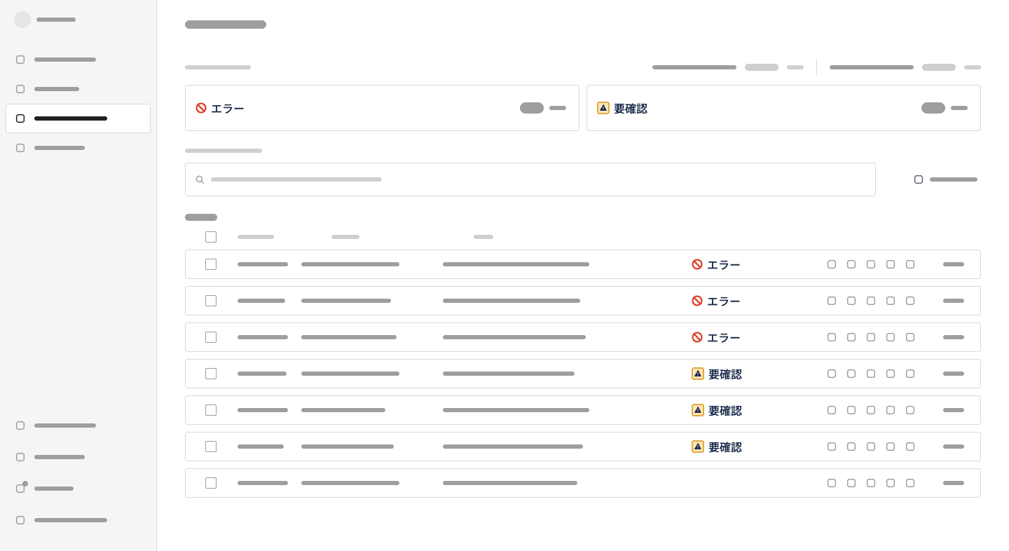
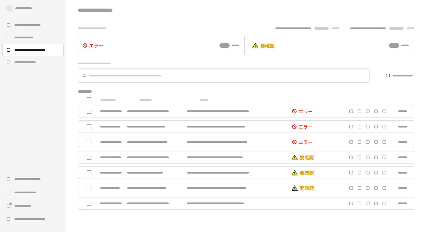
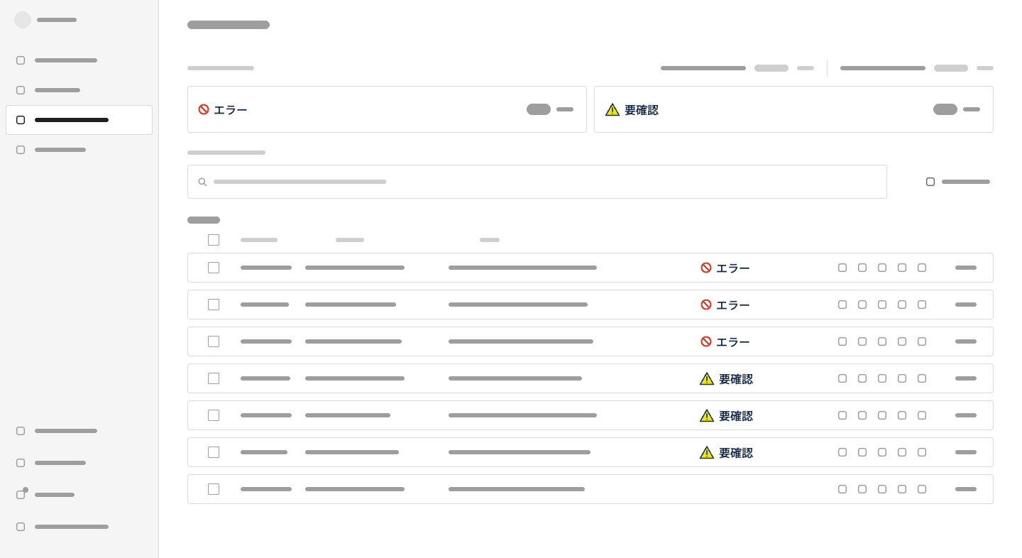
Building in context is also what surfaced a real bug in the same session. The next task on the plan added a filter chip under the search box. On the version of the screen that already had a row-selection toolbar, the chip pushed the table past the frame's fixed height and silently clipped the last row. That's not a hypothetical risk I'd catch by inspecting a design file; it only shows up when the change is built in a realistic layout and checked, which is what the pipeline forces at every pass. The fix (growing the frame, then resizing the sidebar and nav highlight to match, a technique documented in an earlier session) went into design-context.md as a dated entry, next to the comparison itself.
The badge decision didn't close in that session: which combination to adopt was still marked open at the end of the week. That's worth keeping in, not editing out. The pipeline doesn't force decisions to completion; it forces the state of a decision, resolved or not, to be visible and dated instead of silently forgotten.
It closed a week later. After I shared the designs with the team and we discussed them, we adopted the one on the right:
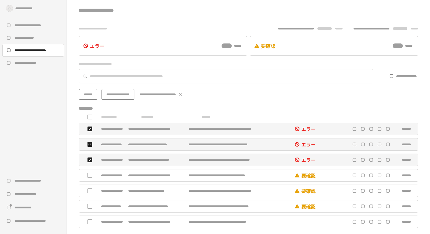
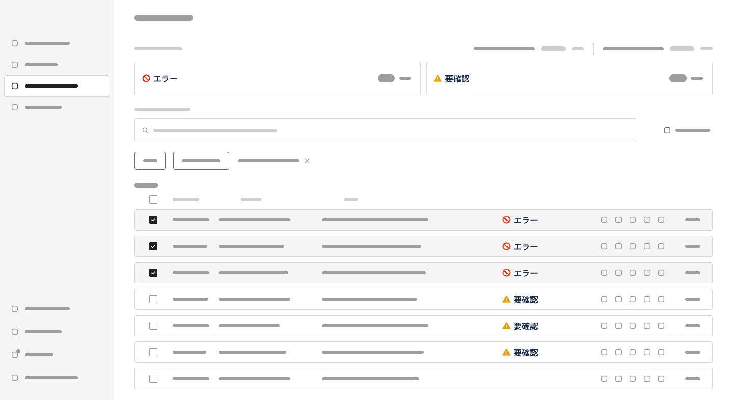
This design has the best balance of clarity and consistency. The icons are visually distinct, while the text is clear without being noisy.
Where the pipeline hits a wall, and what that tells me
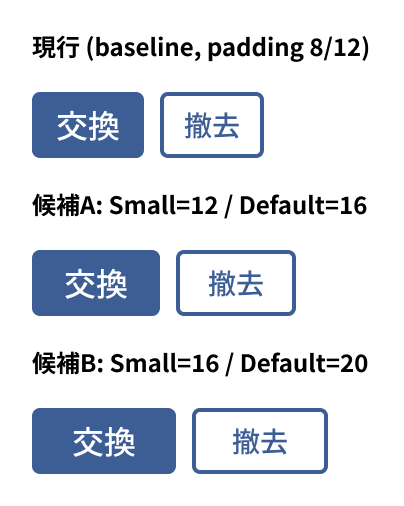
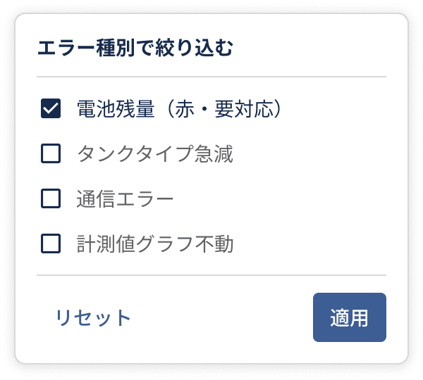
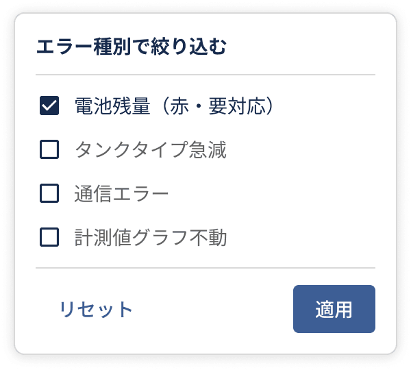
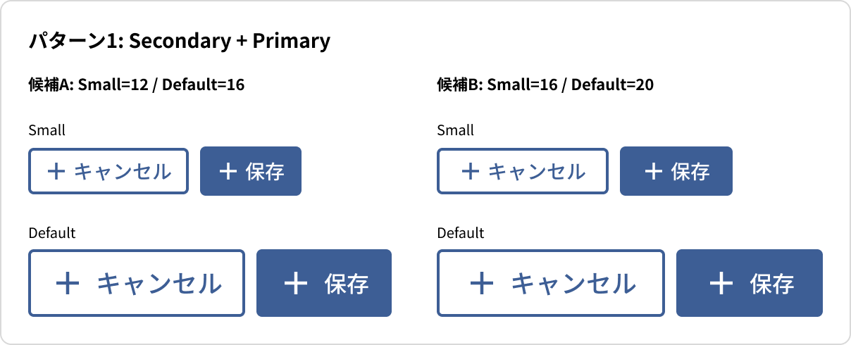
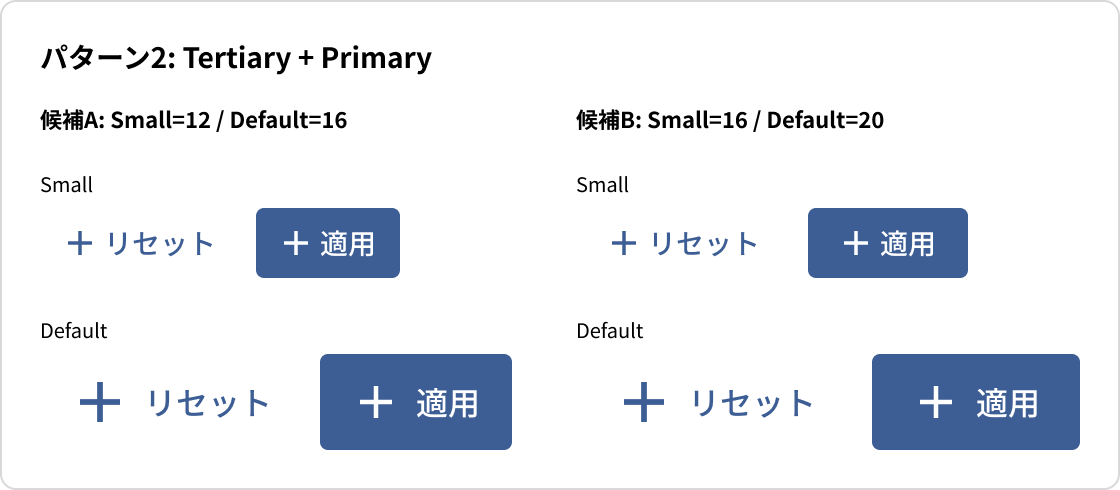
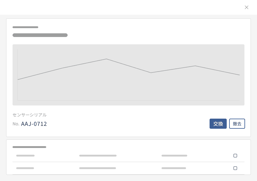
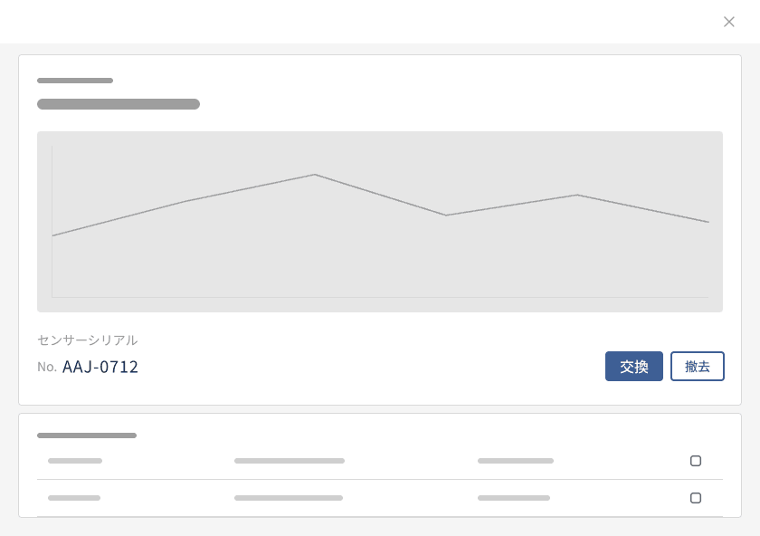
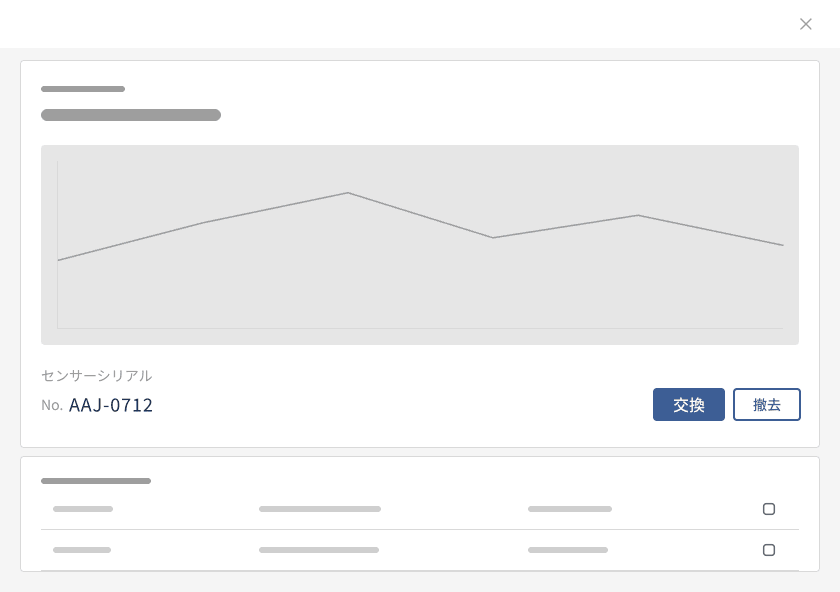
Not everything is autonomous, and the boundary is more interesting than the automation. On another day, we needed to test a wider minimum button padding across the design system. /build-plan cloned the real button component sets, applied two padding candidates, and put both into three real contexts (a dialog, a button-pair pattern and a filter panel): the same "real design, not isolated swatches" discipline as the badge example.
Then it hit a Figma Plugin API limit. A newly created component can't be imported into another file with importComponentByKeyAsync until a human publishes it to the team library through Figma's UI; as far as I could find, the Plugin API has no call for publishing. The workaround was to clone the local copies Figma keeps of the already-published buttons inside the working file and apply the same padding recipe to those, so the in-context comparisons could render without needing me to step in mid-build.
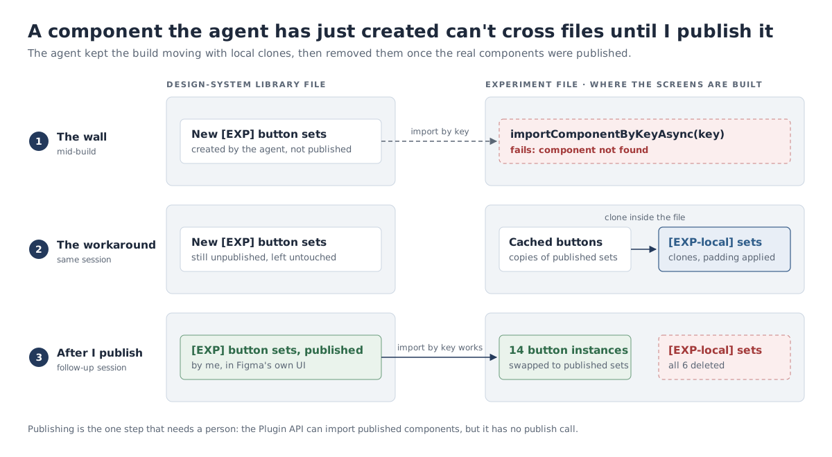
Once I did publish the real candidate components, the next session found every leftover use of the workaround (14 button instances), swapped each one onto the properly published component, and deleted the six workaround sets. This is the cleanup that a "ship it and move on" approach would very plausibly have left behind as debt.
I think this is a more honest version of "autonomous with a human review gate" than the pitch usually sounds. It's not that I chose to stay in the loop out of caution. Some things can't be automated away, and the interesting design decision was a workaround that kept the work moving without pretending the constraint didn't exist, followed by an explicit flag for the follow-up: once a padding value is chosen, publish the real set and remove the experimental ones. That flag is itself a decision-log entry, which is the mechanism working as intended.
These are the comparisons that came out of it:
What we adopted
For buttons on top-level layouts (pages), the padding went from 12px to 20px:


For buttons on second-level layouts (popups, such as the filter panel above), it went from 12px to 16px.
We also adopted two button-pair patterns:


The governance layer, and where I've had to govern myself
/consistency and /component-creation exist because "AI can move fast in Figma" is a liability without something checking the output against the system's own rules. Those rules live in two files. CLAUDE.md holds the automation rules the agent follows on every task:
## Design automation rules

- Always read design-context.md before making Figma changes
- Prioritise auto-layout and avoid manual positioning; if auto-layout is missing, make it
- Use the components specified in design-context.md wherever possible; if a component is missing, make it and document it in design-context.md
- Never detach component instances — swap variants instead; if a component is missing, make it and document it in design-context.md
- Match existing naming conventions specified in design-context.md
- Before any task, always duplicate the closest existing frame as specified in design-context.md or if no close match exists, find one by yourself; if unsure, ask for clarification.
- Always use tokens defined in design-context.md; if a token is missing, create it and document it in design-context.md
- Do not ask for permissions to edit the Figma file or run commands; just go ahead and make the necessary changes, following the above rules
- Use Japanese for any documentationdesign-context.md holds what those rules point to: the token tables, the component inventory, the layout system and the layer-naming conventions. A redacted excerpt:
# Tankwise Design Context

Token names follow [W3C DTCG](https://design-tokens.github.io/community-group/format/) dot-path convention. The `$type` column uses DTCG-specified types.

[…]

## Spacing Variables

### Inner Spacing (padding / gap within components)

| Token | `$type` | `$value` | Notes |
|---|---|---|---|
| `spacing.inner.smallest` | `dimension` | `4px` | Tightest inner padding |
| `spacing.inner.small` | `dimension` | `8px` | Small inner padding |
| `spacing.inner.medium` | `dimension` | `12px` | Medium inner padding |
| `spacing.inner.large` | `dimension` | `16px` | Large inner padding |

[…]

## Layer Naming Conventions

### Component Set Names (COMPONENT_SET)

Format: **`Title-case`** — first word capitalised, subsequent words lowercase, separated by hyphens. No underscores, no spaces.

| Pattern | Examples |
|---|---|
| Category prefix | `Button-primary`, `Button-secondary`, `Button-tertiary`, `Button-icon` |
| Deprecated | `_deprecated-open-in-new` — prefix `_deprecated-` before the name |

### Variant Node Names (COMPONENT inside a COMPONENT_SET)

Format: `Key=Value` pairs, comma-separated for multiple properties.

### Internal Layer Names (FRAME, GROUP)

Format: **`kebab-case`** — all lowercase, hyphens only, descriptive.
The audit-before-fix step in /consistency is the same instinct that shows up everywhere else in this pipeline: build first, but make the reasoning and the deviations visible before anything gets fixed unreviewed.
The place I've had to apply that discipline to myself is design-context.md. By the end of August it was 1,289 lines and roughly 280KB: a single file holding the token system, the full component inventory and around fifty dated build and decision entries, all appended since early July. It had grown long enough that I found it hard to read, and that's not just an inconvenience. A longer context file means more tokens spent grounding every AI session in it, which is the exact kind of cost this pipeline was supposed to be eliminating, not reintroducing somewhere else.
The fix isn't "stop documenting." A single ever-growing file is the wrong shape for this kind of record. My approach has three parts:
- Review the file regularly, answering the open questions and closing them.
- Supersede rather than edit where appropriate, so a new entry replaces an old one and the old one stays as history.
- Move design decisions out of the single file and into separate, dedicated documents.
Whatever shape the file takes, one rule has held: I don't let the AI append whatever it wants to it unreviewed. Every entry was something I read and, by not correcting it, endorsed as an accurate record. That review step is slower than "let it write itself", and I've kept it anyway, because an unreviewed decision log is just a longer changelog with extra steps.
What the evidence trail actually shows
It's worth being precise here rather than rounding up. The repo's git history has seven commits, between 2 July and 14 August:
cb5456e 2026-08-14 Add design plans for meetings on 2026-08-07 and 2026-08-12
949dad2 2026-08-05 Add design plans for sensor feedback meetings and updates
4558e76 2026-07-09 Add design plan for 2026-07-02, including status display updates and design tasks
22ca54e 2026-07-09 Update build and make plan documentation for clarity; add transcribe command for meeting recordings
14893e3 2026-07-09 Add sensor table and dialog updates with design adjustments and variant properties
31fb37e 2026-07-02 Add build and make plan commands with detailed steps and documentation
65e0753 2026-07-02 Add initial command documentation and settings for Figma automation
The tooling itself (the commands, the automation rules and the plan template) stopped changing early: no command file was touched after 9 July. The weekly work kept going well past that. There are fourteen dated plans in design-plans/, covering meetings from 25 June to 16 September; the last five, and the decision-log entries from mid-August onwards, exist only as local files.
So the honest framing is: the tooling was built and versioned in the first few weeks, then run, almost unmodified, for eleven more weekly plans of real client work. That's arguably a better story than "everything's in git": once built, the pipeline was stable enough that I didn't need to keep touching it to keep using it.
Wrapping up
I started with the decision nobody can explain eighteen months later. This pipeline doesn't make those decisions for me, and it doesn't make documentation free either: I still review every plan and every log entry. What it changes is where the record comes from. It falls out of the weekly work I was already doing, so it no longer competes with that work for time.
That's systems thinking applied to design operations, not just to interfaces. If someone asks why the 要確認 badge has navy text, or why page-level buttons have 20px of padding, the answer is a dated entry I can open, not something I have to reconstruct from memory.