
- Don't show healthy
- Split problems into two tiers
- Arguing over one word: error or needs action
- What shipped, and what was left
- References
A note on privacy: As in the hub case study, I keep the company and product anonymous and product details general.
The sensor list is the screen for viewing the status of the sensors fitted to fuel tanks, all in one list. A single company can have tens of thousands of sensors. From July to September 2026, I was responsible for designing this screen.
At its heart was a problem of words rather than looks: how many levels to show a sensor's status in, and in what words. In short, it settled into this: show nothing for healthy, and split problems into two tiers. Part of it shipped. This post is the record of how that vocabulary was decided.
Don't show healthy
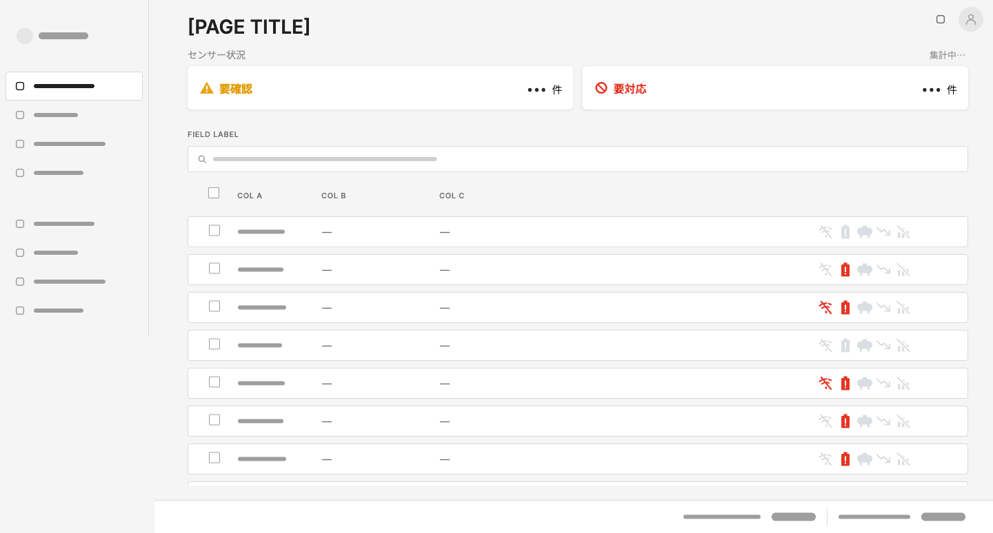
In the early-July design, sensor status came in three states: 正常 (healthy), 要確認 (needs checking) and エラー (error). At the weekly meeting on 2 July, I asked whether "healthy" was really needed. Needs checking and error are both flags raised when something is wrong. A flag, by nature, stays down when nothing is wrong. If almost all of tens of thousands of sensors are healthy, a "healthy" badge fills most of the list while saying nothing.
On 22 July we also agreed to remove the green dot on the detail screen that showed nothing was wrong, so that the rule "nothing shown means healthy" held from the list through to the detail view. In the shipped list too, every icon on a row with no problem is pale grey, and only the ones with a problem are coloured.
This isn't a new idea. Aircraft cockpits follow a design philosophy called the "dark cockpit": indicator lights stay off when everything is normal and come on only when there's a problem, drawing the pilot's attention straight to it (Gandini & Ruiz, 2026). ISA-18.2, the alarm management standard for process plants, likewise defines an alarm as a notice of an abnormal condition that needs a response (Tennant, Control Engineering). Keep announcing things that need no response, and the notices that really matter get buried.
For the same reason, I narrowed how colour was used. Green, yellow and red appear only when they mean something, backgrounds are no longer tinted, and small text gets no colour.
Split problems into two tiers
Among the problems, there were two different kinds.
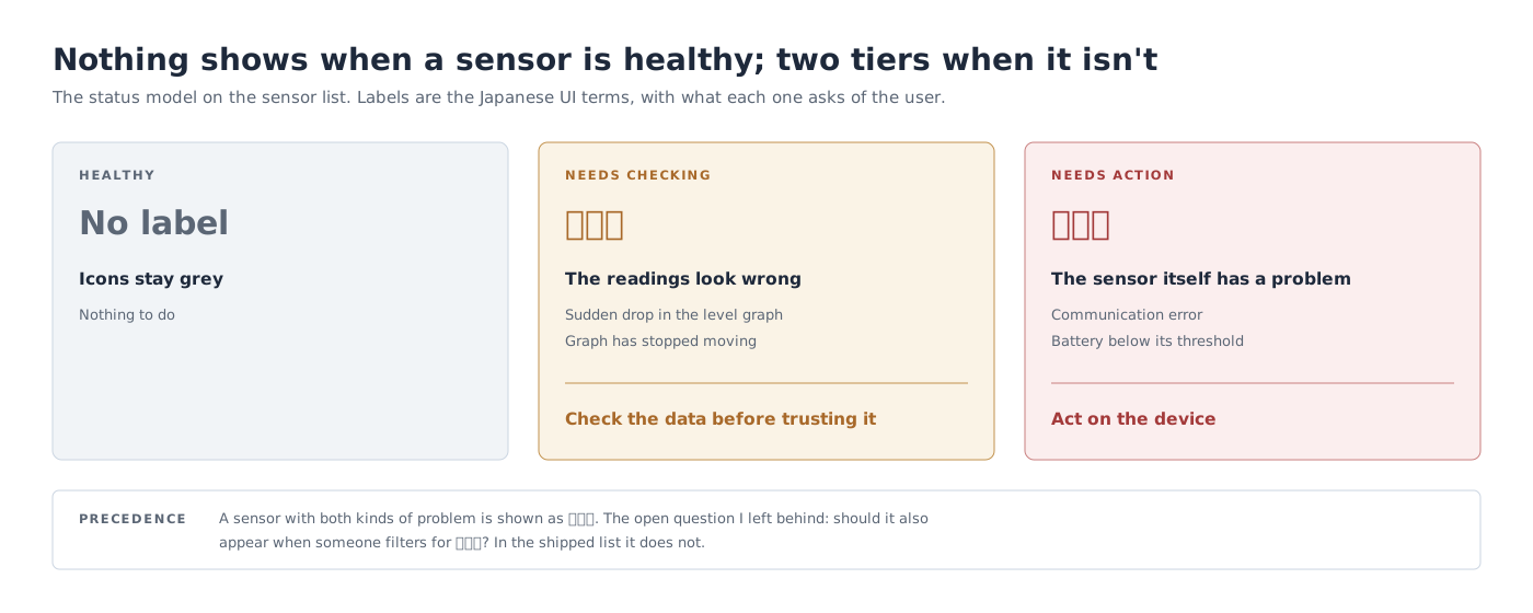
One is when the data looks wrong but it isn't yet clear whether there's really a problem: the level graph has dropped suddenly, or the graph has stopped moving. The other is when the sensor itself has a problem: communication has dropped, or the battery is about to run out. The first only needs someone to check the data; the second needs action on the device. Because what the person who sees it does next is different, I made them look different too.
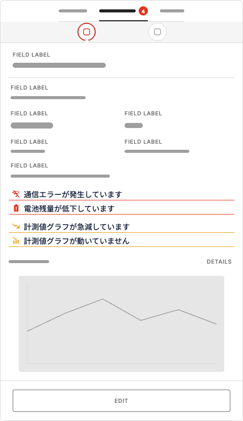
For the detail view, I designed a way to show all the problems in one place. The side panel's tab shows a count, and inside the panel the two tiers are listed, told apart by the colour of their dividing lines. The condition was that nothing else should move as problems come and go.
Arguing over one word: error or needs action
What to call the upper tier was debated to the end. At the weekly meeting on 26 August, the PdM and the team leader favoured 要対応 (needs action) over エラー (error). "Error" doesn't tell users what to do next, and they wanted the word tied to the user's next action. On the other hand, there was also a view that the system should keep the distinction between "confirmed problems" and "problems that need checking".
Where it settled was keeping the structure and changing only the word on the surface. The two-tier distinction stayed, and the upper tier was named 要対応 (needs action). I also designed short descriptions of what each tier means, to sit on the count cards. The shipped screen doesn't include them, though.
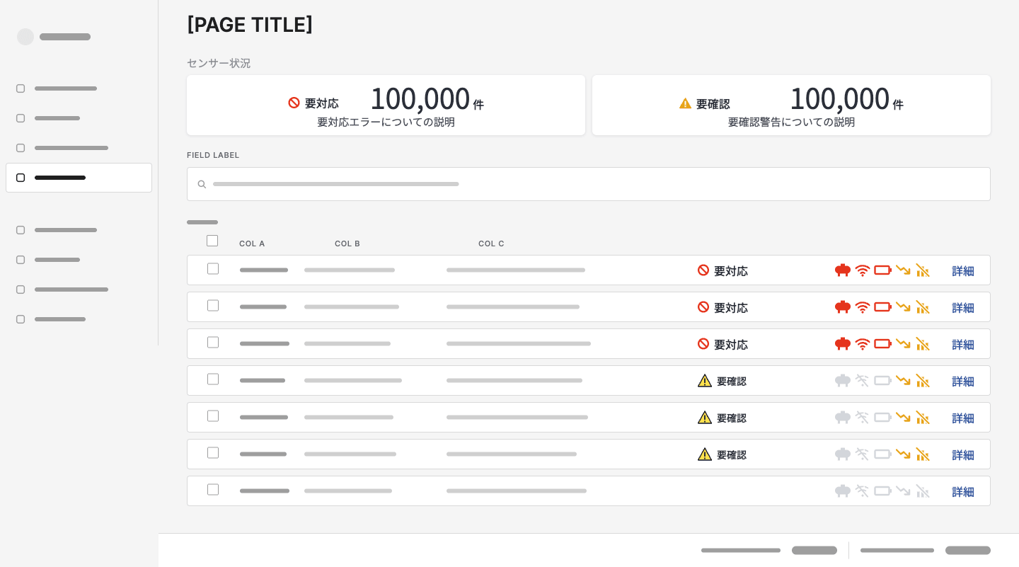
Looking back, this debate looked like one about words, but half of it was about structure. What I was trying to protect in the design wasn't the word but the two-tier distinction. As long as the distinction stayed, calling the label "needs action" lost nothing. Had we merged the tiers into one for the sake of the wording, things that only need checking and things that need action now would have looked the same.
What shipped, and what was left
The sensor list shipped in September. But what went out was a slightly earlier iteration of my design, without things like the tab badge I'd made in August or the footer showing the number of sensors owned and installed. When I left, implementing the detail view was still some way off.
I also left one problem unsolved. A sensor that qualifies for both needs action and needs checking is shown as needs action. As a display, that's correct, but filter the list for needs checking and that sensor doesn't appear. A colleague noticed this at the weekly meeting on 9 September, and it was taken away as a spec issue.
The cause was that I'd decided how the statuses look and what they're called, but not how a sensor that qualifies for both should be counted and filtered. A status badge is a display spec, but it's also a spec for counts and search. Next time I decide a vocabulary like this, I'll write the priority order, and how it affects counts and filters, into one spec together with the status model.
References
- Gandini, A. & Ruiz, J. (2026). The Dark Cockpit: What Aviation Can Teach Lean Leaders. Lean Enterprise Institute.
- Tennant, M. Implementing Alarm Management per the ANSI/ISA-18.2 Standard. Control Engineering (republished by Yokogawa).