- Content-centric vs Task-oriented Interfaces
- What the User Tests Revealed
- The Design Solution
- A Small Change That Matters
- Final Thoughts
During a recent user testing session for LingoBun, participants reported what initially sounded like a minor usability issue:
The input fields used for word definitions and example sentences were too narrow. When the text exceeded the visible width, only part of the content was visible. To read the rest, users had to scroll horizontally inside the input field.
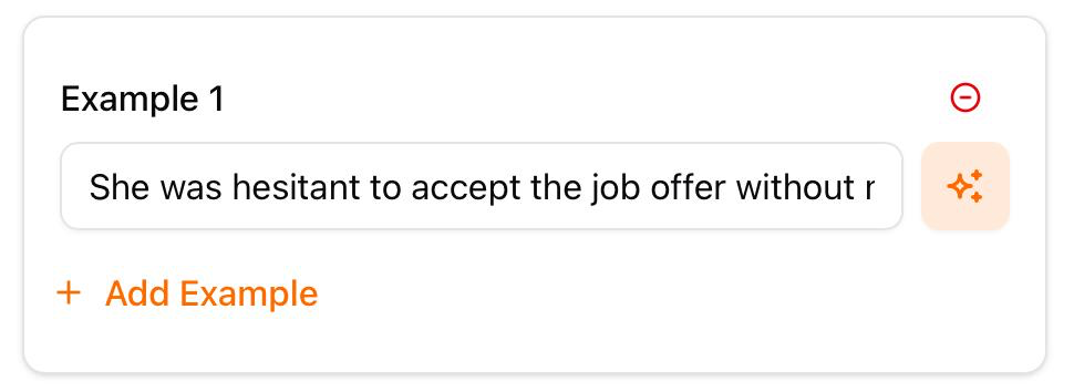
At first glance, this might not seem like a serious problem. After all, many forms allow overflowed text in input fields. Users can simply scroll to see the rest. But this situation turned out to be different.
Content-centric vs Task-oriented Interfaces
In many interfaces, forms are task-oriented. Users type information and move on. For example, when entering an email address, users rarely need to repeatedly review the entire content especially when it is auto-filled from a password manager. In these cases, hidden overflow text may not significantly harm usability.
LingoBun, however, is content-centric. The definitions and example sentences of a word are not just data being submitted; they are learning material. Users often pause to reread them, verify phrasing, or reflect on meaning. In other words, the text inside the input field is not merely input, it is part of the learning experience.
Design literature frequently emphasizes that interfaces should prioritize the visibility and accessibility of important information. When content is central to the user's task, hiding it behind interaction costs, like scrolling, can introduce unnecessary friction (Norman, 2013; Nielsen, 1994).
What the User Tests Revealed
During testing, participants frequently tried to check the auto-filled definitions and example sentences of the word they were adding. But because the text overflowed horizontally, they had to scroll inside the input field to see the rest. This created several issues:
- It interrupted the reading flow.
- It made the term creation flow slow.
- It introduced subtle frustration during what should be a reflective learning moment.
What appeared to be a minor layout detail turned out to directly affect the learning experience itself.
The Design Solution
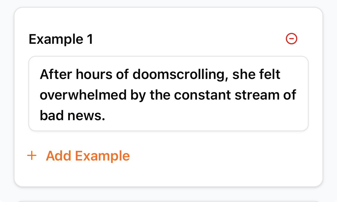
The solution was simple: replace the fixed-height input fields with adaptive inputs whose height automatically expands as the content grows. Instead of forcing users to scroll horizontally, the field now grows vertically to accommodate longer definitions and example sentences.
This approach aligns with common usability guidance that recommends reducing interaction cost when reviewing or editing user-generated content. Auto-expanding text areas are widely used in writing interfaces for exactly this reason.
A Small Change That Matters
From a purely visual perspective, the expanded input fields are not always perfectly uniform. Longer entries naturally create taller fields.
But this is a deliberate trade-off. Design decisions should prioritize clarity and usability over visual symmetry, especially in tools designed for learning and reflection.
Like many tweaks in LingoBun, the modification was small, but its impact on the user experience was significant.
Final Thoughts
One of the recurring lessons from building LingoBun is that seemingly minor interface details often become important once real users interact with the product. What looks acceptable in isolation can behave very differently when placed inside an actual learning workflow.
User testing surfaced the issue. A small design adjustment resolved it. And the result is an interface that better supports the way people actually learn.
Sometimes good design isn't about adding new features; it's about removing the small frictions that quietly get in the way.