In The Design of Everyday Things, Don Norman emphasizes that design should act as a clear, intuitive conversation between an object and its user. Yet, decades after the book’s original publication, examples of poor design still surround us in everyday life.
An Everyday Example of Problematic Design
Last week, my friend and I visited a park in Brisbane, where we encountered a public wash basin that left us puzzled—how do we get water out of it?
There was no visible control we could push, pull, or touch. What appeared to be the water spout didn’t resemble any tap we were familiar with, adding to our confusion.
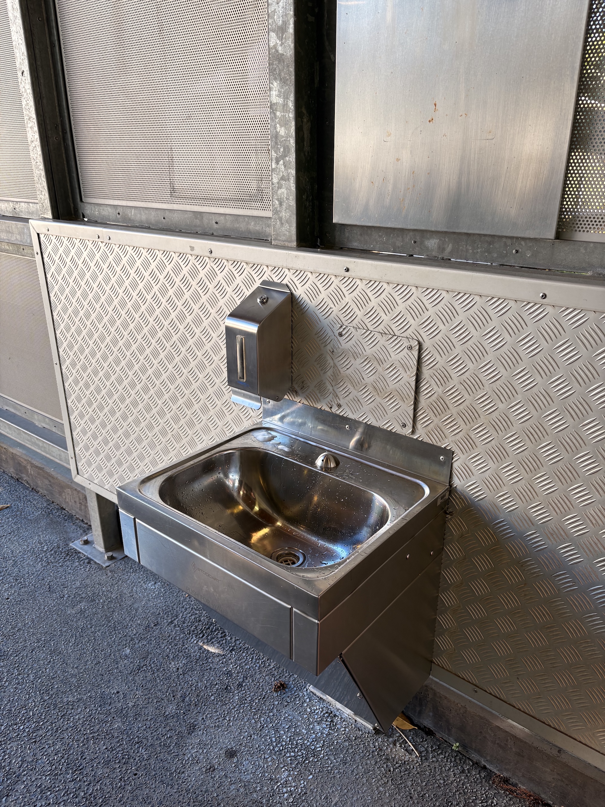
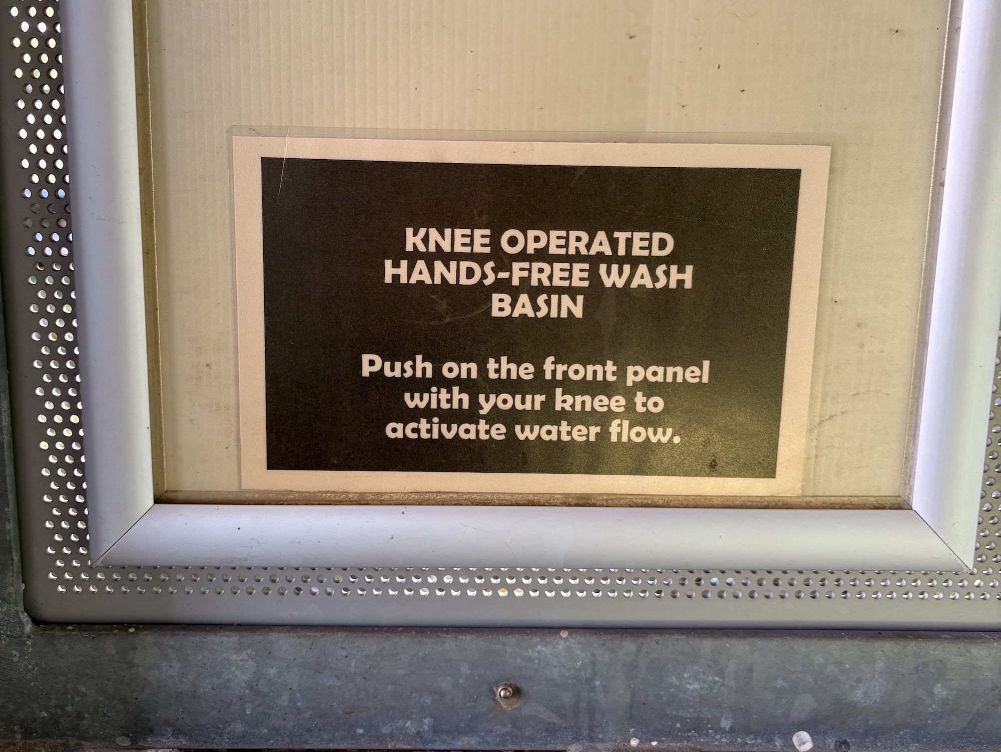
After more than five minutes of guessing and fumbling, we finally noticed a small instruction label located several meters away. It revealed that the basin was actually a knee-operated, hands-free wash basin.
While the designers may have had valid reasons for certain decisions—such as hygiene or vandal-resistance—those intentions weren’t communicated to the users. In the case of such a ubiquitous object, the design should promote its usability, not hinder it.
What Went Wrong?
- Lack of user consideration. The usability of the basin depends on a range of human factors—such as age, height, body type, and physical ability. The design failed to accommodate a diverse user base. For instance, a 5-year-old child would struggle to reach the knee panel, rendering the basin unusable for them.
- Confusing interface. Norman identifies discoverability (what actions are possible) and understanding (what the object does) as the two core attributes of good design. This basin failed on both counts—its interface offered no clues about how it worked or what users were supposed to do.
- Poorly placed information. Norman also introduces the idea of knowledge in the world—that useful cues and information should be embedded in the product’s environment. In this case, the instructions were not only non-obvious but also placed too far from the point of interaction to be helpful.
Improving the Design
Suggesting improvements without knowing all the design constraints can be risky—but it’s still a worthwhile exercise. Here are some practical changes that could improve usability:
-
Use a more familiar tap. Replace the unusual spout with a standard tap (like the one in the picture) or motion-activated sensor that aligns with users’ expectations.

A familiar tap (Photo by Luis TostaonUnsplash)
-
Introduce foot pedals instead of knee activation. Foot-operated mechanisms tend to be more inclusive, especially for children or people with limited mobility.
-
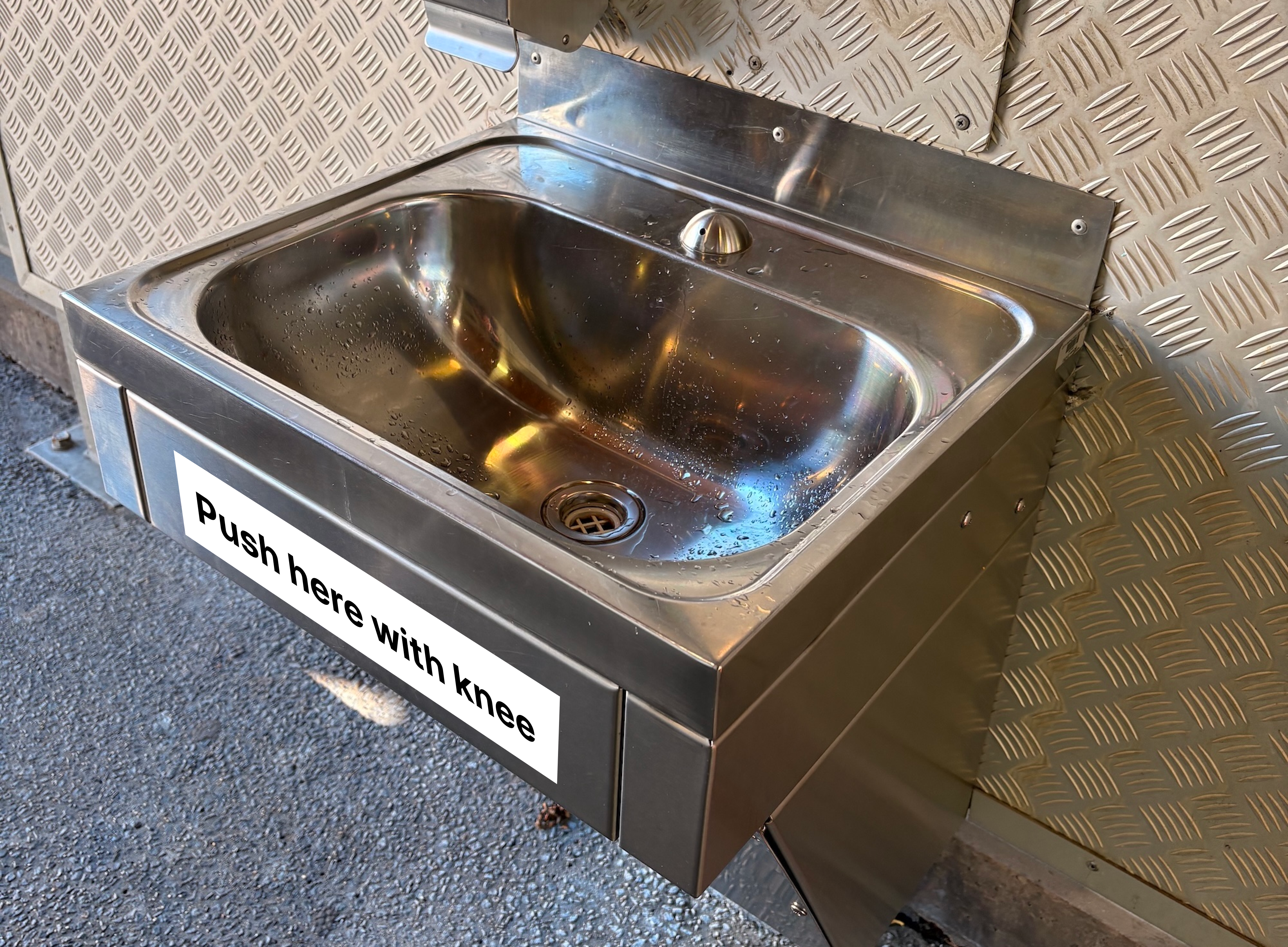
Place clear signage directly on or near the activation point. Even if the design remains hands-free, a simple sign—e.g. “Push Here with Knee”—placed on or beside the activation panel would drastically reduce confusion.
Conclusion
Ploblematic design is everywhere. And often, it does not take a designer to spot the flaws—or even propose improvements. All it takes is empathy for the people trying to use the product.
As a designer working in the digital space, I am continually amazed at how much I can learn from physical-world design. Many issues we see in public infrastructure—unclear interaction models, missing feedback, inaccessible features—are mirrored in websites and apps. That’s why it’s so valuable to observe the everyday things around us. Often, the tiniest frustrations reveal the most impactful design lessons that we can bring back into our own work.