
- The Guidelines for Human-AI Interaction
- Claude
- ChatGPT and Google AI Mode
- Where This Leaves AI Interaction Design
- Resources
- References
In 2019, a team of Microsoft researchers led by Saleema Amershi and Eric Horvitz set out to answer a question most product teams still answer by instinct rather than evidence: what makes an AI system feel trustworthy and legible to use, as distinct from a regular piece of deterministic software? Their paper, Guidelines for Human-AI Interaction, distilled more than 20 years of scattered HCI research and industry practice into 18 concrete, testable guidelines, then stress-tested them by having 49 design practitioners apply them to 20 popular AI-infused products. Six years and several product generations later, it's still one of the only frameworks built specifically for AI interaction rather than borrowed wholesale from traditional usability heuristics, and it holds up well when pointed at products that didn't exist when it was written.
That durability matters right now because everything around the framework is moving. Design writer Patrick Neeman has described the current moment in AI product design as feeling like 1999 again: extraordinary capability, but almost no shared conventions for putting it in front of people. Half the field's own vocabulary is still being invented as it's used. That's exactly the situation in which a fixed, evidence-based yardstick earns its keep — it gives us something stable to hold a moving target against, instead of reinventing evaluation criteria for every new release. So I picked three products people use every day — Claude, ChatGPT, and Google's AI Mode — and looked at their first-run experience through the lens of a handful of these guidelines.
The Guidelines for Human-AI Interaction
Amershi et al. organise the 18 guidelines around four phases of a user's relationship with an AI system: what it should communicate initially, how it should behave during interaction, what it owes the user when it's wrong, and how it should evolve over time. That structure is itself a useful design tool, because it maps directly onto the questions a new user actually asks, in order: what is this, how much can I trust it, what do I do when it fails me, and does it get better the more I use it?
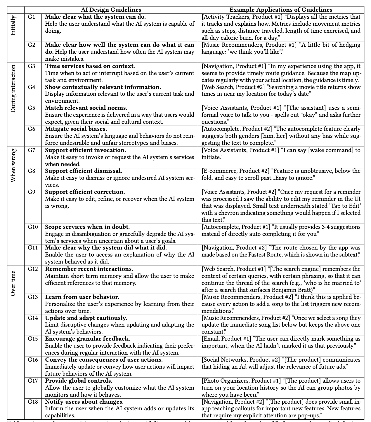
This piece focuses on three guidelines from the "initially" and "over time" ends of that spectrum, because that's where I found the sharpest contrast between the products: G1 (make clear what the system can do), G2 (make clear how well the system can do it), and G13 (learn from user behaviour).
Claude
G1: Make Clear What the System Can Do
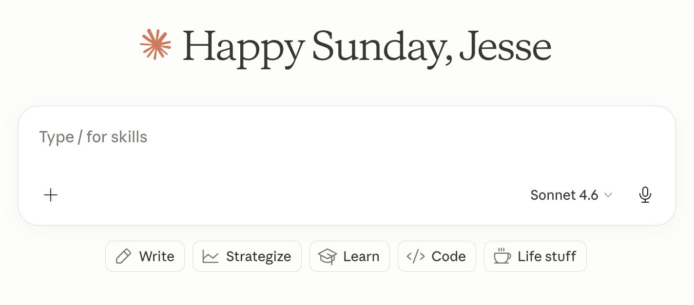
Claude's home screen passes this guideline cleanly. Rather than presenting a single unlabeled text field and trusting the user to guess at scope, it surfaces five category chips — Write, Strategize, Learn, Code, Life stuff — that function as a menu of capability, not just a decoration. For a new user, this is the difference between "type something and hope" and "here are five concrete doors you can walk through." It's a small piece of interface, but it does real work: it converts an abstract, unbounded tool into something with visible edges.
G2: Make Clear How Well the System Can Do What It Can Do
Where Claude's home screen starts to strain is the guideline right after it. Category labels tell you what kind of task the system handles; they say nothing about how well it handles any particular instance of that task, and that gap is where trust calibration actually happens. "Write" covers everything from a two-line social caption to a nuanced client email, and the interface gives no signal about which end of that range Claude is reliably strong at versus merely capable of attempting.
This isn't a Claude-specific shortcoming so much as a hard property of the underlying technology. In Co-Intelligence, Ethan Mollick describes AI capability as a "jagged frontier": from a distance, AI systems look like they're uniformly good or uniformly weak at a domain, but up close the frontier is jagged — a system can be excellent at a task that looks hard and surprisingly poor at a neighbouring task that looks easy, with no intuitive way for a user to tell which side of that line they're on without just trying it. A single high-level category label can't communicate a jagged frontier; it flattens it into something that reads as uniform competence. What would actually satisfy G2 here is finer-grained signal at the point of use — example outputs, a stated confidence level, or a visible track record for a given task type — rather than a static label decided once, up front, for an entire category.
G13: Learn From User Behaviour
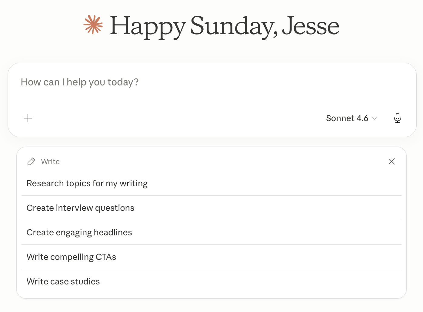
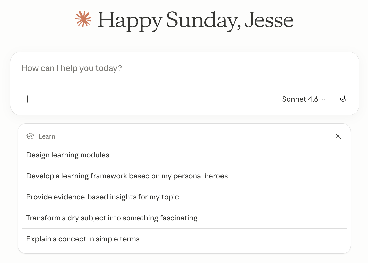
This is where the experience falls apart, and it's worth being precise about why. The home screen greets me by name and by day — "Happy Sunday, Jesse" — which reads, at a glance, as evidence of context-awareness. But click into any category and the quick actions underneath are generic prompt templates, identical regardless of who's logged in or what they've asked Claude for in the past. "Write compelling CTAs" and "Develop a learning framework based on my personal heroes" appear whether I'm a new user or someone who has spent months in this product. Nothing here has been shaped by my actual behaviour; the personalisation is confined entirely to the name in the greeting.
That gap between a personalised surface and impersonal substance is worth naming on its own terms, because it's a pattern that shows up across the current generation of AI products. A recent UX Collective piece on Blade Runner's design predictions makes a related point about synthetic memory: when a system visibly remembers something about you, users tend to relax their scrutiny of what it says next, treating the appearance of memory as a proxy for the substance of understanding. A name and a day-of-week greeting are exactly that kind of visible-but-shallow memory — real enough to register as personalisation, thin enough to do nothing underneath. G13 asks for the underneath part: the system should be personalising the experience, via the actions on offer, by learning from what a user actually does, not just decorating a static menu with their name.
There's a second-order argument for taking this guideline seriously, beyond first impressions. A separate UX Collective piece on AI and cognitive delegation cites research finding that developers who fully delegated coding tasks to AI scored below 40% on comprehension tests of their own work, versus 65%+ for developers who used AI as a thinking partner rather than a replacement. The mechanism generalises: a menu of generic, one-click quick actions nudges users towards delegation over partnership, because the path of least resistance is to click a pre-written prompt rather than articulate what they actually need. A genuinely learned set of suggestions — grounded in a user's real history rather than a static template library — would do the opposite: it would reflect the user's own goals back at them, which keeps them in the loop rather than routing around them.
ChatGPT and Google AI Mode
G1 and G2: The Blank Box Problem
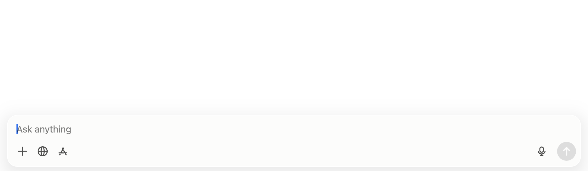
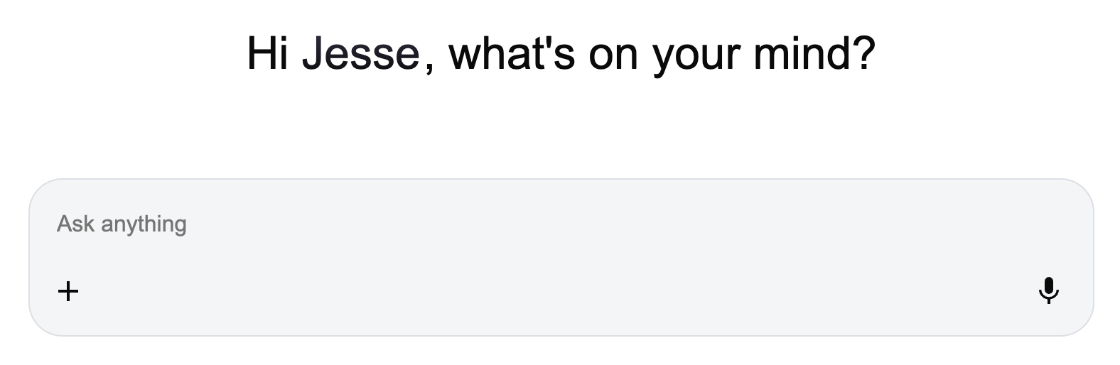
Where Claude's home screen gives a new user five concrete doors, ChatGPT and Google AI Mode give them one open field and the instruction to "ask anything." That instruction fails both G1 and G2 at once: it communicates neither a bounded set of capabilities nor any sense of where the system is strong, and it does so by design, since an unconstrained input is precisely a refusal to communicate scope. For an experienced user who already knows what they want, an empty box is efficient. For a new user, it's the interface equivalent of being handed a blank sheet of paper and told to write something — the freedom is real, but it's also exactly what produces the freeze.
This is a well-documented failure mode outside AI products too: more unconstrained choice tends to increase cognitive load and decision paralysis rather than satisfaction, which is the core finding behind Barry Schwartz's paradox-of-choice research and, in interaction design terms, Hick's Law — the time it takes someone to make a decision grows with the number and complexity of the choices in front of them. A blank box with infinite possible inputs is choice complexity taken to its limit. Personalising the greeting, as in "Hi Jesse, what's on your mind?", doesn't fix this; it makes the box feel warmer without making it any less blank. What the guideline actually calls for is closer to what Claude's chips attempt, or what a recent survey of collapsing UI patterns describes as the direction the whole category is heading: replacing manual setup and configuration with the system inferring intent and offering a starting point, rather than outsourcing that inference entirely to the user's first keystroke.
The Security Cost of "Ask Anything"
There's a sharper cost to the blank box than lost engagement, and it's a security one. An open-ended prompt with no framing invites open-ended disclosure. Without any signal about what the system does with what's typed, what gets retained, or what a sensible scope of a question even looks like, users routinely paste in more than they'd hand over if the interface gave them any cue to pause — health details, financial specifics, proprietary work content, credentials copied in by habit while pasting a larger block of text. This is the same trust-calibration failure as G2 wearing a different hat: a system that doesn't communicate its boundaries doesn't just produce worse answers when misjudged, it produces worse disclosure decisions, because the user has no basis for knowing where the sensible boundary is. A framed set of starting points does more than reduce cognitive load; it implicitly signals the shape of an appropriate ask, which a blank field cannot.
Where This Leaves AI Interaction Design
Line these products up against each other and a pattern falls out: today's leading AI products are strongest at the guidelines that are cheap to satisfy with a static layer of UI, and weakest at the ones that require actual plumbing back to user data and behaviour. Category chips and a friendly greeting are a design decision made once, at ship time. Genuinely learning from behaviour, or surfacing calibrated confidence per task, requires infrastructure that keeps working after launch — which is a much harder, much less visible thing to get credit for shipping.
That's a real problem for products whose central pitch is that the model itself improves relentlessly, since it means the interaction layer improving on the same timeline can't be assumed. Notably, the same "10 UI patterns" piece cited above argues that AI is already reshaping onboarding and help documentation across the industry into support that's contextual to what a user is actually doing, replacing static wizards and generic tooltips. It's a real irony that the companies building the AI systems capable of that kind of inference haven't yet turned it on their own front door. The tools for solving G13 already exist inside these products; they just haven't been pointed at the onboarding experience itself.
Resources
- Guidelines for Human-AI Interaction (PDF) — the full paper, including all 18 guidelines and their validation methodology.
- Google PAIR Guidebook — Google's own People + AI Research guidance, a useful complement to Amershi et al.'s more academic framing.
- A running list of human-AI interaction papers — Georgia Tech's TAIL lab reading list, for going deeper into the research this guideline set draws on.
- Ethan Mollick, Co-Intelligence: Living and Working with AI (2024) — source of the "jagged frontier" framing used above, and a useful mental model for G2 generally.
- 10 UI patterns that won't survive the AI shift — on setup wizards, dashboards, and onboarding being replaced by inferred intent.
- AI and Cognitive Delegation: The Hidden Cost of AI That Works Too Well — the delegation-versus-partnership research cited above.
- What Blade Runner Got Right About AI — on synthetic memory and the gap between appearing to remember and actually understanding.
References
- Amershi, S., Weld, D., Vorvoreanu, M., Fourney, A., Nushi, B., Collisson, P., ... & Horvitz, E. (2019, May). Guidelines for human-AI interaction. In Proceedings of the 2019 CHI Conference on Human Factors in Computing Systems (pp. 1–13).
- Mollick, E. (2024). Co-Intelligence: Living and Working with AI. Portfolio/Penguin.
- Schwartz, B. (2004). The Paradox of Choice: Why More Is Less. Ecco.