
クラウドコンピューティングの課題として開発しているWebアプリ「Interlixir」には、ロゴが必要でした。1つの仕様、2つのツール:実際のプロジェクトで比べるClaude DesignとGoogle StitchでUIをデザインしたのと同じアプリです(そのときはまだ Interview Synthesis という名前でした)。アプリ内で名前の横に置けて、アイコンとして単独でも使えるマークが欲しいと考えていました。
そこで試したのがRecraftです。プロンプトから画像やベクターグラフィックを生成するAIデザインツールです。最初の試みは狙いを外しました。2回目はほぼ一発で決まりました。変わったのはツールではなくプロンプトで、それは数点の見本ロゴをもとにClaudeに書いてもらったものでした。
Recraftでの最初の試み
プロンプト
Make a logo for Interlixir, a cloud service for UX and product researchers. Researchers upload interview and usability-test recordings. An asynchronous pipeline transcribes them, redacts personal information, and synthesises a structured Markdown research document using a chosen schema (template). Users organise documents in projects, watch stage-by-stage progress, retry failed jobs, export Markdown, browse an activity history with token cost, and chat with an AI agent that can read their own projects and documents.
Ensure it can be used both standalone and paired with the app name.
Ensure visual balance and rythm, and make sure it looks modern.
Use black and white for now.
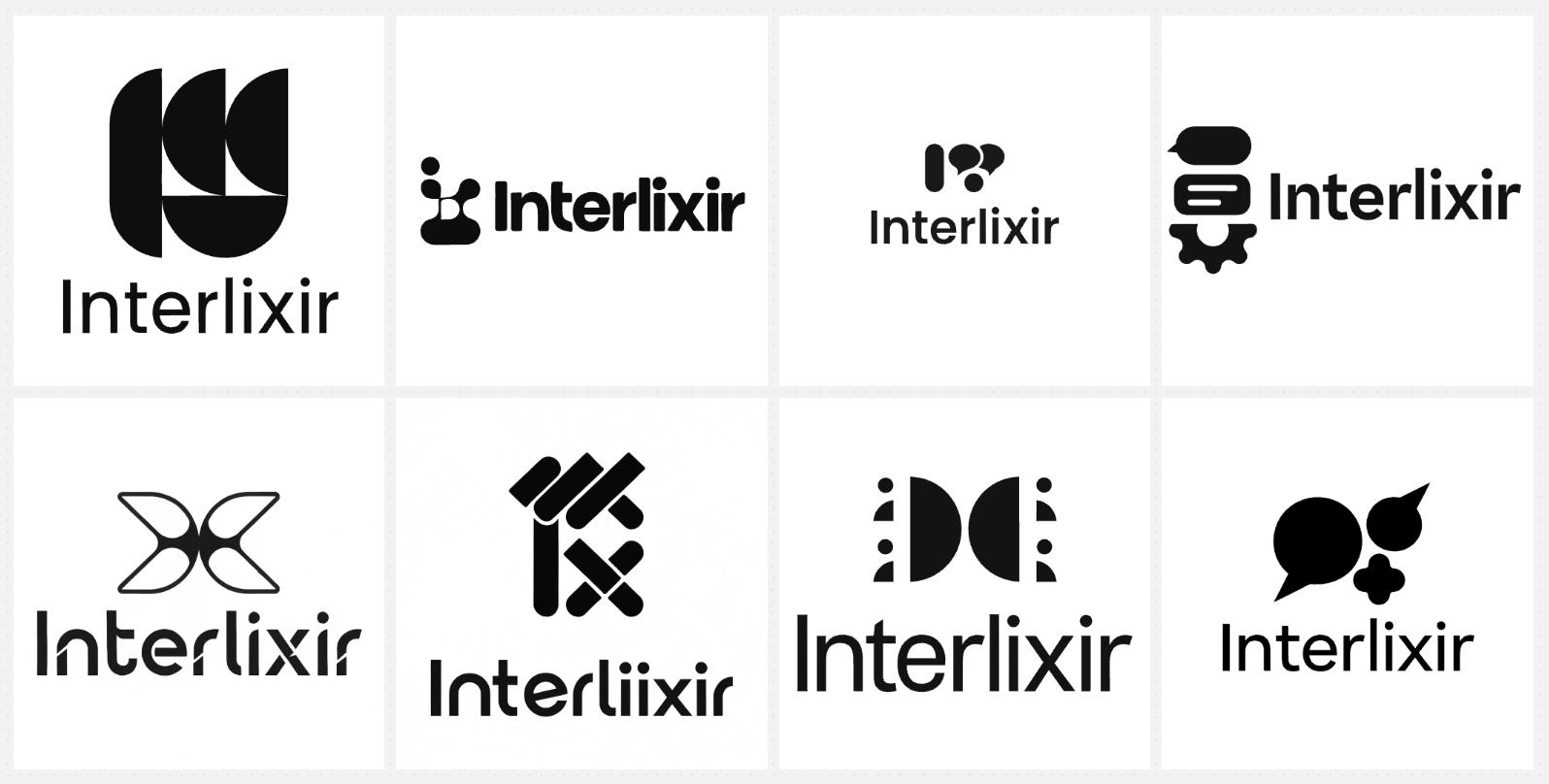
生成されたデザイン
ClaudeでRecraftを補う
最初のデザインには、がっかりしました。意図をとらえておらず、欲しいものではありませんでした。ただ、問題は私のほうにもありました。本当に欲しいものを、はっきり言葉で定義するのが難しかったのです。わかっていたのは、欲しいデザインがどんな見た目かということだけでした。
そこで、フューショット・プロンプティング(few-shot prompting)を使いました。欲しいものを言葉で説明するだけでなく、いくつかの例をモデルに見せる方法です。欲しいものに近いロゴの見本を、元のプロンプトとRecraftの最初の結果と一緒にClaudeに渡しました。Claudeに手伝ってもらったのは、見本から共通するパターンを抜き出し、Recraftが扱える明確で正確な文章にすることでした。
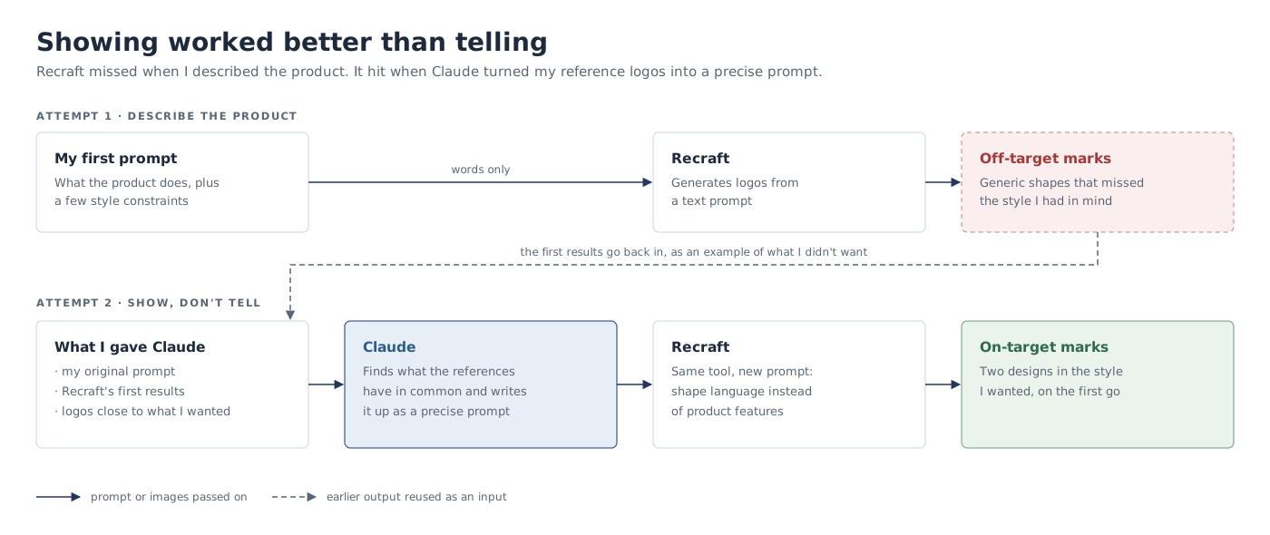
Claudeに渡したフューショット・プロンプト
I'm using Recraft.ai to make the logo for Interlixir.
This is the prompt I used:
"Make a logo for Interlixir, a cloud service for UX and product researchers. Researchers upload interview and usability-test recordings. An asynchronous pipeline transcribes them, redacts personal information, and synthesises a structured Markdown research document using a chosen schema (template). Users organise documents in projects, watch stage-by-stage progress, retry failed jobs, export Markdown, browse an activity history with token cost, and chat with an AI agent that can read their own projects and documents.Ensure it can be used both standalone and paired with the app name.
Ensure visual balance and rythm, and make sure it looks modern.
Use black and white for now."The first attached image show the generated designs, which are not as good as I desired.
The other attached images are examples of my desired logo types. Ignore the colors for now and focus on the shapes and styles.
Based on these, give me a prompt to copy for Recraft to create a logo that better aligns with what I want.
添付した画像は、Recraftの最初の結果と、Pinterestで集めた参考ロゴです。(参考ロゴはそれぞれのデザイナーやブランドの作品で、Claudeに何を渡したかを示すためだけに掲載しています。)
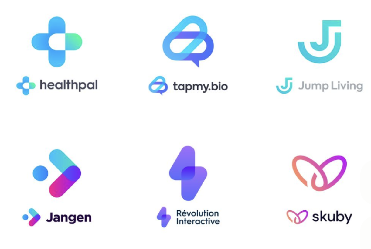

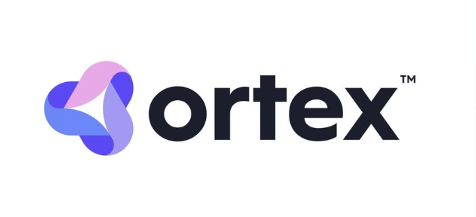

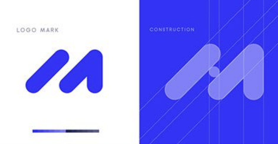
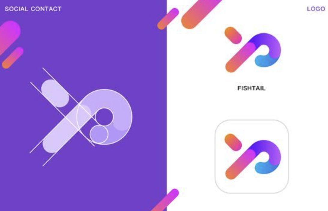
Claudeが抜き出したもの
プロンプトを書く前に、Claudeは参考ロゴに共通する点をまとめてくれました。
Your references have something in common, which is a monogram built from very few geometric strokes. The prompt below describes that shape language and leaves the features out.

What your references share

- Few parts: 2–4 pill or capsule strokes with fully rounded ends.
- Same stroke width: every stroke matches, set on a strict 45° diagonal grid.
- Overlaps: where strokes overlap, the overlap shows as a third tone.
- A letter, not a picture: each mark is abstracted from a letterform (M, P, J, W, the arrow + dot).
- A dot for rhythm: a single circle often finishes the sequence.
- Small-size friendly: the mark is bold and simple enough for an app icon.
Claudeは、見本に共通するパターンを正確にとらえていました。簡単そうに見えますが、人間が同じ精度でこれをやるのは、実はとても難しいことです。
Claudeが生成したプロンプト
Minimal geometric logo mark for "Interlixir", a research tool that distils raw interview recordings into clear, structured insight. Abstract monogram combining the letters "I" and "X", built from 3 thick capsule-shaped strokes with fully rounded ends, all the same stroke width, arranged on a strict 45-degree diagonal grid. Strokes overlap; render each overlap as a flat mid-grey so the mark has three tones: black, grey, white. A single small circle (a droplet) completes the rhythm at the end of the sequence, suggesting raw input distilled into one refined output. Even spacing between elements, strong visual balance, flat vector, no gradients, no outlines, no text. Bold enough to read as an app icon at 32px. Modern, friendly, confident, in the style of contemporary SaaS monogram logos. Black and grey on a plain white background, centered, generous padding.
新しいプロンプトはより詳細で、仕様も正確です。実は私のものより少し長い(約136語対104語)のですが、焦点が絞られています。ほぼすべての単語が、プロダクトの機能ではなくロゴそのものを説明しています。今回は長さはあまり問題になりませんでした。Recraftはトークンを数えるのではなく、画像の種類に応じて生成1回あたり決まった数のクレジットを消費する仕組みだからです。ただ、トークンで計測する他のAIツールでは、言葉を正しいことに使うプロンプトは、トークン効率のよいプロンプトでもあります。これは重要なことです。
Recraftが生成したデザイン
新しいプロンプトから、Recraftは1回目で2つのデザインを生成し、私はすぐに欲しいもの(右のデザイン)を手に入れました。
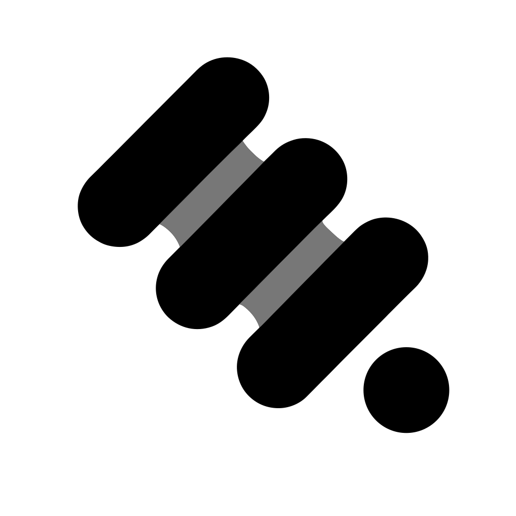

どちらのデザインもスタイルの一貫性がずっと高く、見た目の質もずっと上で、プロンプトを得るためにClaudeに見せたデザインのタイプとよく合っています。面白いことに、私が選んだほうはプロンプトに完全には従っていません。3本ではなく、2組4本のストロークでできています。
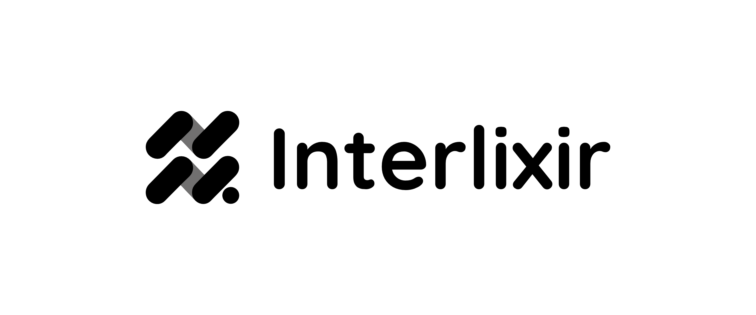
完成したデザイン。マークを名前と組み合わせたものです。
まとめ
Recraftはロゴを描くことはできましたが、私の説明から、私が思い描いていたロゴを描くことはできませんでした。Claudeはロゴをまったく描けませんが、私の見本を見て、それを正確に言葉にすることはできました。どちらのツールも、単独ではそこまでたどり着けなかったでしょう。デザインの仕事はますます、1つのツールでは十分に高い水準で仕上げられない、複数のステップと複数のエージェントによるプロセスになりつつあります。
だからこそ、それぞれのツールの強みと弱みを理解することが大切です。あるツールの強みで別のツールの弱みを補うと、効果が掛け算で効いてくるからです。今回、ClaudeはRecraftの代わりになったのではなく、必要なプロンプトを渡すことでRecraftのロゴ生成を強化しました。これは、Claude DesignとGoogle Stitchの比較でとった方法と似ています。あのときは、デザインツールに欠けていたプロジェクトのコンテキストをClaude Coworkが持っていたので、プロンプトを書く作業をClaude Coworkに任せました。今回足りなかったのはコンテキストではなく言葉でした。欲しいものを言葉にできなかったので、見本で見せ、言いたいことを言葉にする役はClaudeに任せたのです。