
Interlixir, the web app I'm building for my cloud computing assignment, needed a logo. It's the same app I designed the UI for in One Spec, Two Tools: Claude Design vs Google Stitch on a Real Project (there it was still called Interview Synthesis). I wanted a mark that could sit next to the name in the app and also work on its own as an icon.
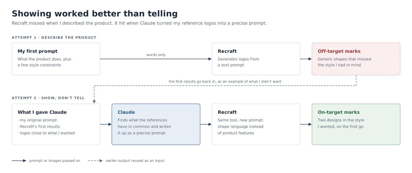
I tried Recraft, an AI design tool that generates images and vector graphics from a prompt. My first attempt missed. The second one landed almost straight away, and what changed wasn't the tool: it was the prompt, which I got Claude to write from a handful of example logos.
First try with Recraft
Prompt
Make a logo for Interlixir, a cloud service for UX and product researchers. Researchers upload interview and usability-test recordings. An asynchronous pipeline transcribes them, redacts personal information, and synthesises a structured Markdown research document using a chosen schema (template). Users organise documents in projects, watch stage-by-stage progress, retry failed jobs, export Markdown, browse an activity history with token cost, and chat with an AI agent that can read their own projects and documents.
Ensure it can be used both standalone and paired with the app name.
Ensure visual balance and rythm, and make sure it looks modern.
Use black and white for now.
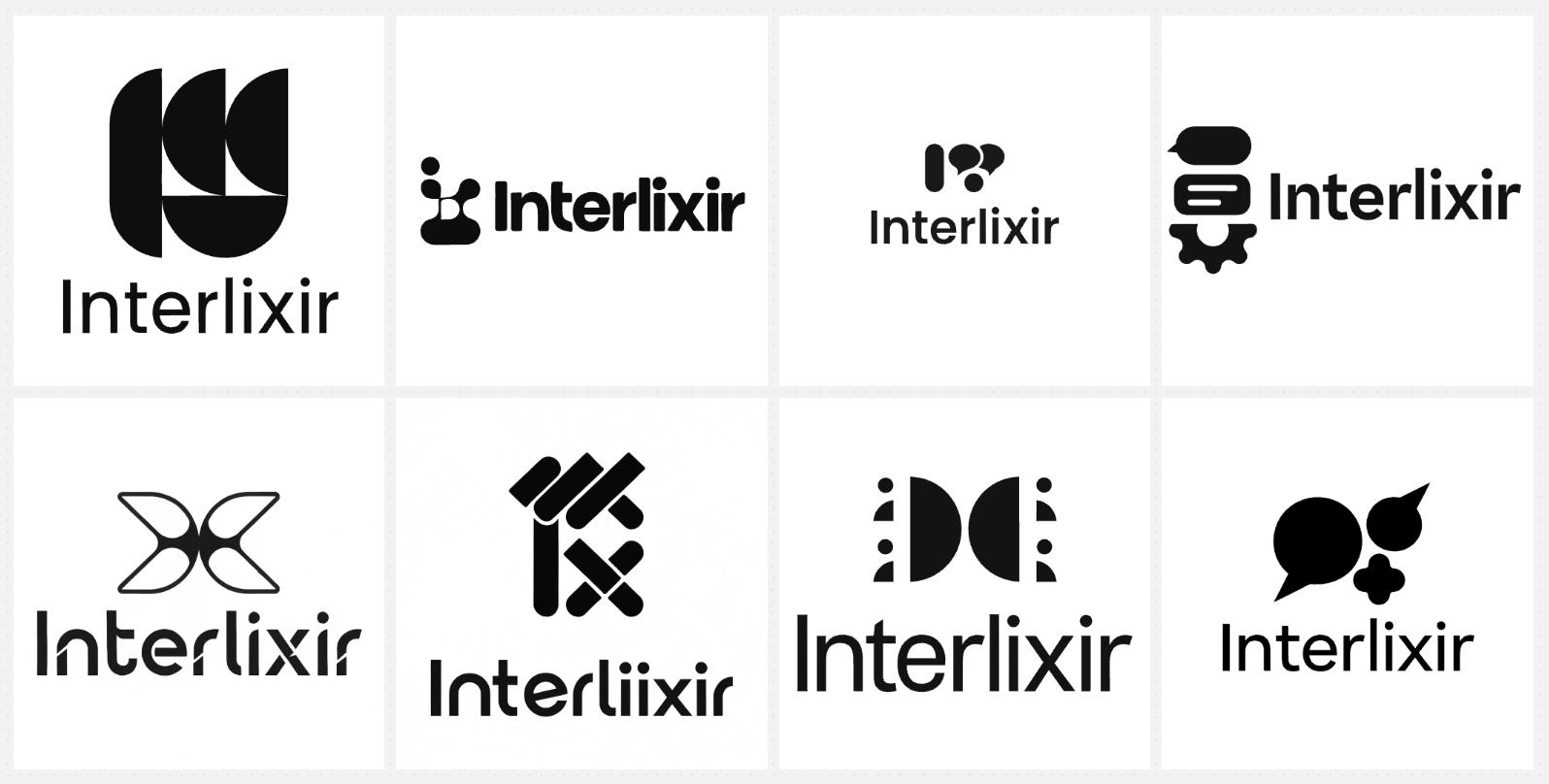
Generated designs
Augmenting Recraft with Claude
The first designs were disappointing. They failed to capture my intention and weren't what I wanted. The trouble was that I found it hard to put what I really wanted into clear words, too: I only knew what my desired designs would look like.
So I used few-shot prompting, which means giving a model a few examples of what you want instead of only describing it. I gave Claude some sample logo designs that were close to what I wanted, along with my original prompt and Recraft's first results. What Claude helped me with was extracting the patterns from the examples and putting them into clear, accurate text that Recraft could work with.
The few-shot prompt for Claude
I'm using Recraft.ai to make the logo for Interlixir.
This is the prompt I used:
"Make a logo for Interlixir, a cloud service for UX and product researchers. Researchers upload interview and usability-test recordings. An asynchronous pipeline transcribes them, redacts personal information, and synthesises a structured Markdown research document using a chosen schema (template). Users organise documents in projects, watch stage-by-stage progress, retry failed jobs, export Markdown, browse an activity history with token cost, and chat with an AI agent that can read their own projects and documents.Ensure it can be used both standalone and paired with the app name.
Ensure visual balance and rythm, and make sure it looks modern.
Use black and white for now."The first attached image show the generated designs, which are not as good as I desired.
The other attached images are examples of my desired logo types. Ignore the colors for now and focus on the shapes and styles.
Based on these, give me a prompt to copy for Recraft to create a logo that better aligns with what I want.
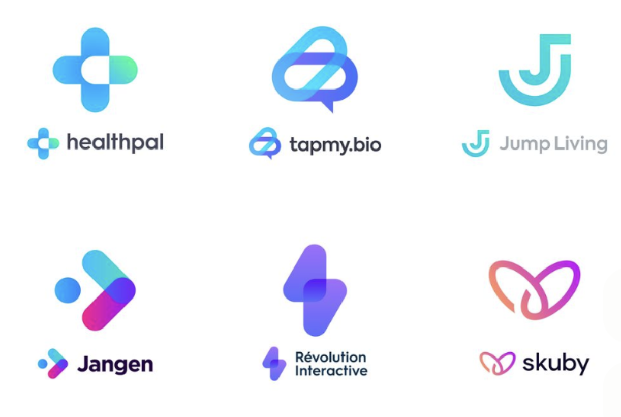
The attached images: Recraft's first results, then the reference logos I'd collected on Pinterest. (The reference logos are the work of their original designers and brands; I've included them only to show what I gave Claude.)

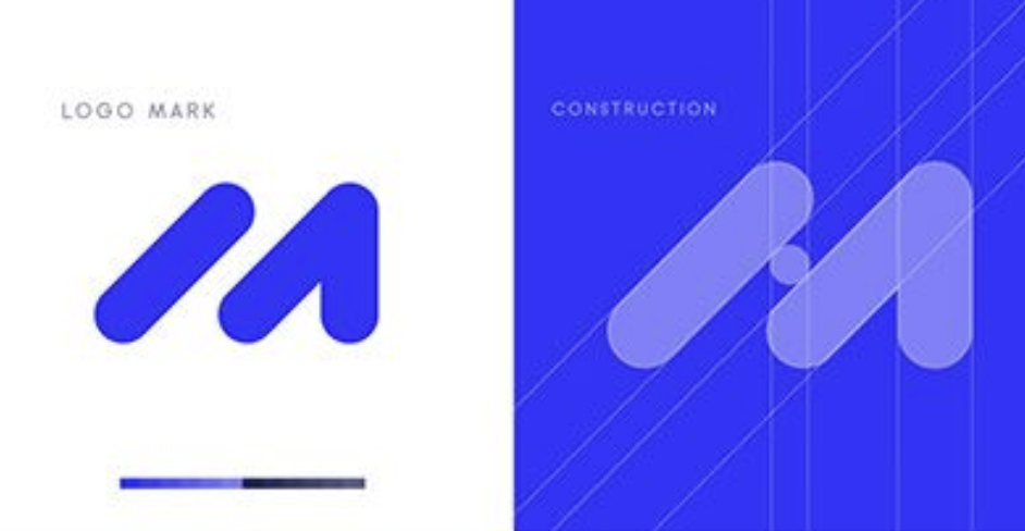
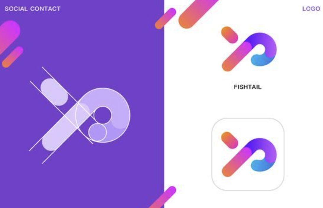
What Claude extracted
Before writing the prompt, Claude summarised what my references had in common:
Your references have something in common, which is a monogram built from very few geometric strokes. The prompt below describes that shape language and leaves the features out.

What your references share

- Few parts: 2–4 pill or capsule strokes with fully rounded ends.
- Same stroke width: every stroke matches, set on a strict 45° diagonal grid.
- Overlaps: where strokes overlap, the overlap shows as a third tone.
- A letter, not a picture: each mark is abstracted from a letterform (M, P, J, W, the arrow + dot).
- A dot for rhythm: a single circle often finishes the sequence.
- Small-size friendly: the mark is bold and simple enough for an app icon.
Claude accurately captured the shared patterns from the examples. That looks effortless, but it's actually very hard for a human to do with the same level of accuracy.
Claude-generated prompt
Minimal geometric logo mark for "Interlixir", a research tool that distils raw interview recordings into clear, structured insight. Abstract monogram combining the letters "I" and "X", built from 3 thick capsule-shaped strokes with fully rounded ends, all the same stroke width, arranged on a strict 45-degree diagonal grid. Strokes overlap; render each overlap as a flat mid-grey so the mark has three tones: black, grey, white. A single small circle (a droplet) completes the rhythm at the end of the sequence, suggesting raw input distilled into one refined output. Even spacing between elements, strong visual balance, flat vector, no gradients, no outlines, no text. Bold enough to read as an app icon at 32px. Modern, friendly, confident, in the style of contemporary SaaS monogram logos. Black and grey on a plain white background, centered, generous padding.
The new prompt is more detailed, with accurate specifications. It's actually a little longer than mine (about 136 words against 104), but it's more focused: almost every word describes the logo, not what the product does. Length didn't matter much this time, since Recraft charges a set number of credits per generation, depending on the type of image, rather than counting tokens. With other AI tools that do measure tokens, though, a prompt that spends its words on the right things is also the more token-efficient one, which matters.
Recraft-generated designs
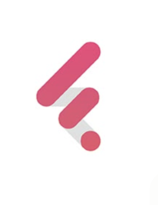
Recraft generated two designs on the first go from the new prompt, and I instantly got what I wanted (the design on the right):
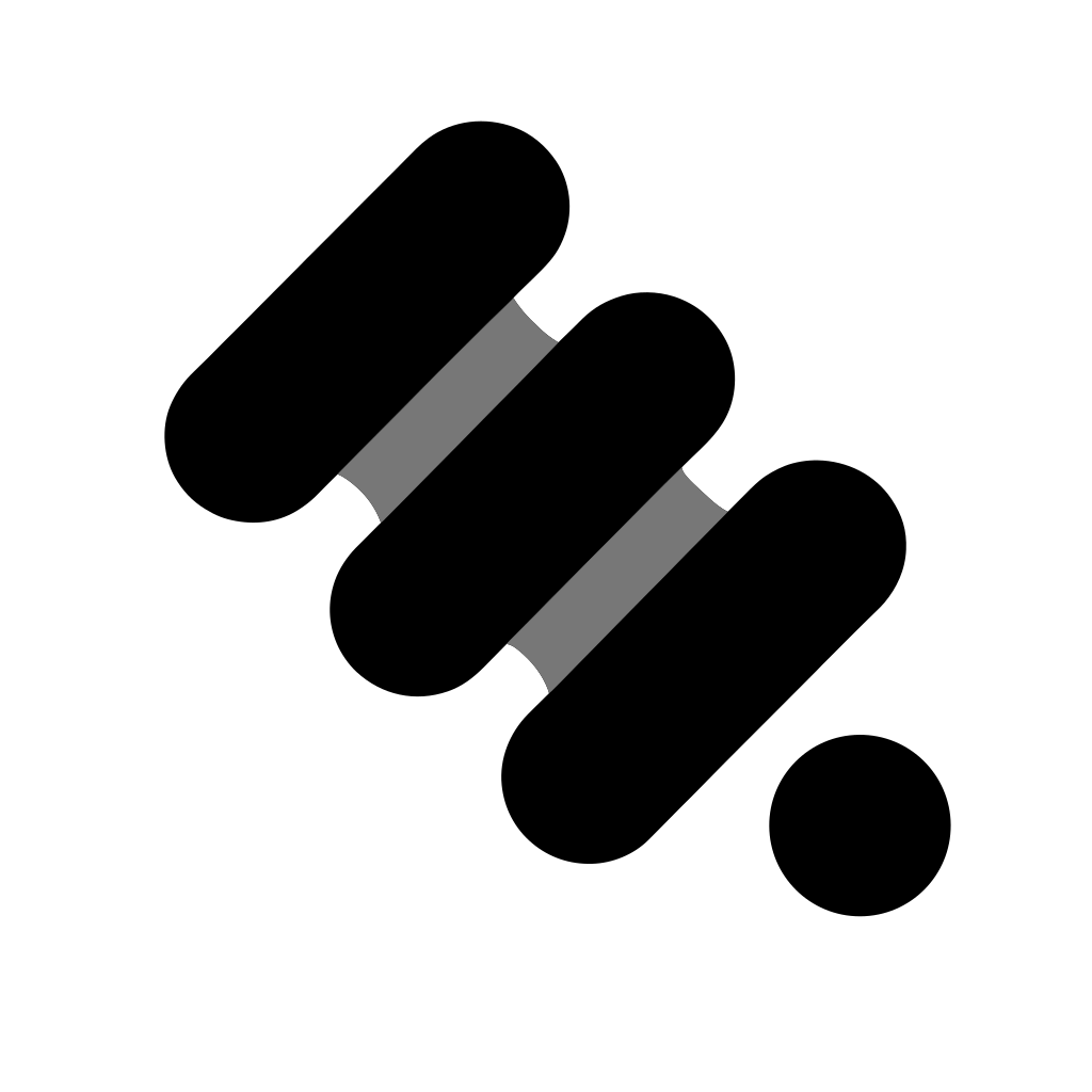
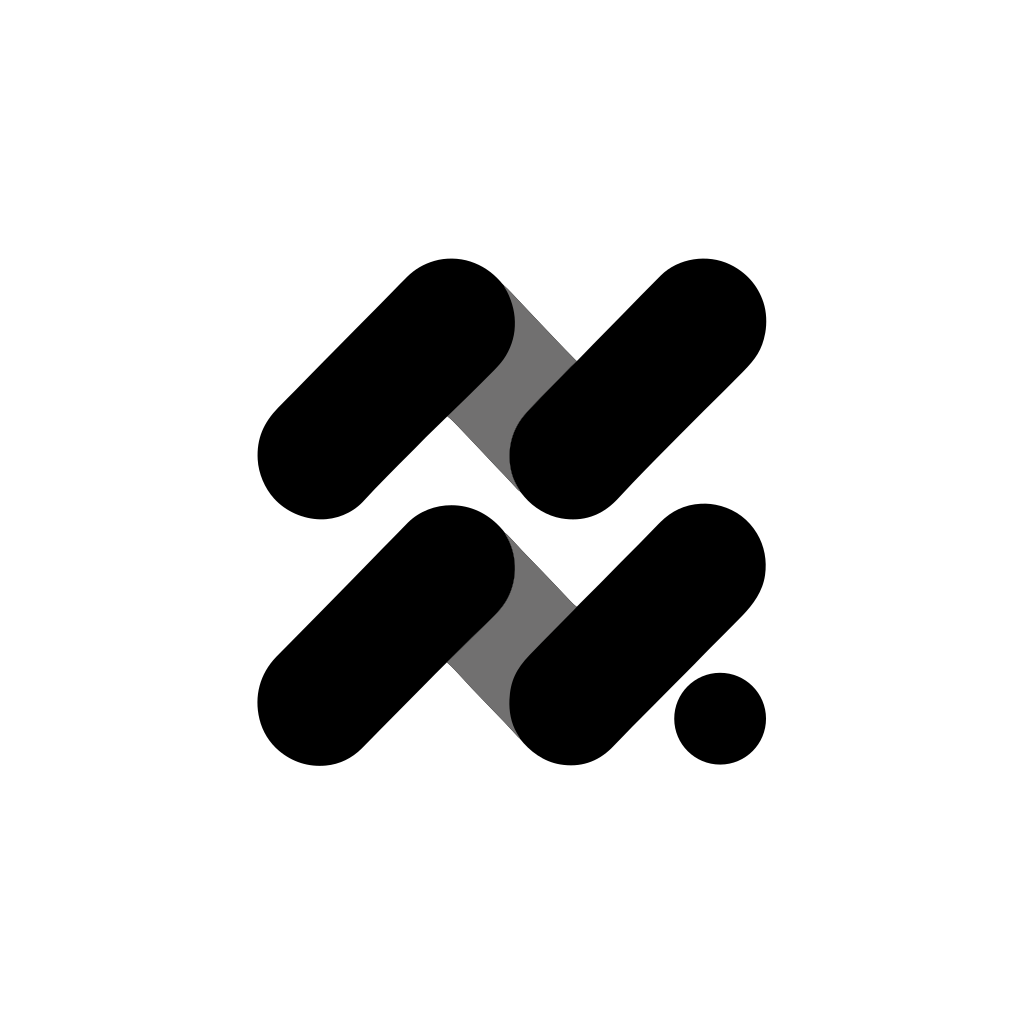
Both designs are much more consistent in style and of much higher visual quality, closely matching the type of designs I shared with Claude to get the prompt. Interestingly, the one I picked doesn't follow the prompt to the letter: it's built from four strokes in two pairs, not three.
The completed design, with the mark paired with the name:
Key takeaways
Recraft could draw logos; it just couldn't draw the one I had in mind from my description. Claude couldn't draw the logo at all, but it could look at my examples and describe them precisely. Neither tool would have got me there on its own. Design work is increasingly becoming a multi-step, multi-agent process that a single tool can't complete to a high enough standard.
That makes it important to understand the strengths and weaknesses of each tool, because using one tool's strength to compensate for another's weakness has a compound effect. In this case, Claude didn't replace Recraft; it augmented Recraft's logo generation by giving it the prompt it needed. It's a similar move to my Claude Design vs Google Stitch comparison, where I handed prompt writing to Claude Cowork because it had the project context the design tools lacked. This time the missing piece wasn't context but words: I couldn't say what I wanted, so I showed it, and let Claude do the saying.