- Context
- The experiment
- What came out
- Observations
- The choice for this task
- Key takeaways
- Appendix: full screen gallery
Last time I tried Google Stitch, it lost my language and then lost my context (see Lost in Translation, Lost in Context: My First Try at Google Stitch). This time I wanted a fairer test: a real project, clear requirements, a ready-made design system, and the same prompt for every tool. Then I'd see whether two AI design tools would give me the same design, or at least the same kind of design.
The two tools were Claude Design, Anthropic Labs' design tool, running Claude Opus 5.5, and Google Stitch, running Gemini 3.8 Flash (its default model since September 2026).
Context
The project was the UI for Interview Synthesis, a web app I was building for a cloud computing assignment. Researchers upload interview and usability-test recordings, and an asynchronous pipeline transcribes them, redacts personal information and turns them into a structured research document.
I'd already done the groundwork. The requirements and system design were written, and I had a design system, "Base", described in a DESIGN.md file: a neutral, greyscale B2B system built on shadcn/ui tokens, with Geist type and Lucide icons. My hypothesis was simple. If the inputs are precise enough (clear requirements, a fixed design system, a detailed prompt), AI-generated designs should become more predictable: consistent within one tool, and comparable across tools.
The experiment
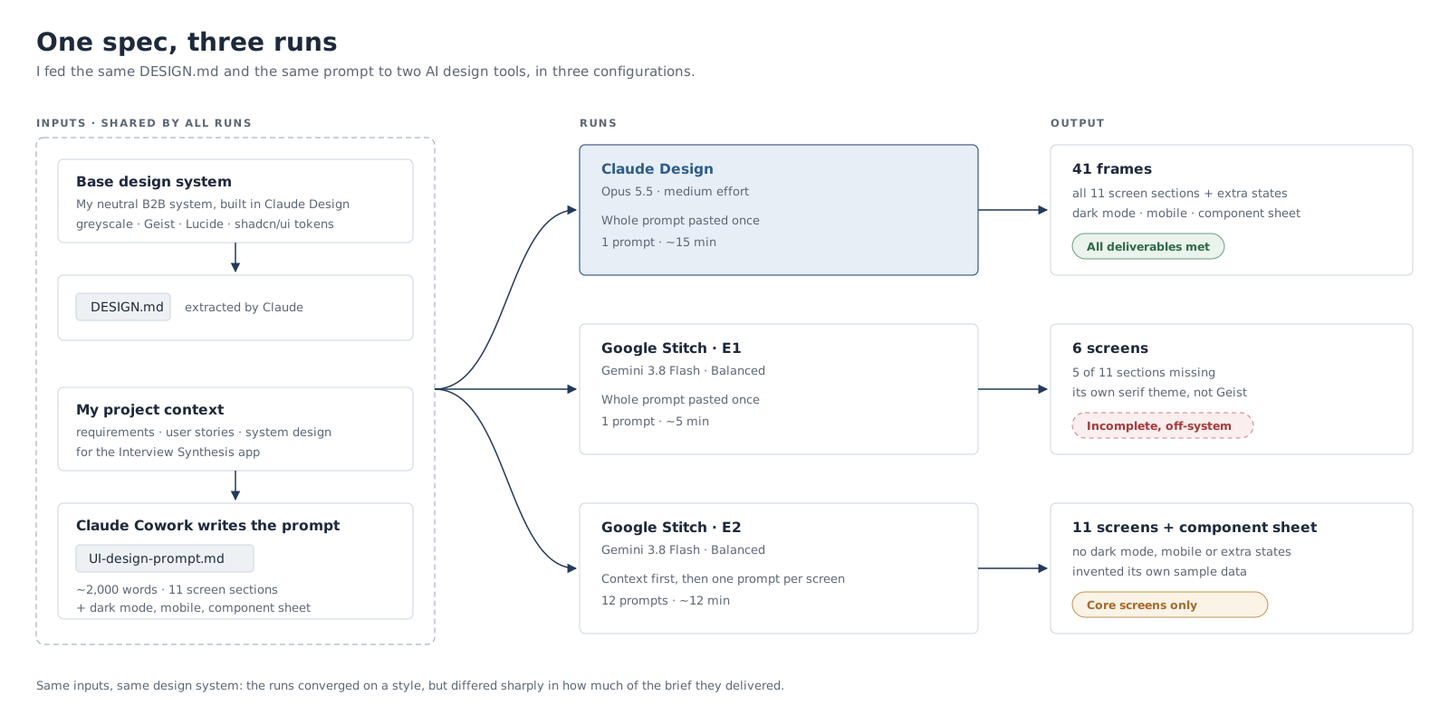
- Design system extraction. I built the Base design system in Claude Design, then asked Claude to extract it into a
DESIGN.mdfile. That format is Google's own: Stitch introduced it in 2026 as a portable, agent-readable file of design rules, so both tools should be able to read it. - Prompt generation. A good design prompt for this task needed a lot of project context, and neither design tool had any of it. So I handed prompt writing to Claude Cowork, which had the full project context, and asked it to list any extra context files I should attach separately. The result was a ~2,000-word prompt covering 11 screen sections, an app shell, sample data and a list of deliverables (including dark mode for four key screens, a 390px mobile version and a component sheet).
- Design generation. I ran the same prompt three ways:
| Run | Model / setting | How I prompted | Output | Time |
|---|---|---|---|---|
| Claude Design | Opus 5.5, medium effort | Whole prompt, pasted once | 41 frames: 13 main screens, 27 extra state and transition screens, and a component sheet | ~15 min |
| Stitch E1 | Gemini 3.8 Flash, Balanced | Whole prompt, pasted once | 6 screens | ~5 min |
| Stitch E2 | Gemini 3.8 Flash, Balanced | Tone-setting context first, then one prompt per screen (12 prompts) | 11 screens + component sheet | ~12 min |
One caveat up front: the prompt was written by Claude. I don't think it favoured either tool, since it's plain Markdown with no tool-specific syntax, but it's worth knowing.
What came out
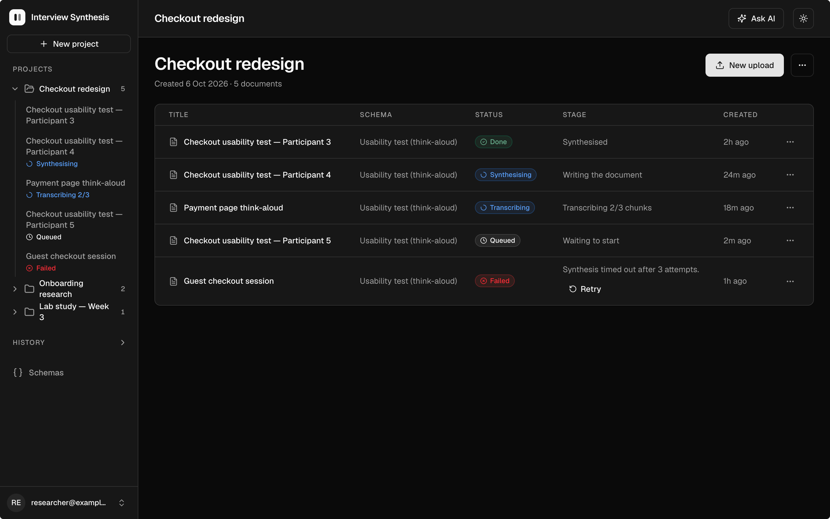
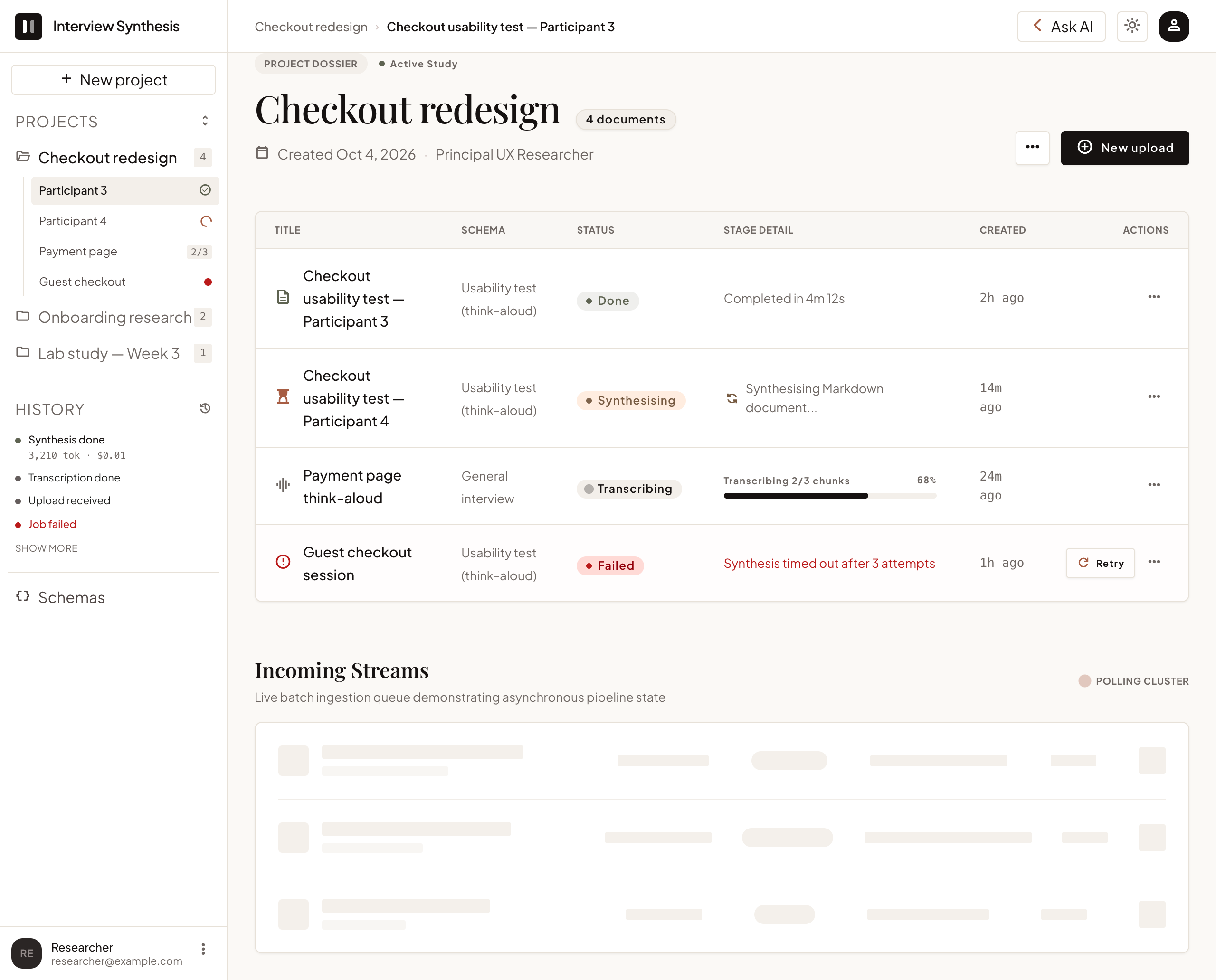
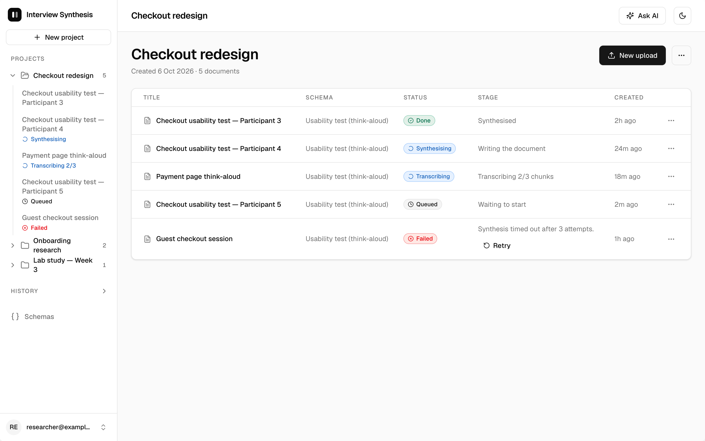
Here's the same screen, Project overview, from all three runs. The full set of screens is in the appendix at the end.
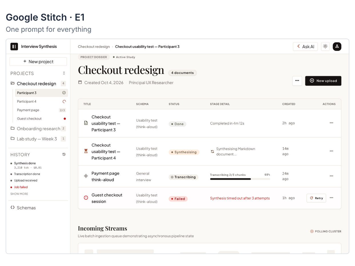
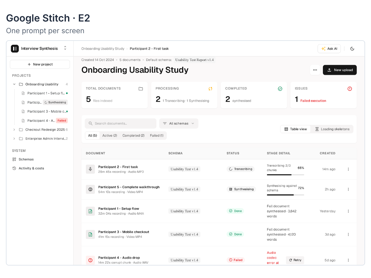
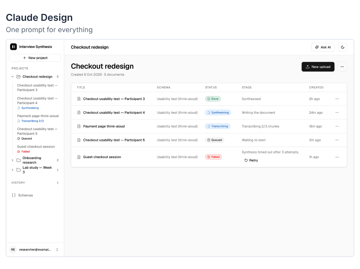
At a glance they look like siblings: greyscale, ink-black primary button, a left sidebar with a project tree, a table of documents with status badges. Look closer and the differences start to show, and they tell most of the story.
Observations
Requirement fulfilment
I checked each run against the deliverables listed in the prompt.
| Deliverable from the prompt | Stitch E1 | Stitch E2 | Claude Design |
|---|---|---|---|
| 11 screen sections | 6 of 11 | All (toasts folded into the component sheet) | All |
| Extra states and transitions | Few | Squeezed into single screens | 27 dedicated screens |
| Dark mode for screens 4, 5, 7, 10 | No | No | Yes, all four |
| 390px mobile version | No | No | Yes |
| Component sheet | No | Yes | Yes (light and dark) |
| Uses the prompt's sample data | Yes | No, invented its own | Yes |
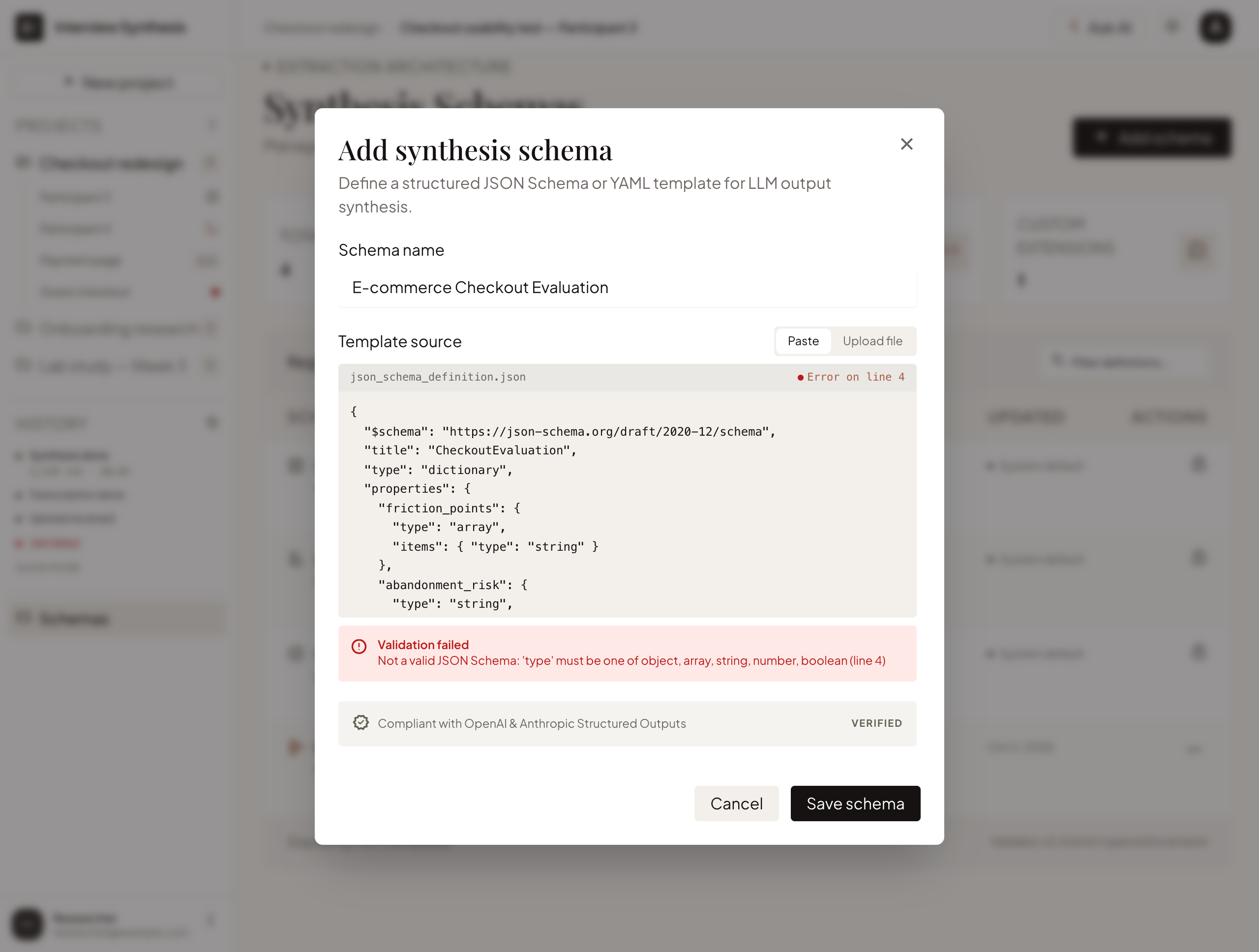
Stitch E1 fell well short. Five of the eleven screen sections got no screen of their own (log in, sign up, the empty state, history and toasts), and the screens it did make didn't cover the key interactions and states.
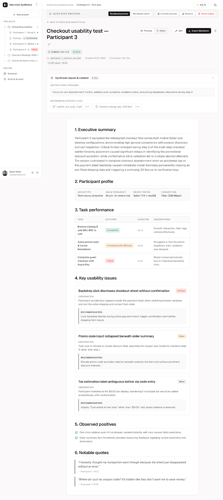
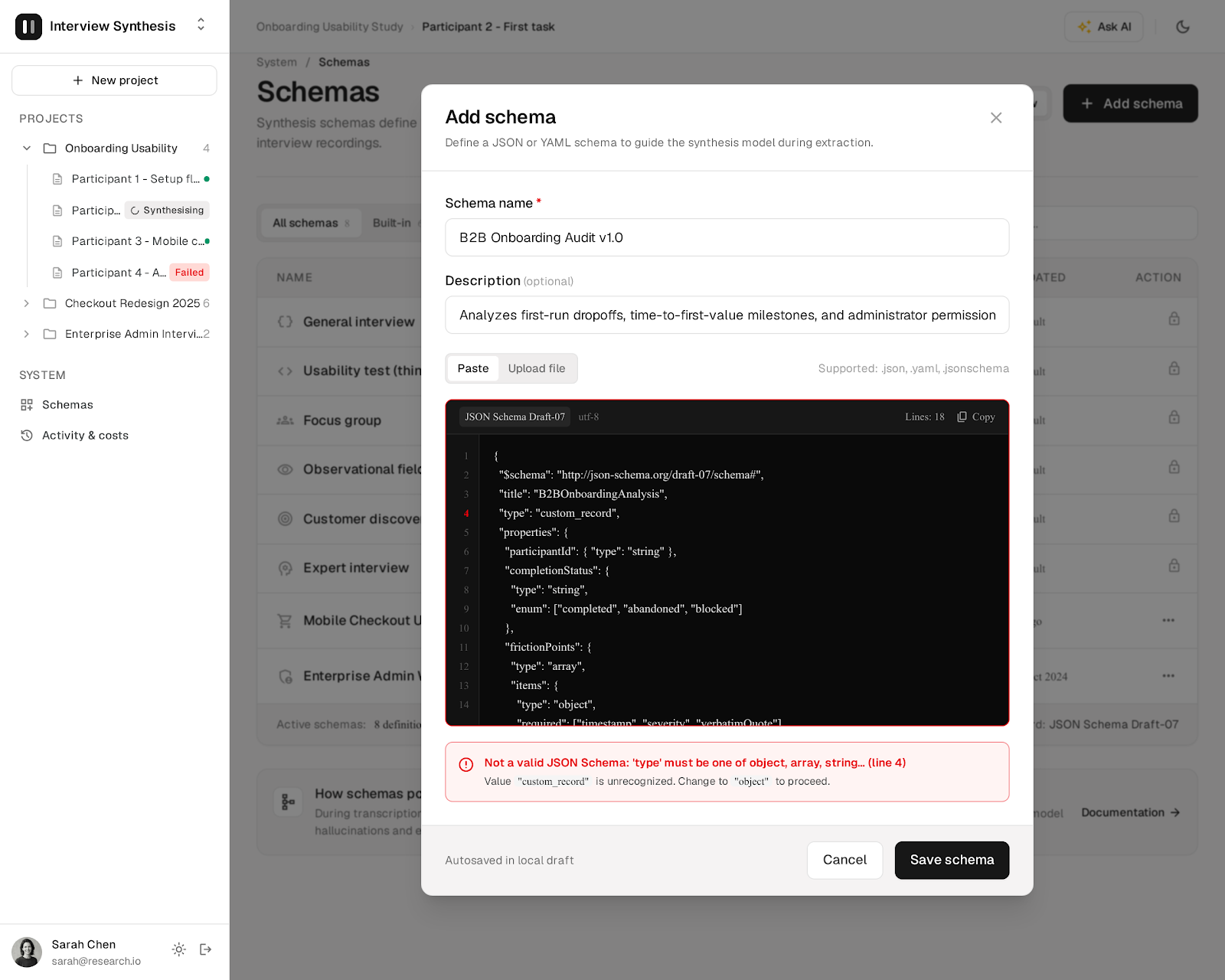
Stitch E2 was much more complete, because I asked for one screen per prompt. All the core screens are there, but states were often squeezed into one screen instead of shown separately. The Schemas screen, for example, only exists with the "Add schema" form open; there's no default state. The document view even has a "Quick state switcher" bar across the top. E2 also stuck strictly to the bare minimum: no transition screens, no dark mode, no mobile. And it quietly ignored my sample data, inventing an "Onboarding Usability Study", a user called Sarah Chen, and a footer claiming the app runs on "Whisper + Claude 3.5 Sonnet".
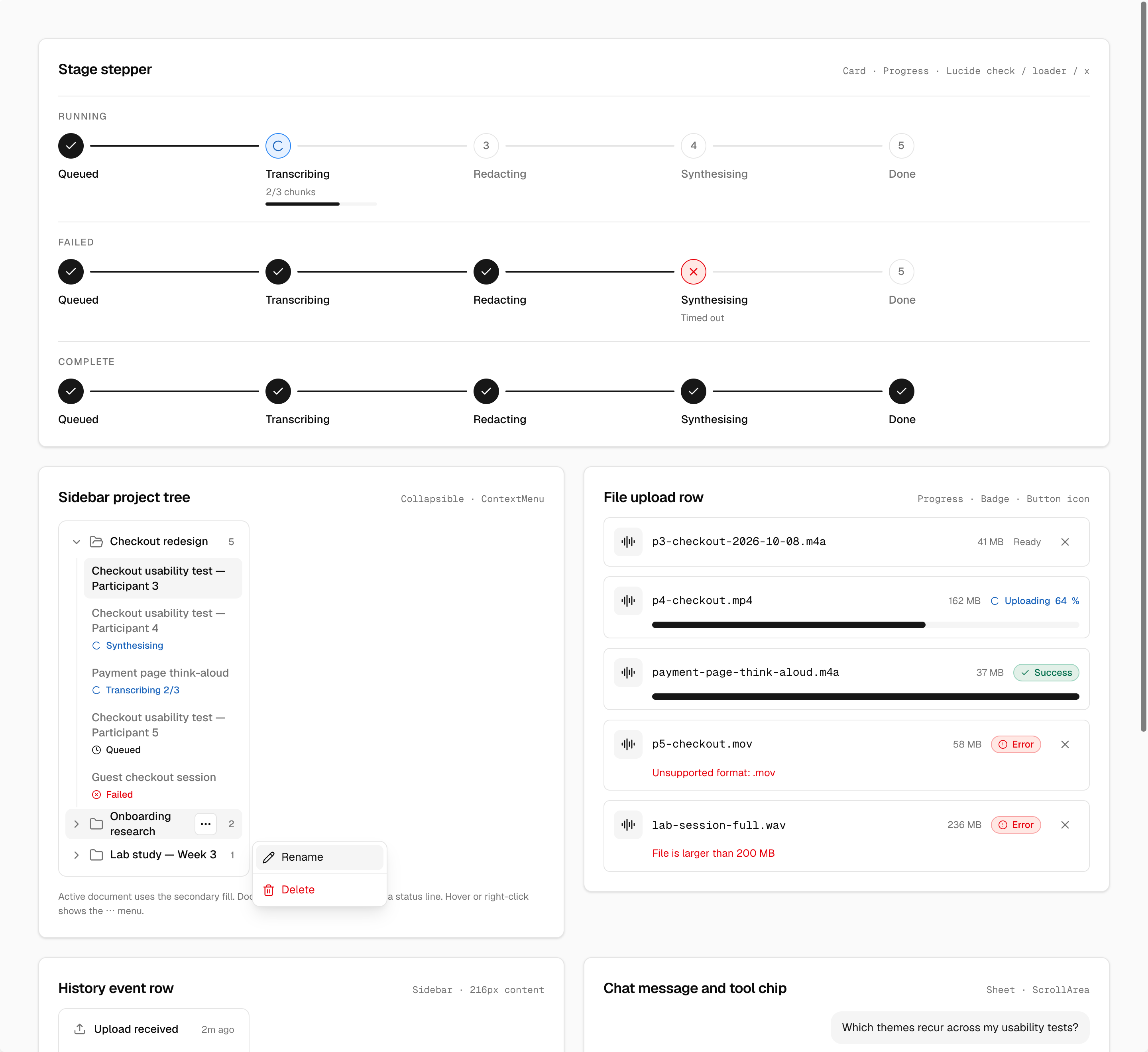
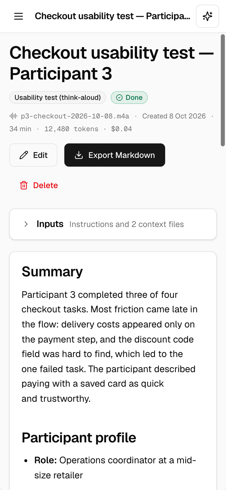
Claude Design delivered everything in one go: every screen section, extra screens for loading, filling and transition states, dark mode for the four screens the prompt listed, and a mobile version and component sheet (both also in dark). It's tempting to see dark mode and mobile as the icing on the cake, but they weren't extras: the prompt required them, and only Claude Design delivered them. The output is close to ready for development.
Design system application
From a distance, the design system clearly shaped all three runs. They're consistent with each other, and it's easy to tell they came from the same (or a very similar) design system. But the exported code tells a more detailed story.
- Stitch E1 didn't really use my design system. Alongside my Base
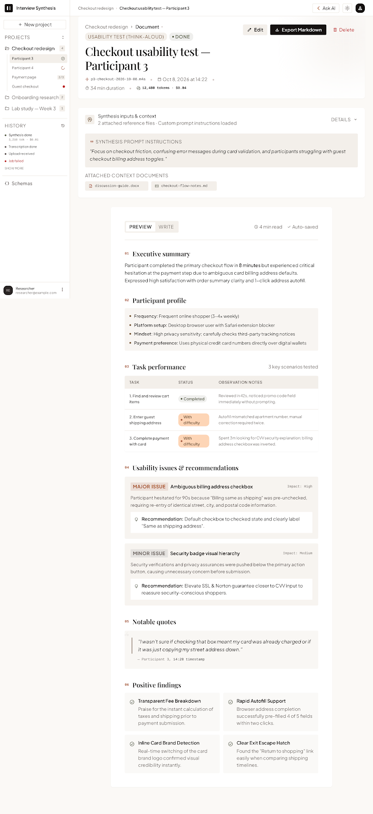
DESIGN.md, the exported project contains a second design system that Stitch generated itself, called "Lumina Luxury Living". The screens use that one: Playfair Display serif headings, Plus Jakarta Sans body text and a warm off-white background instead of Geist on neutral grey. That's why E1's typography and colours drift. - Stitch E2 was much closer. It uses Geist throughout, though a few serif labels still slip in (look at the schema badges in the overview above).
- Both Stitch runs used Google's Material Symbols icons, while the design system and the prompt both specified Lucide.
- Claude Design used Geist, Geist Mono and Lucide icons, matching the design system on every point I checked.
So E2 and Claude Design are the two that look most alike, and the design specs were applied more consistently in both. E1 is the odd one out.
Consistency within a design
Stitch's screens also drift within themselves. In E1's document view, the main content column doesn't line up with the card above it, and the typography varies from block to block. Claude Design's version of the same screen applies the system consistently, with little or no drift.
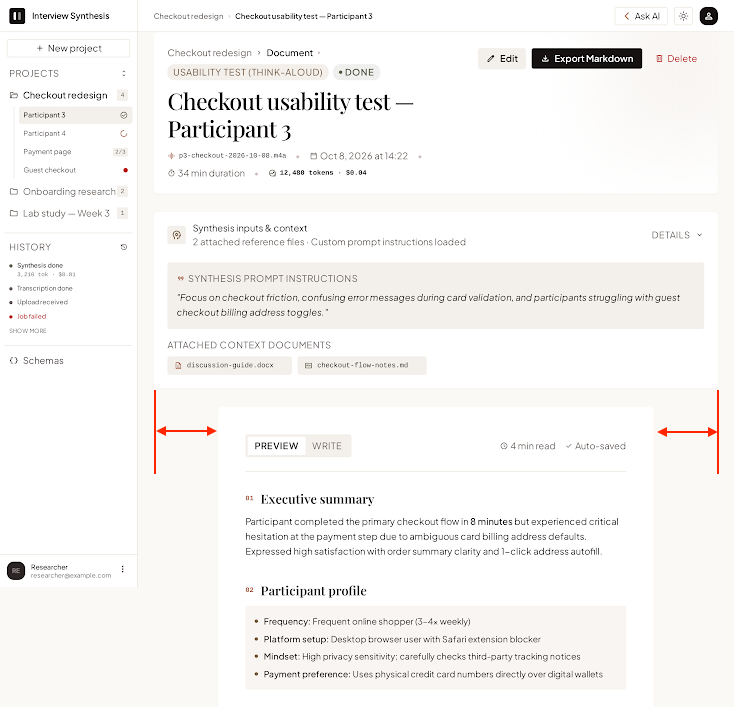
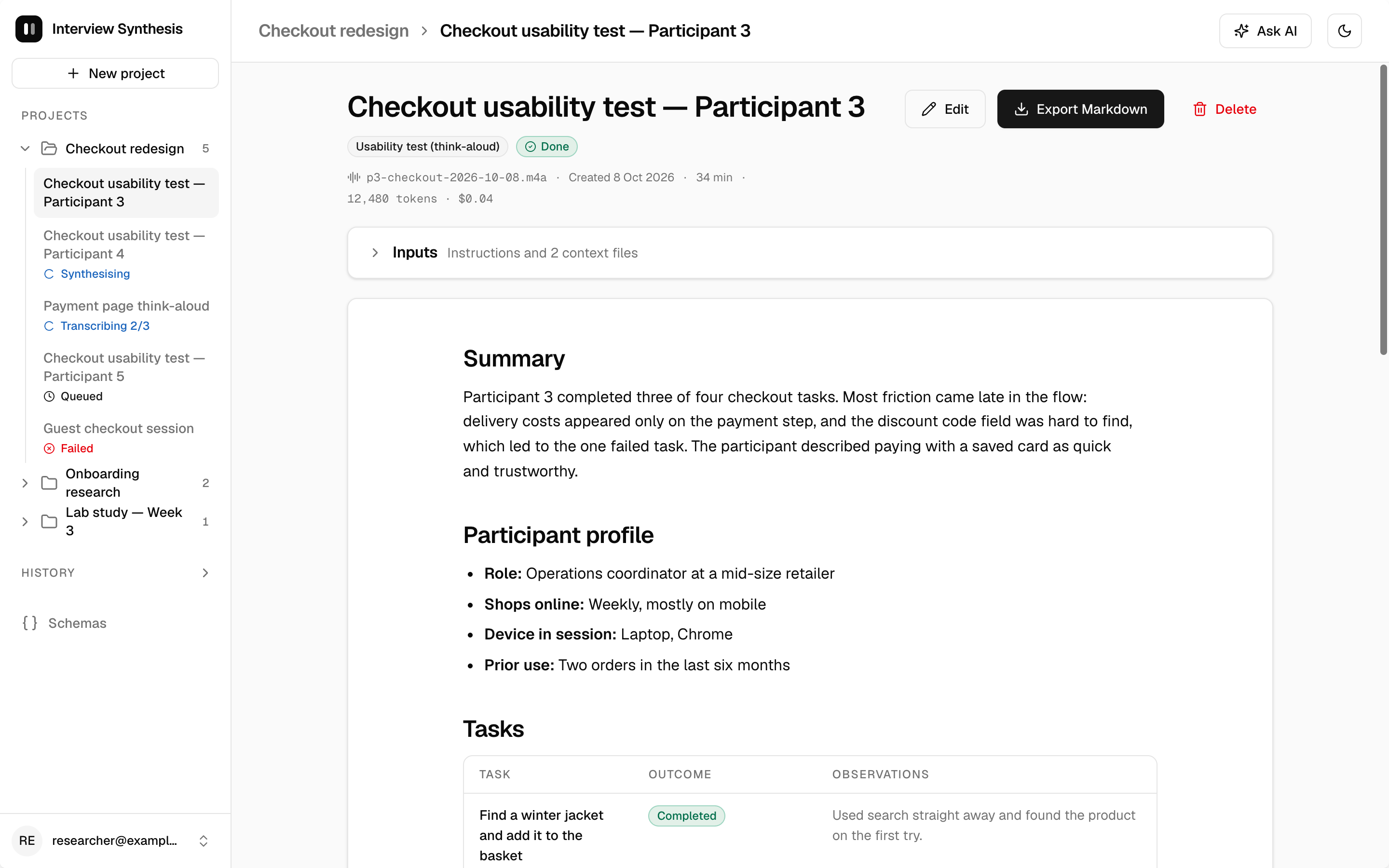
E2 looked cleaner and more modern than E1, and in consistency and overall flavour it came very close to Claude Design. With a precise design system and one screen per prompt, Stitch can produce clean, on-system screens.
There was a cost, though. To keep E2's screens consistent with each other, I had to repeat the same guardrail at the start of every prompt:
Make this screen using the established design system and design principles, and align its design with the already generated screens: Project overview Header: project name (H1), created date, document count; actions: "New upload" (primary), "⋯" menu (Rename, Delete project). Body: a Card containing a table of documents/jobs: Title · Schema · Status (badge) · Stage detail ("Transcribing 2/3 chunks") · Created ("2h ago") · row "⋯" menu. Include rows in every state: Done, Synthesising, Transcribing 2/3, Queued, Failed (with an inline Retry ghost button). Rows open the document view. Show a loading version with Skeleton rows.
That's the same lesson as last time: Stitch struggles to hold context between prompts, even in what looks like the same session from the user's point of view.
Visual quality
On visual quality alone, there wasn't much to separate them. All three runs reached a similar level of fidelity, with consistent colours, typography, spacing and components. All three are easy to read and navigate, apply established principles like information hierarchy, contrast and proximity, and look like modern UI. If you judged on a single screenshot, you'd struggle to pick a clear winner. The gap is in completeness and adherence, not polish.
Efficiency
Time. E1 was fastest at ~5 minutes but produced the least. E2 took ~12 minutes, plus the overhead of feeding it 12 prompts by hand. Claude Design took ~15 minutes and produced by far the most.
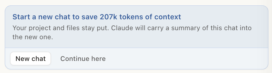
Usage. These are hard to compare directly. By the end of the session, Claude Design suggested starting a new chat to save "207k tokens of context". That's the size of the conversation's context, not a bill, but it gives a sense of scale, and Claude Design usage counts against your Claude plan's limits.
Stitch used 38 credits for both experiments together, out of a free daily allowance of 400. Stitch credits scale with the complexity of each generation, and as far as I can find, Google doesn't publish how they map to tokens.
Why did E1 stop at six screens? My first guess was the model's output limit: Opus 5.5 can produce up to 128K output tokens in a response, Gemini 3.8 Flash up to about 64K. That may play a part, but I don't think it's the main reason. Claude Design built 41 frames over 15 minutes, working through the task step by step, so one response's limit wasn't the constraint there. On Stitch's side, a first generation is reported to produce up to five starter screens, with more added on request. E1's six screens sit right around that ceiling. So the more likely explanation is how each product runs its model, not the model's raw limits. This also points to a limit of my study: I compared products, not models, and I can't fully separate the two.
Tool interface
Google Stitch is AI-first: almost every action, including editing, goes through the AI.
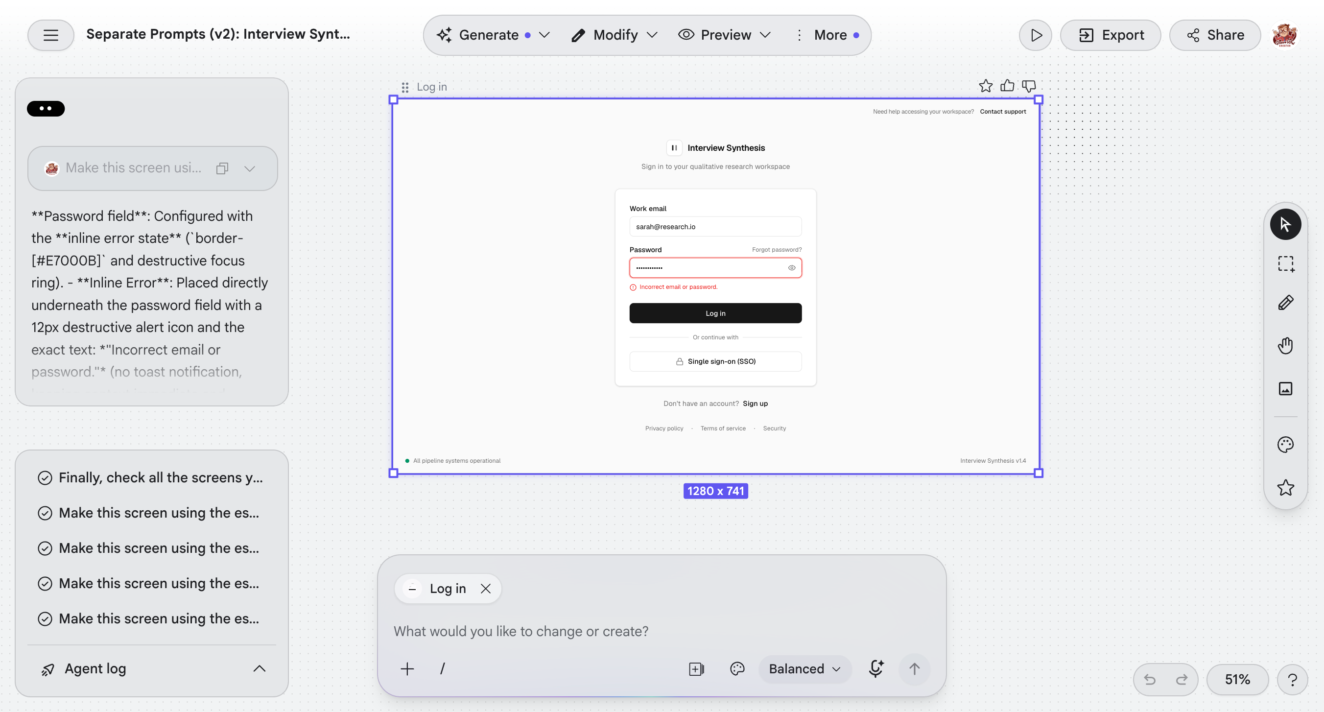
Manual tools exist, but they're limited, and getting to them is awkward. After choosing "Modify" → "Edit", I also had to select "Direct Edit" in the right-hand toolbar before I could change anything by hand.
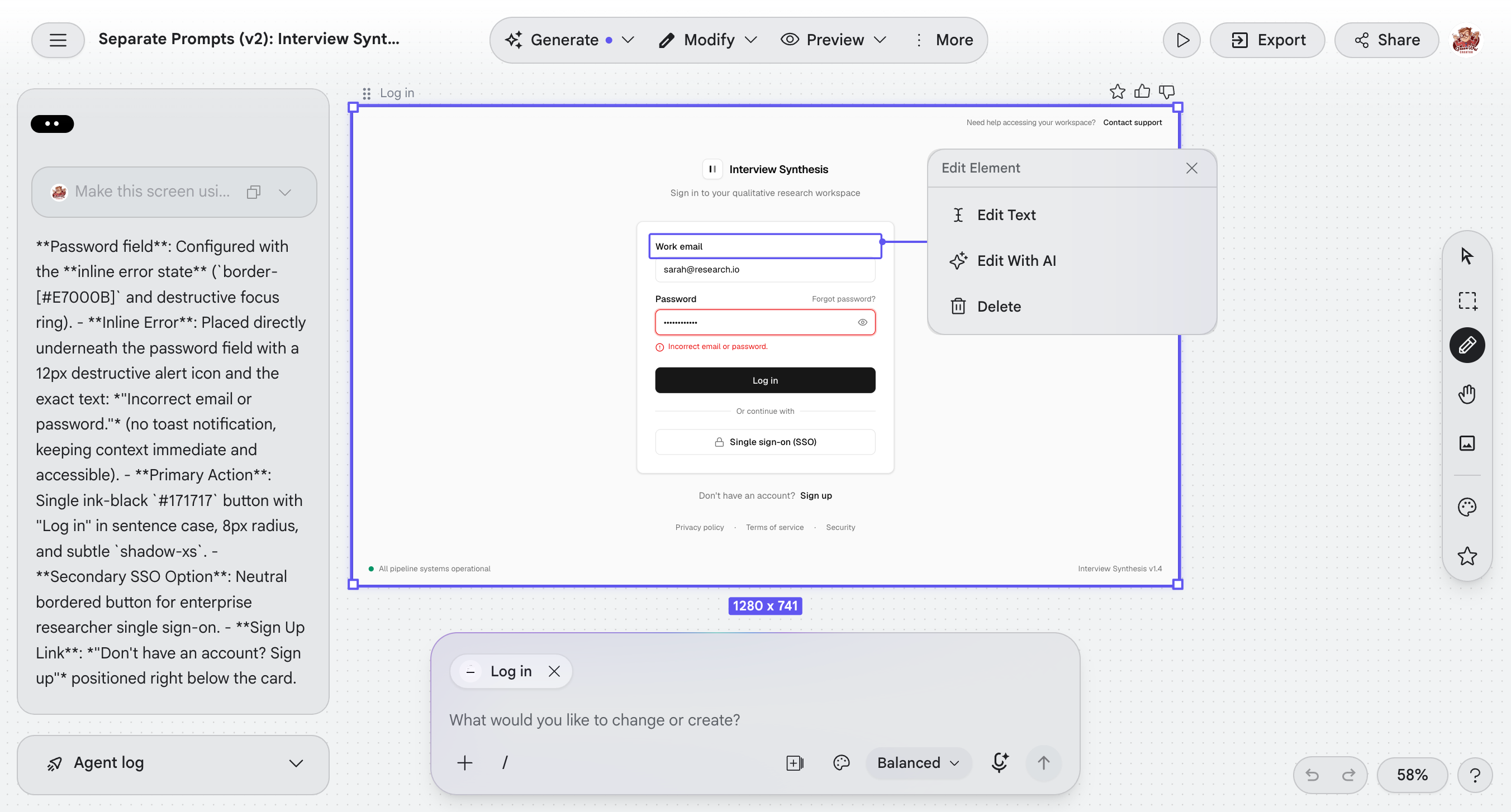
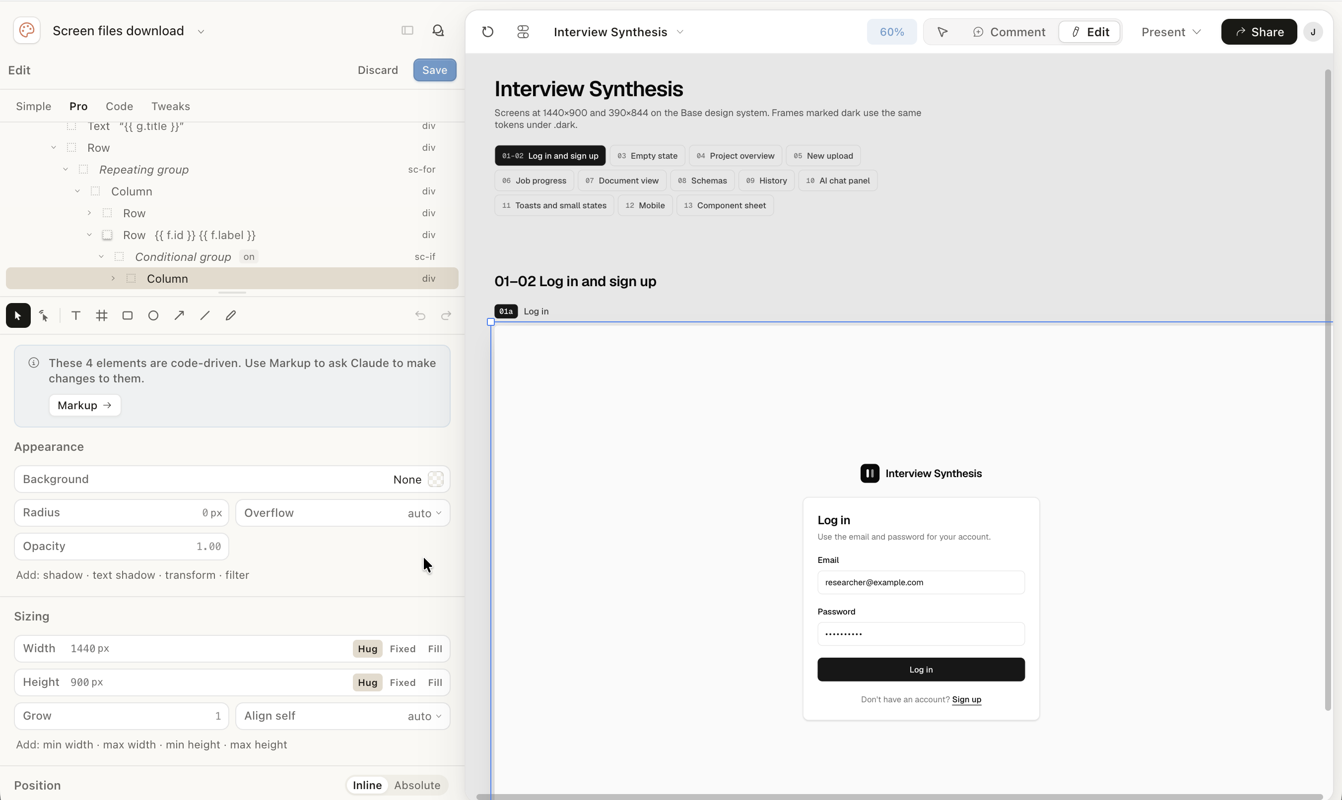
Claude Design's canvas is more interactive. It supports dragging and zooming, and the generated screens are laid out in a grid with tabs, so it's easy to move between screens and review them.
The chat panel on the left works like most chat interfaces: simple and familiar.
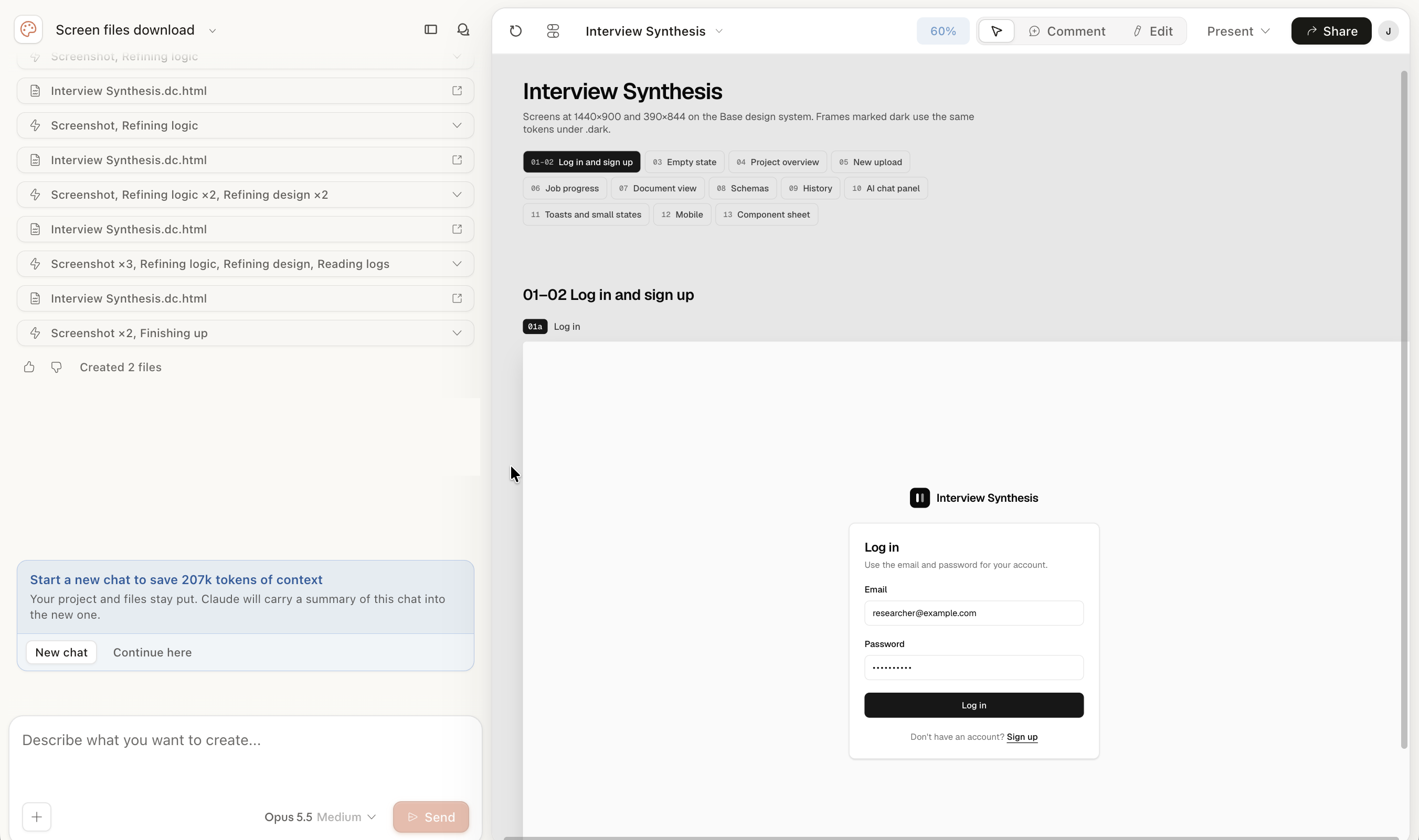
Claude Design also has manual editing, with more tools than Stitch, and editing feels more natural.
The choice for this task
For this project, I went with Claude Design (Opus 5.5, medium effort), for two reasons.
- I wanted a finished, polished design quickly, in one go. This was a cloud computing project, not a UI design project. Fast iteration and cheap variants, where a Flash model shines (on API pricing, Gemini 3.8 Flash costs roughly a fifth of Opus 5.5 per token), weren't the point this time.
- The task was bigger than Stitch could handle in one go. It needed 11 screen sections, dark mode, mobile and a component sheet. E1 showed Stitch won't produce all of that from one prompt. E2 got the core screens, but only after I split the prompt into 12 pieces and pasted them one by one, which would be very inefficient in a real-world workflow. Even then, it skipped dark mode and mobile.
Key takeaways
Towards more predictable design generation
Design decisions, especially visual ones, have always been hard to settle. We have a growing body of principles from UX, accessibility and psychology, but how they're applied stays fragmented across projects, teams and organisations, and it's often hard to argue for one design over another. Generative AI adds another layer: LLMs are stochastic, so asking for the same design twice doesn't guarantee the same result.
My experiment suggests this is improving. When I turned the design system into structured data (DESIGN.md) and gave the tools a detailed prompt with real project context, both tools converged on recognisably the same design language. Requirements and design system did a lot of the steering.
I'd still be careful with the word "deterministic", though. I ran each setup once, so I can say the outputs converged across tools, not that any tool gives the same result every time. My design system was also deliberately neutral ("boring on purpose", in its own words), and neutral systems are easier to converge on. A more opinionated design system, and a few repeated runs per tool, would make a stronger test. The biggest differences I found weren't in style at all; they were in how much of the brief each tool delivered, and how faithfully it followed the specified system.
Future work: Stitch through MCP
Stitch also offers an MCP server, so an agent like Claude can drive it directly. My first idea was to use Opus 5.5 through MCP to get past Gemini's output limits. Looking into it, that won't work as I first imagined: the screens are still generated on Stitch's side, by Stitch's models. Claude would be the orchestrator, not the designer.
That makes for a more interesting question, though. In E2, I was the orchestrator: splitting the prompt, feeding screens one at a time and restating the guardrails every time. Could an agent do that for me, and would Stitch then deliver the whole brief, with the consistency of E2 and without the manual effort?
Appendix: full screen gallery
Google Stitch E1
Project overview:
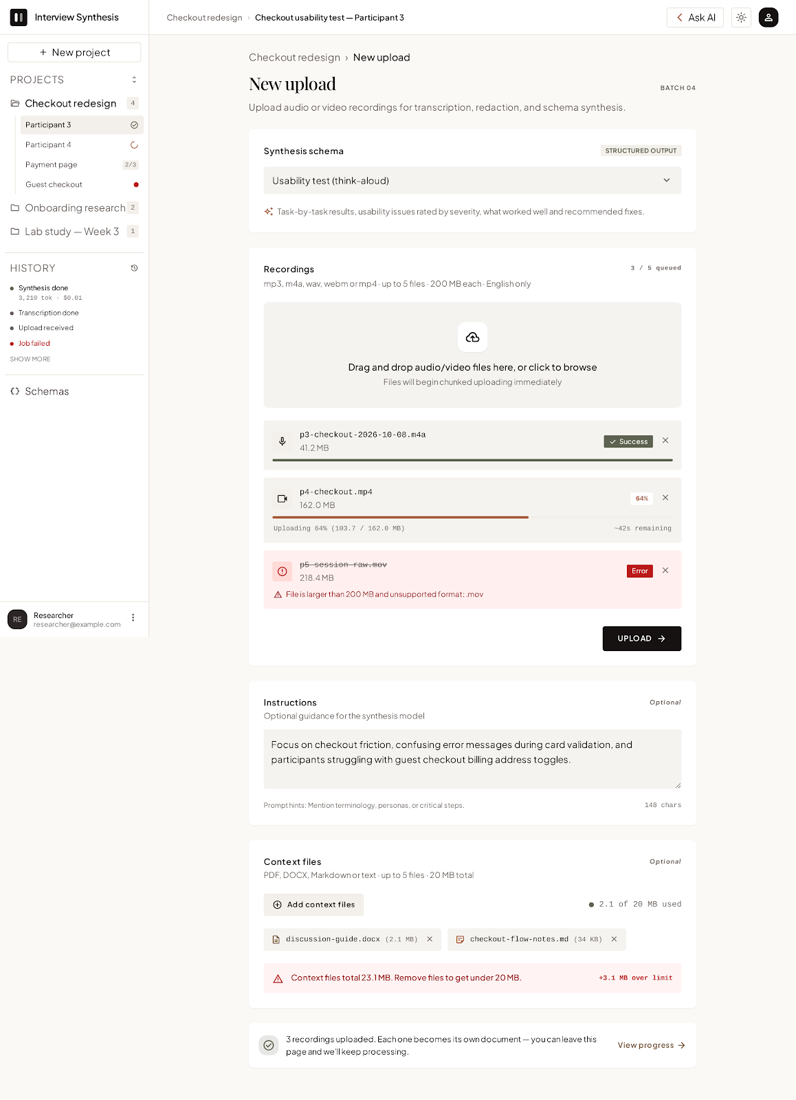
New upload:
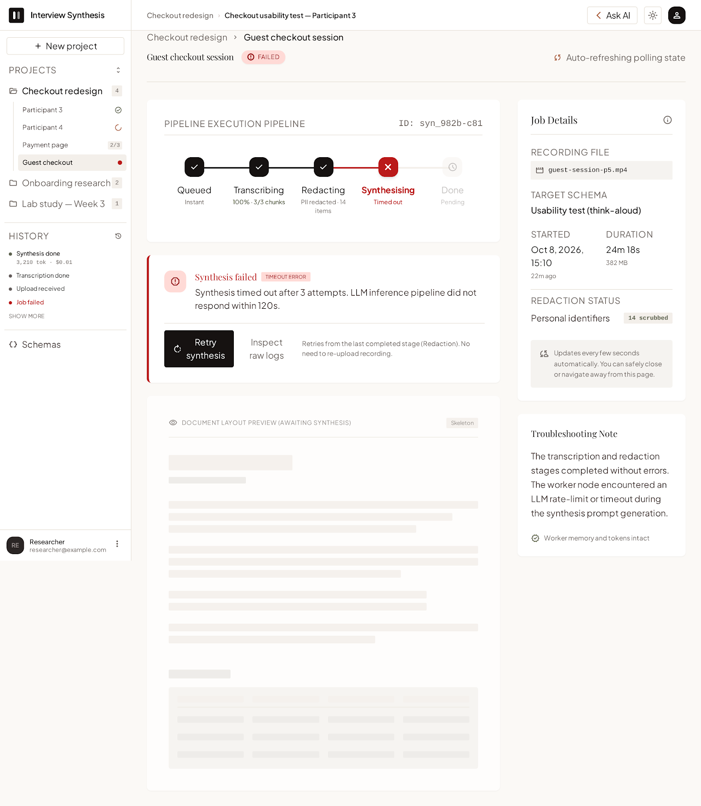
Job progress (document in progress):
Schemas:
Document view:
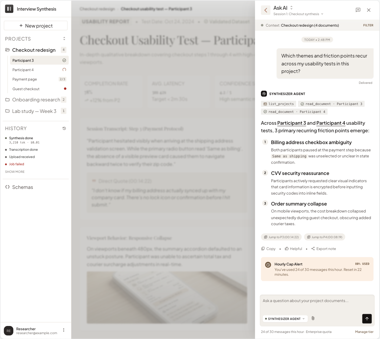
AI chat panel:
Google Stitch E2
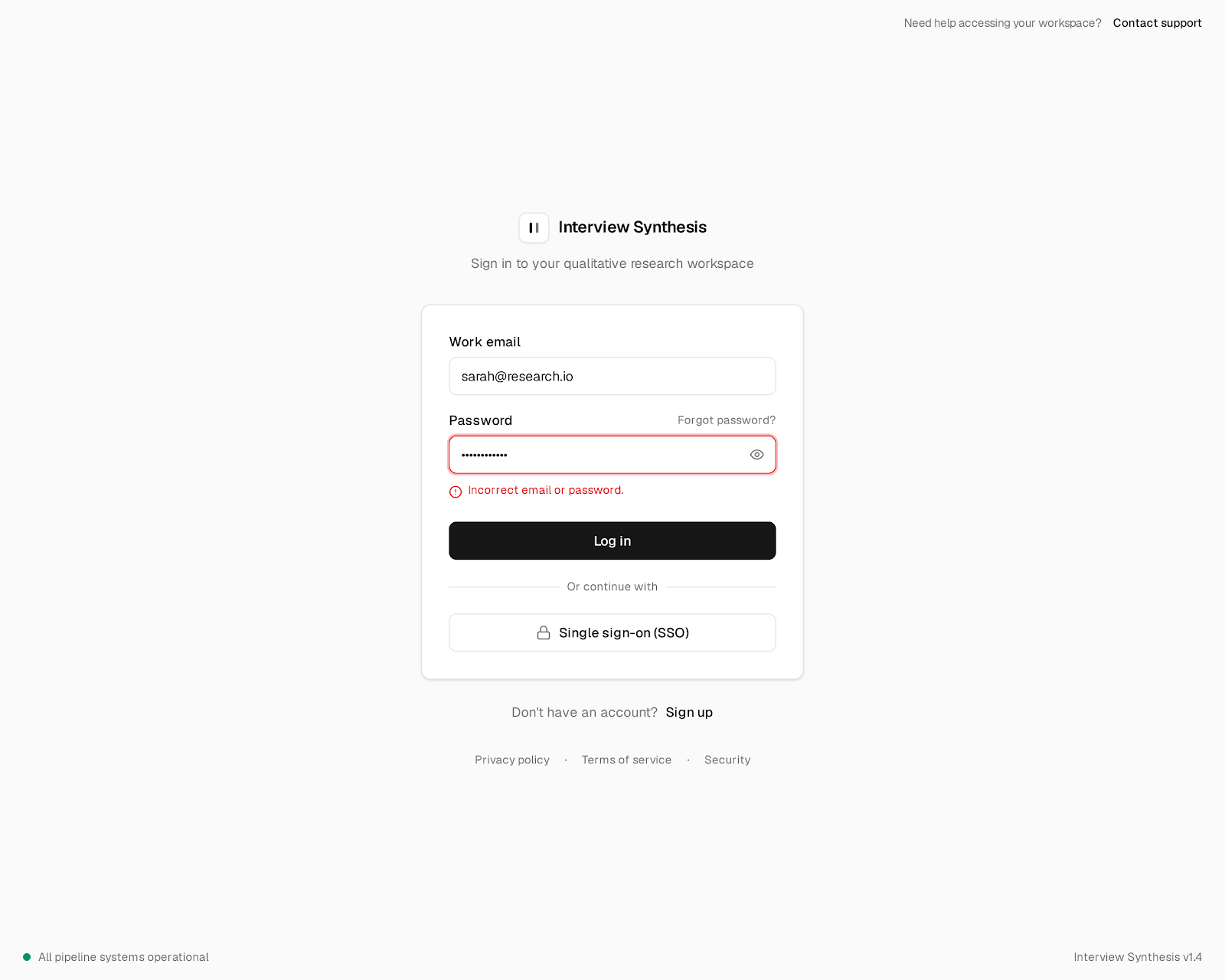
Log in:
Sign up:
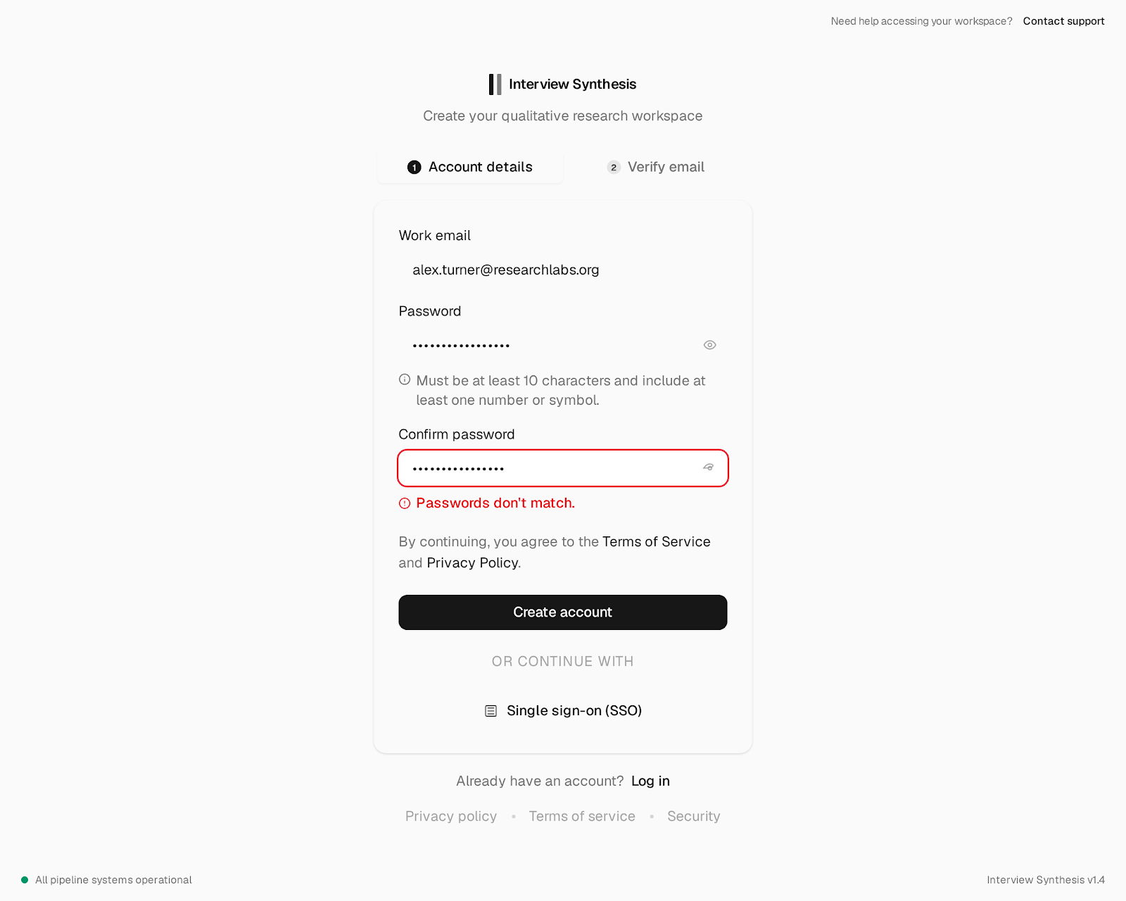
Empty state (first sign-in):
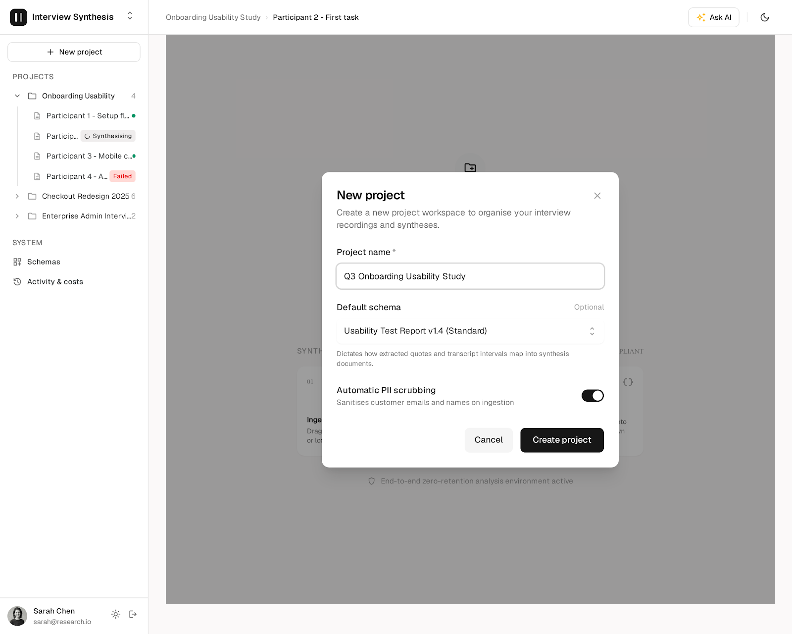
Project overview:
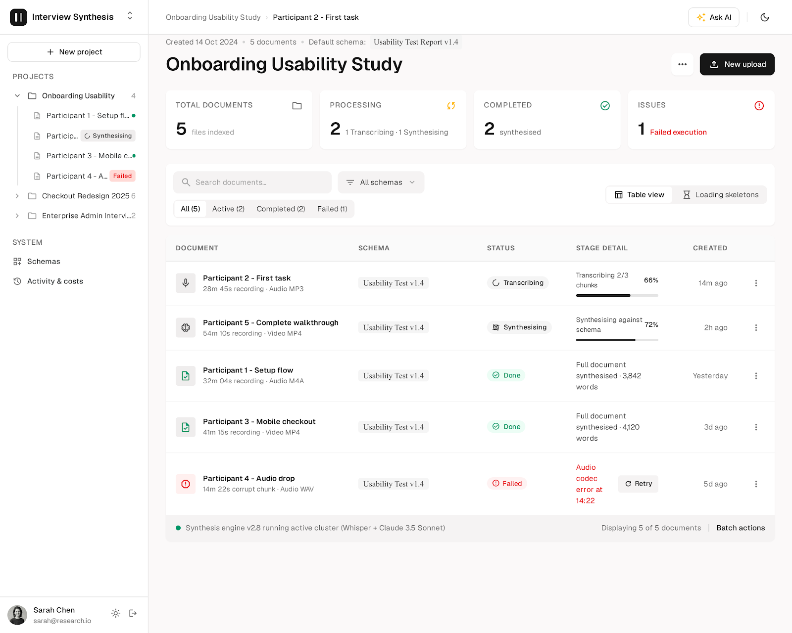
New upload:
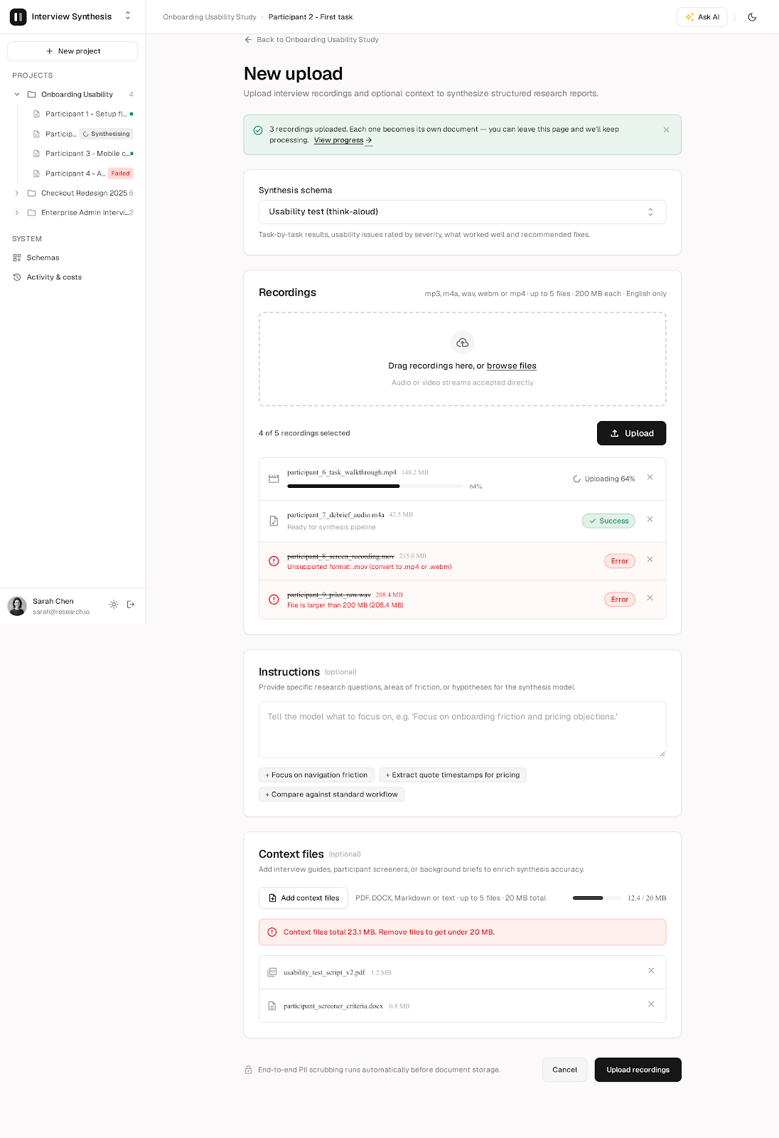
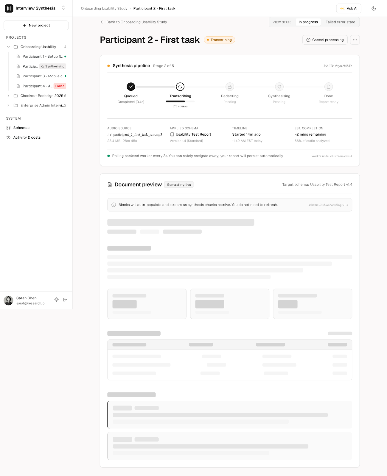
Job progress (document in progress):
Document view:
Schemas:
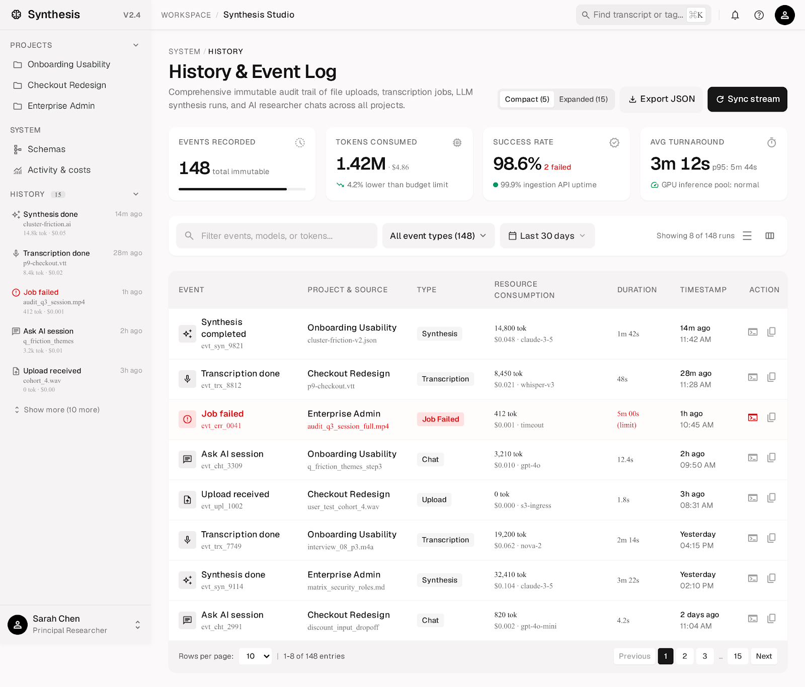
History:
AI chat panel:
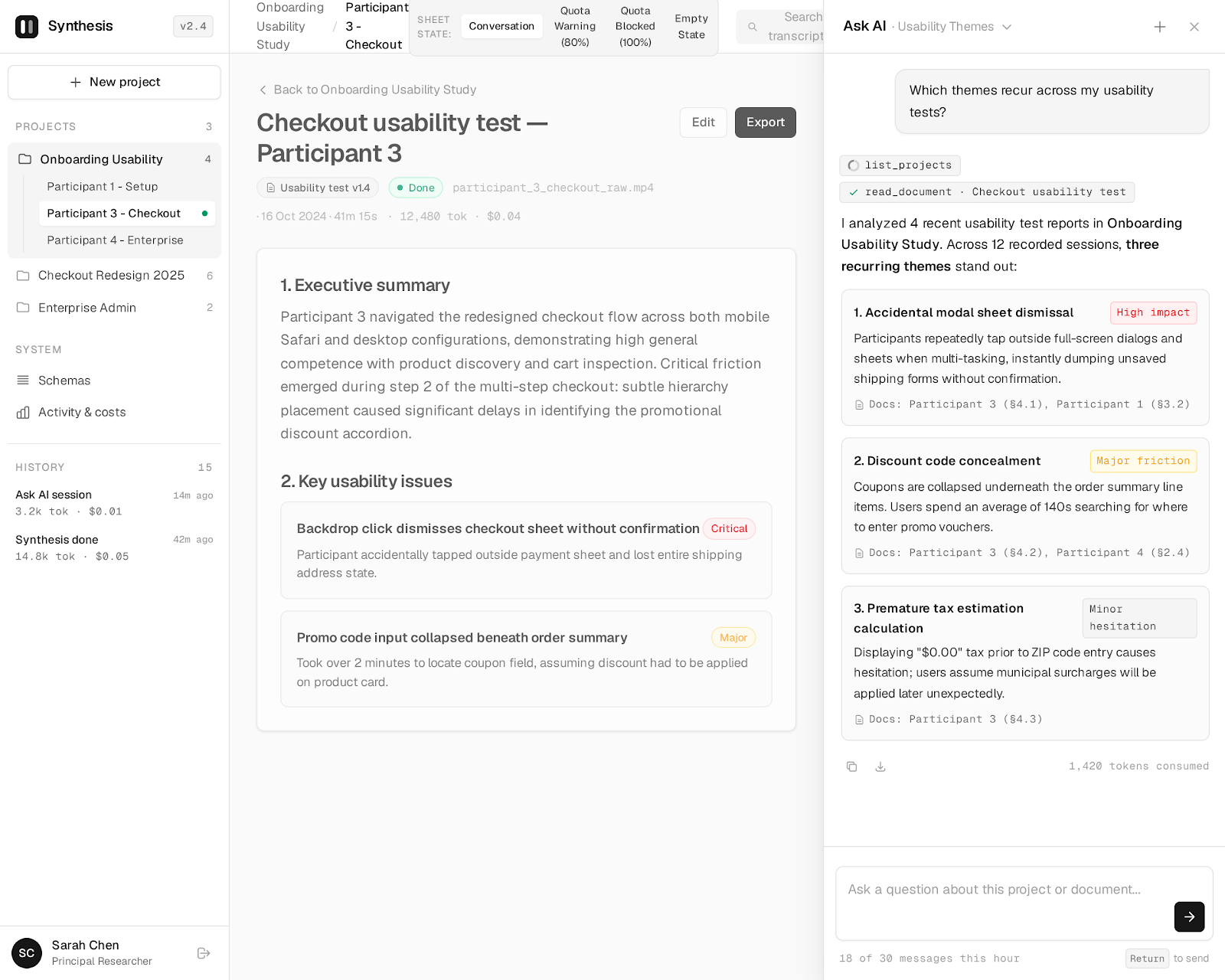
Component sheet:
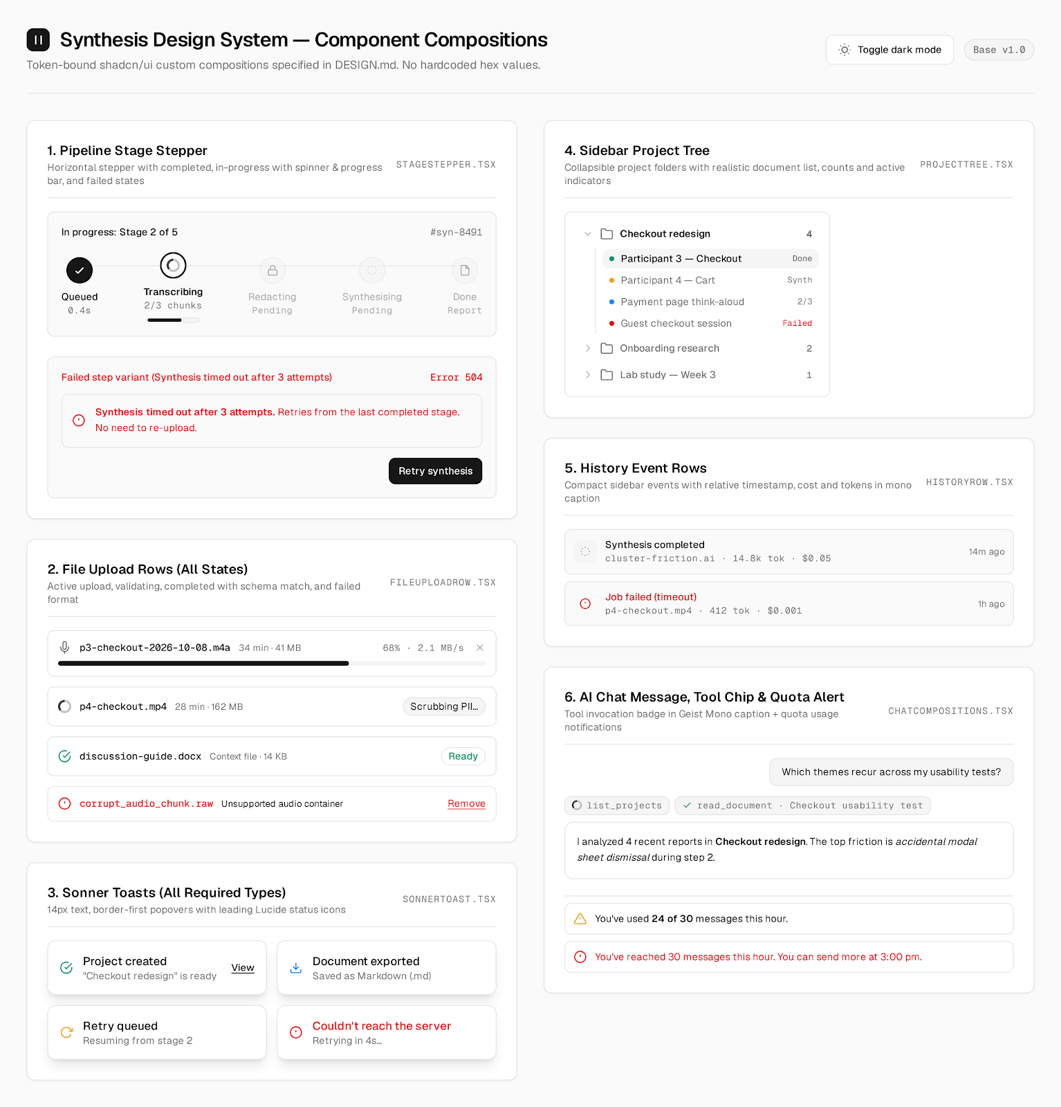
Claude Design
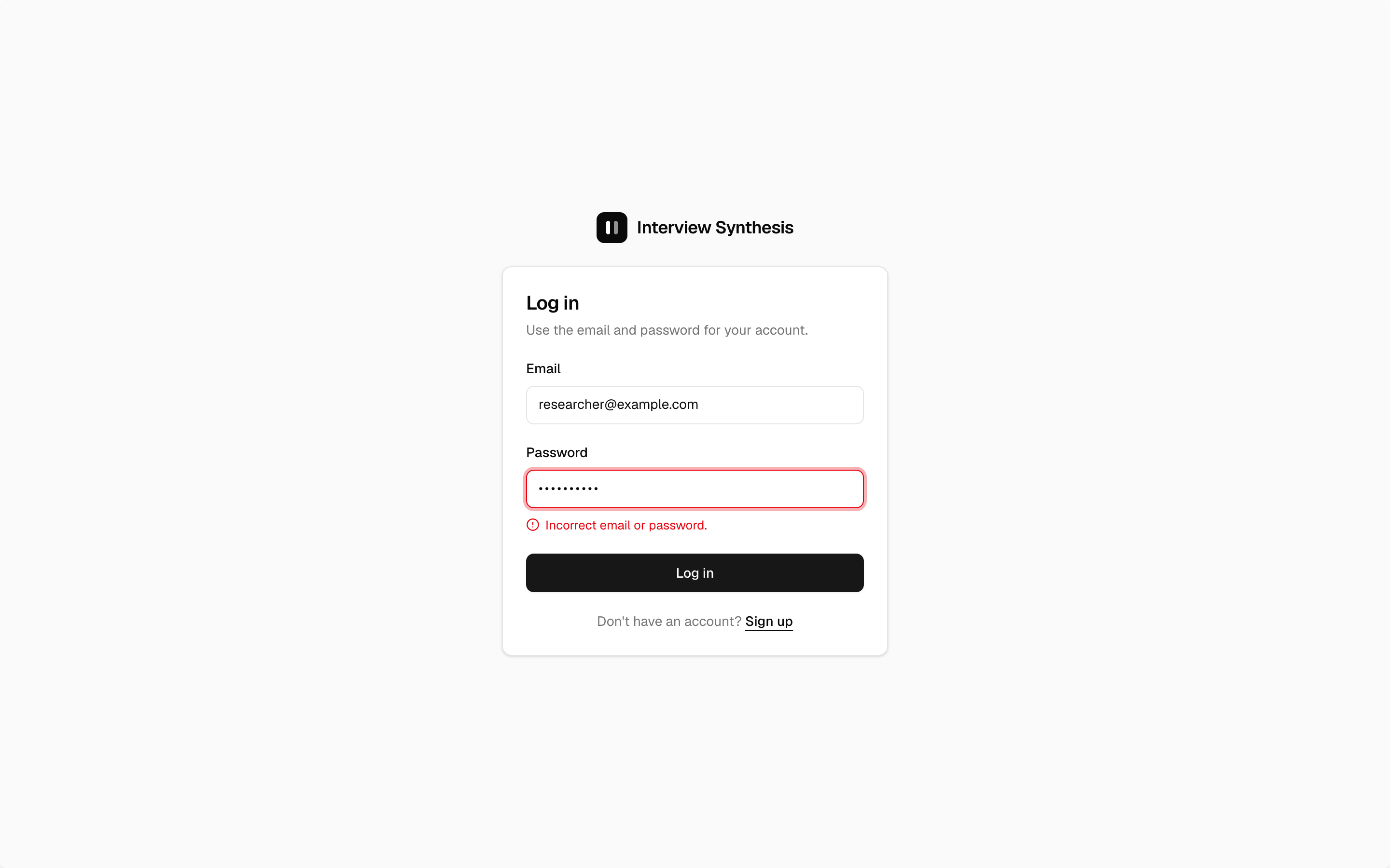
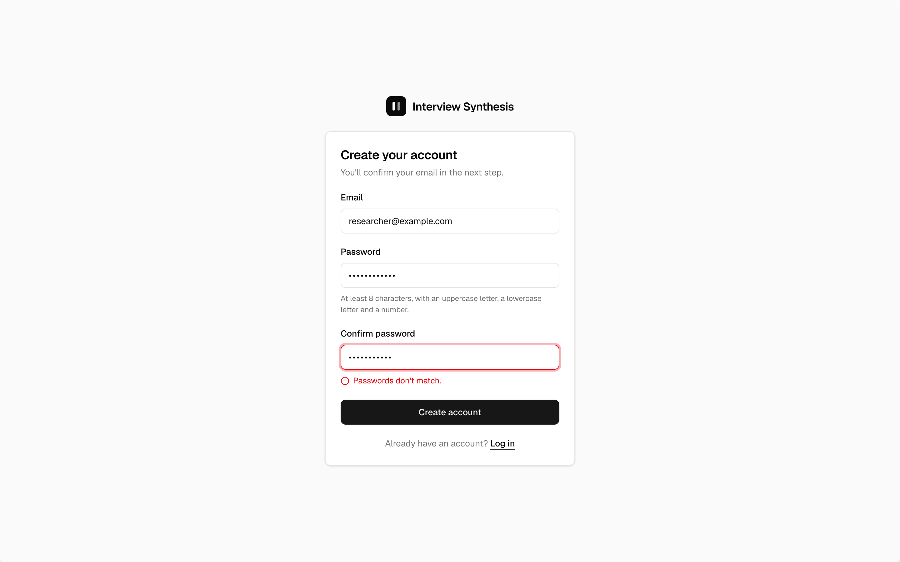
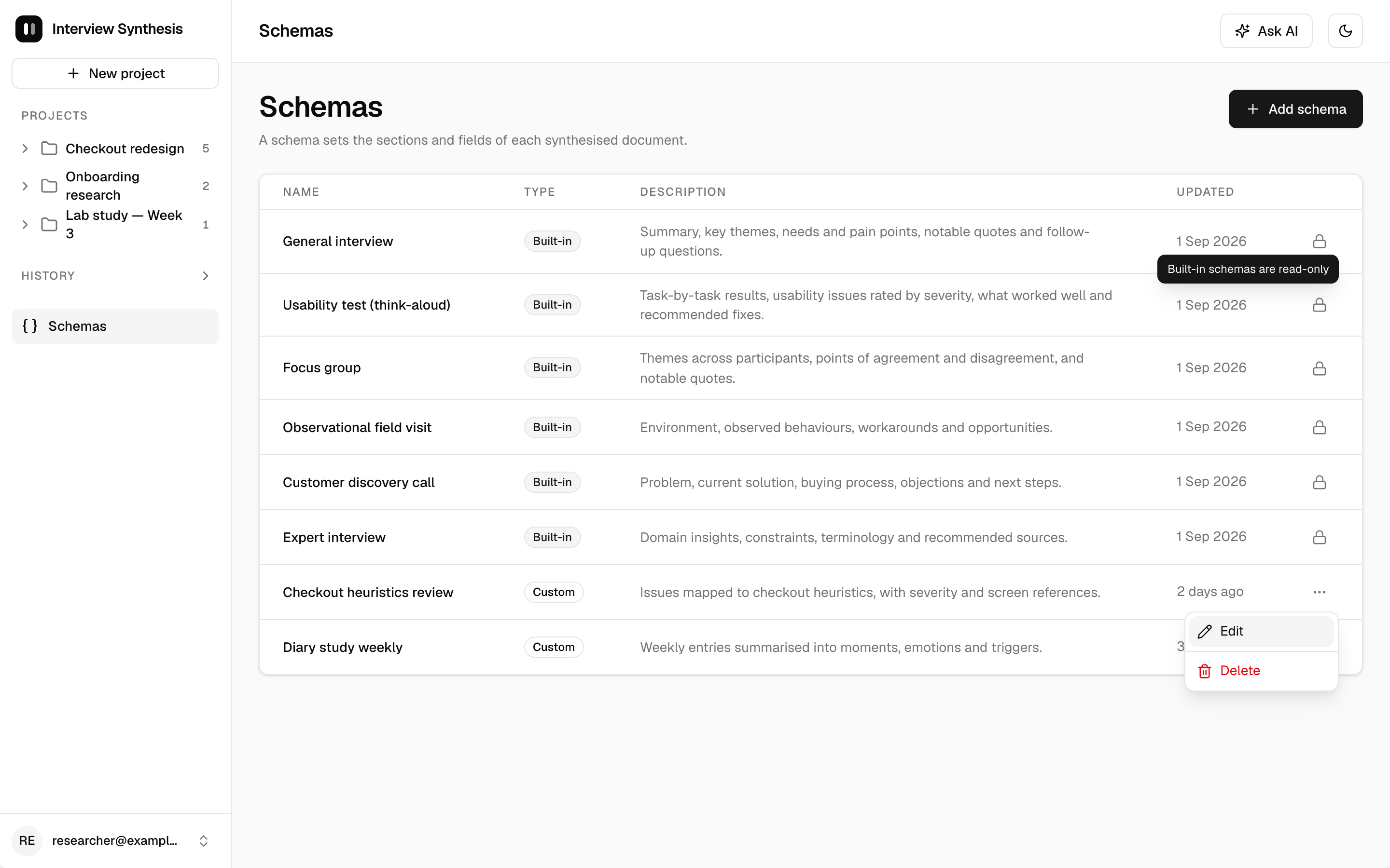
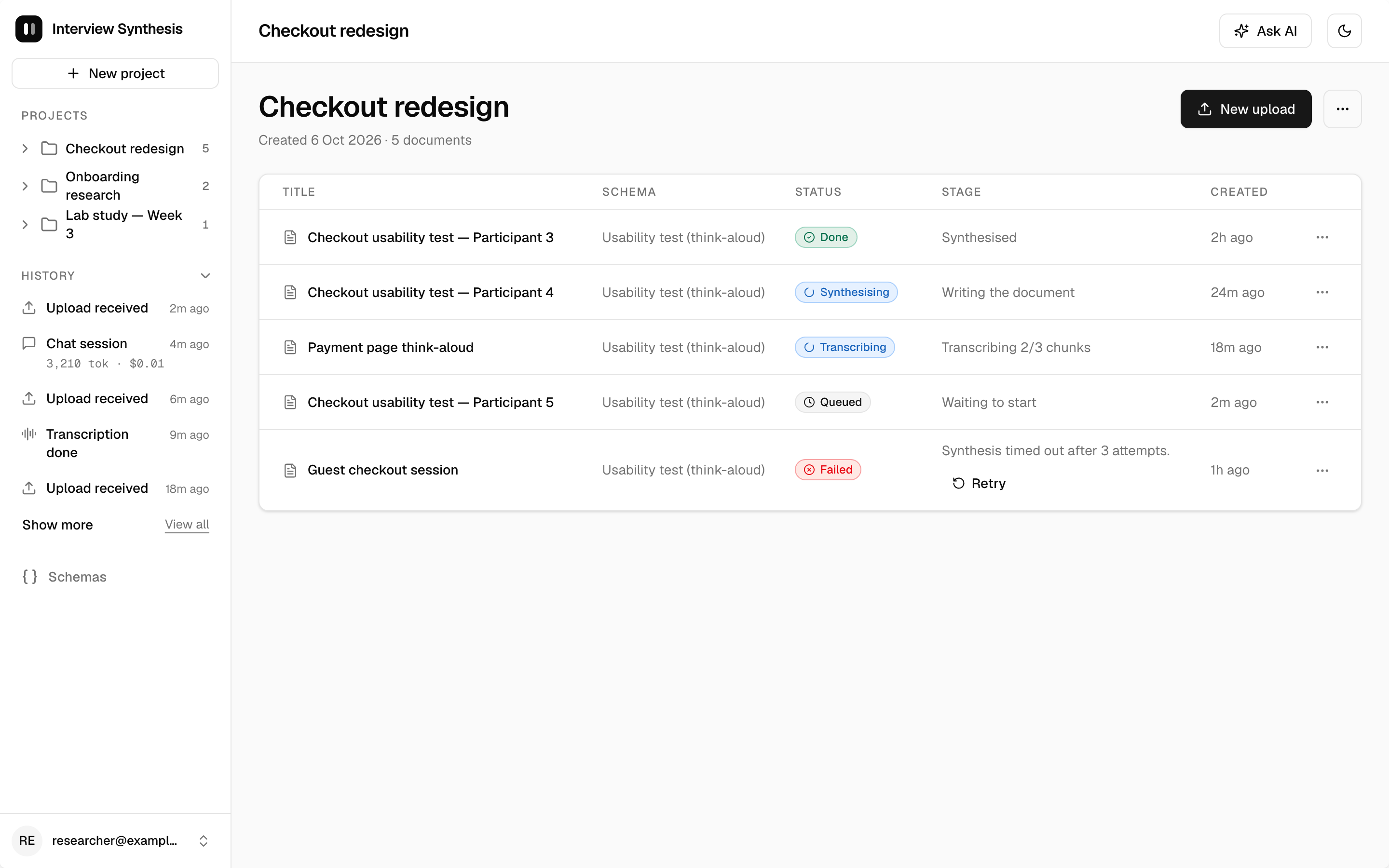
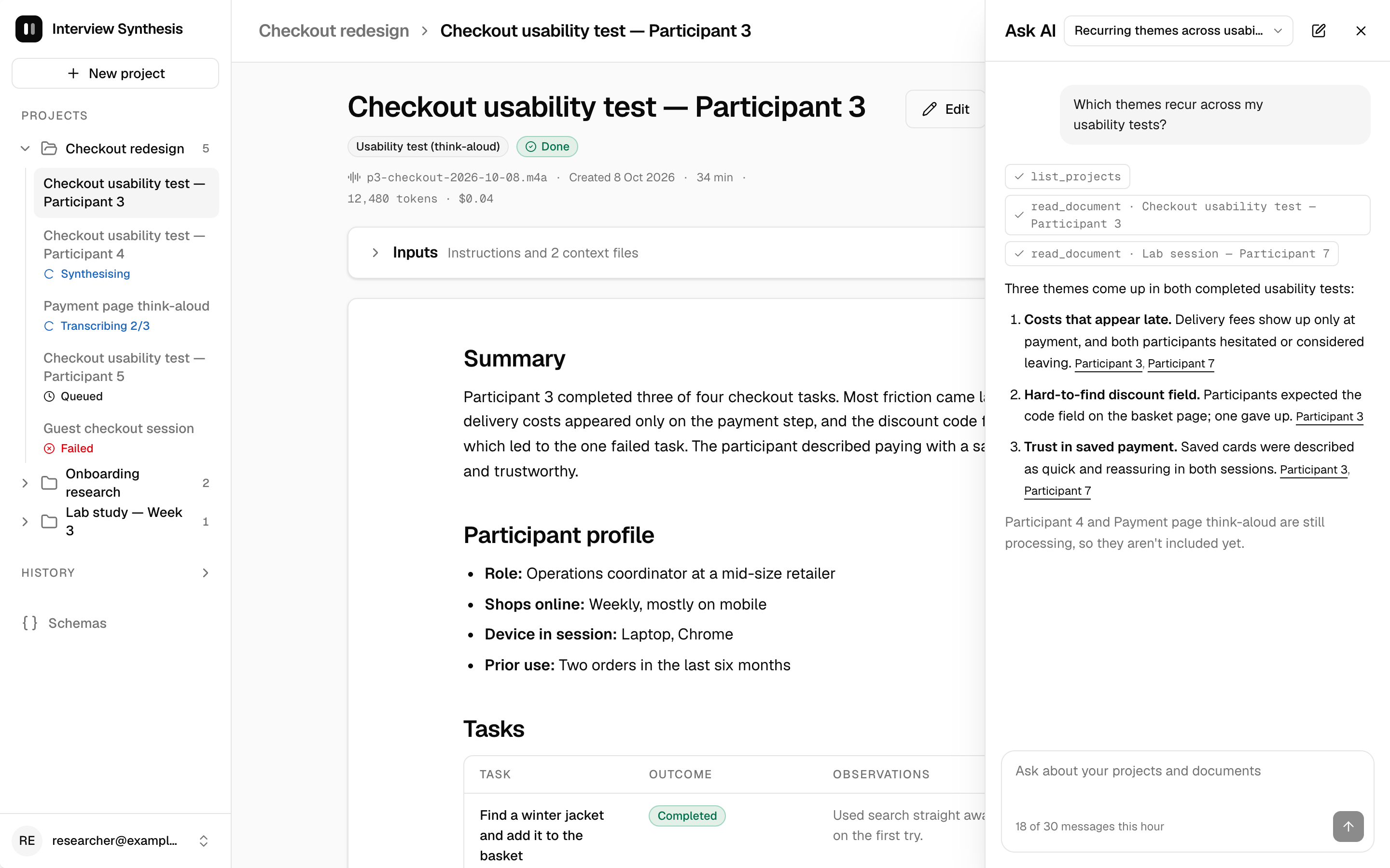
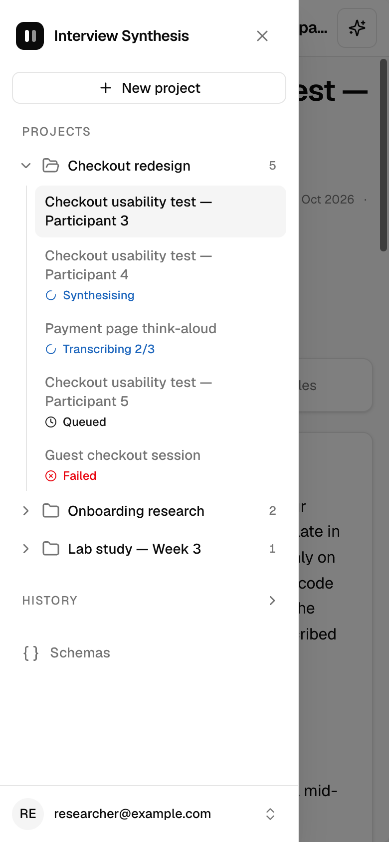
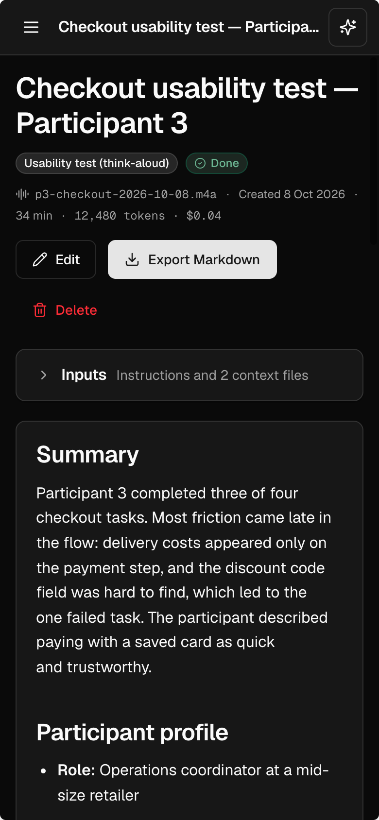
Claude Design generated too many screens to show them all, so these are representative ones.
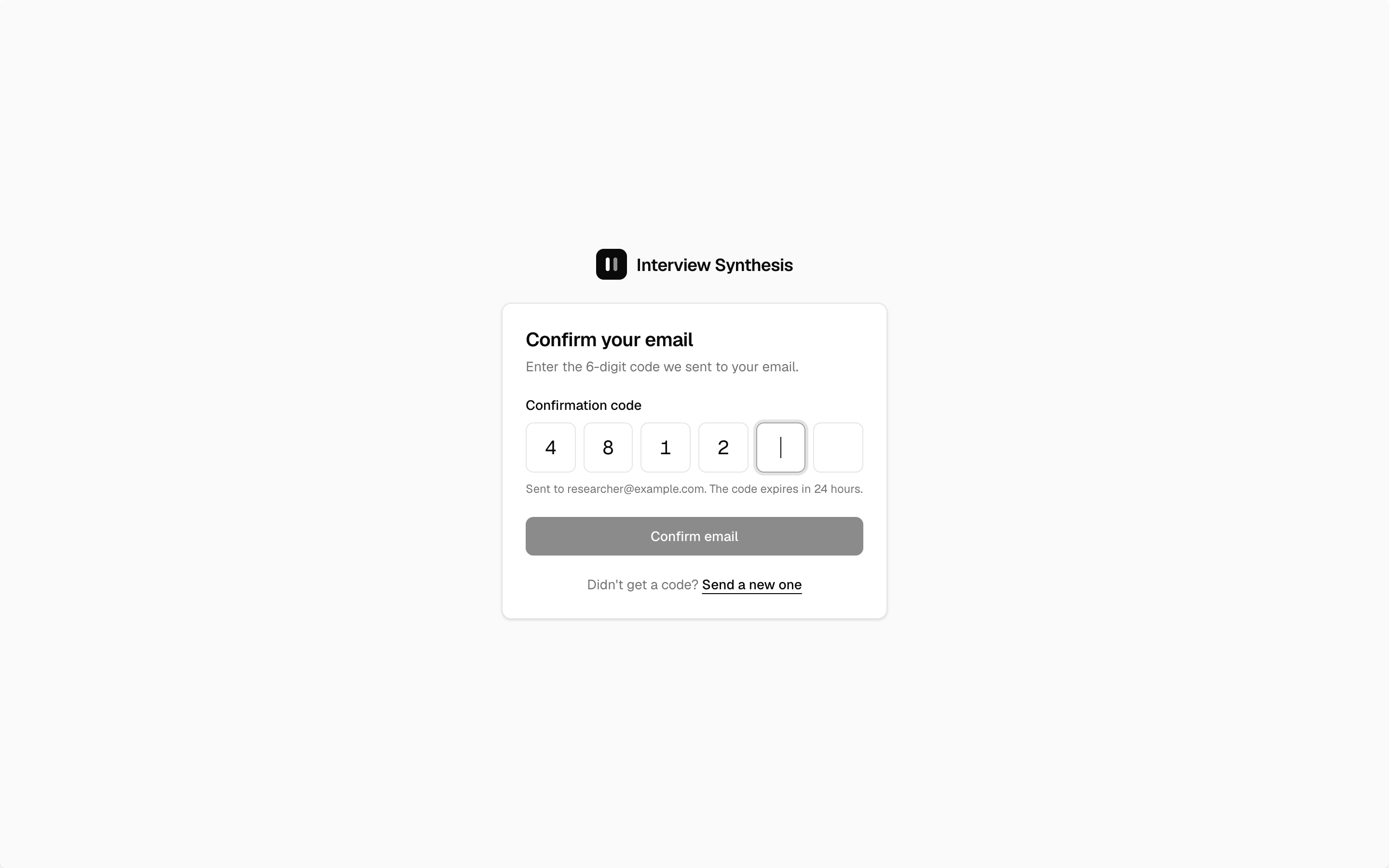
Log in:

Sign up:
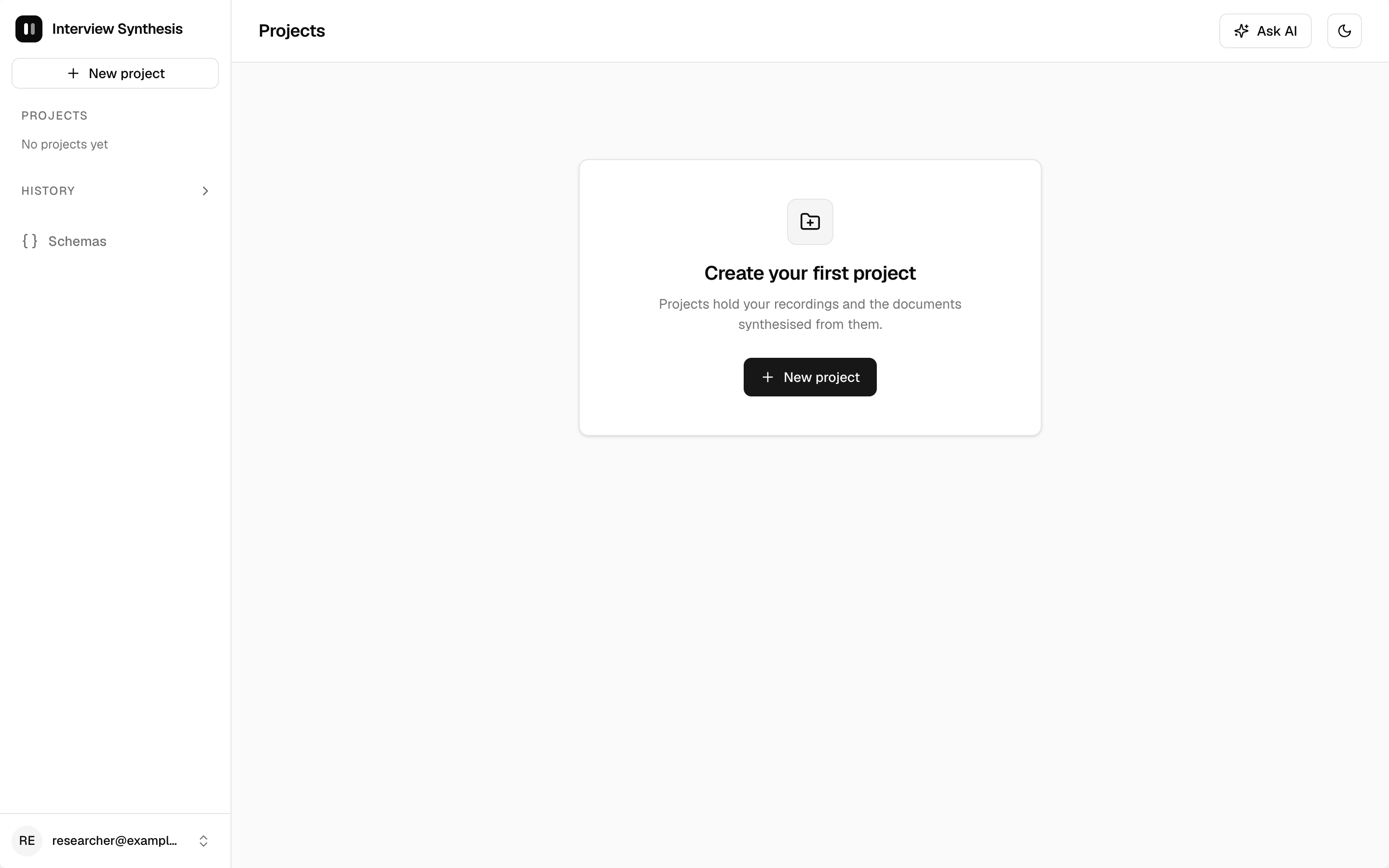
Empty state (first sign-in):
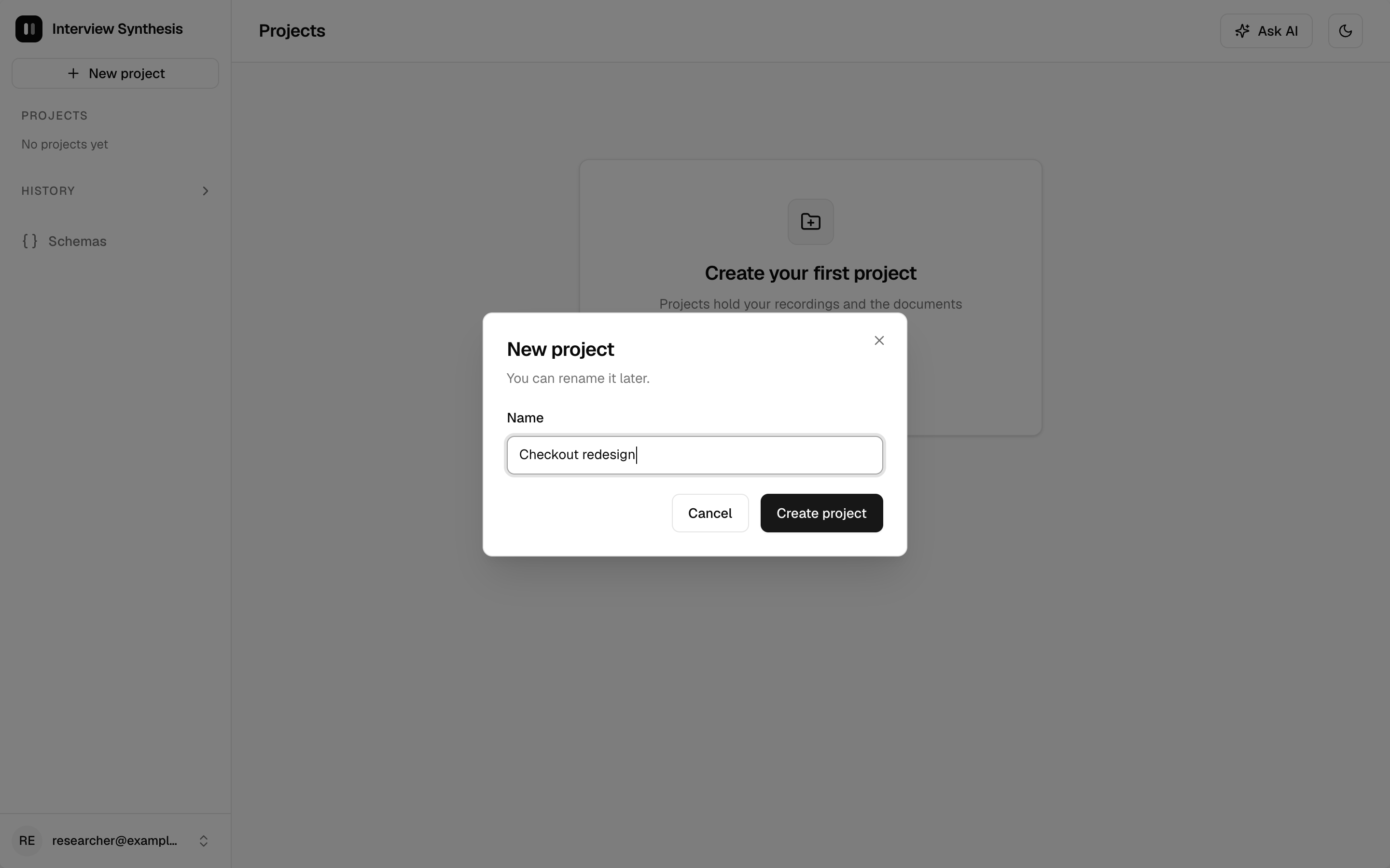
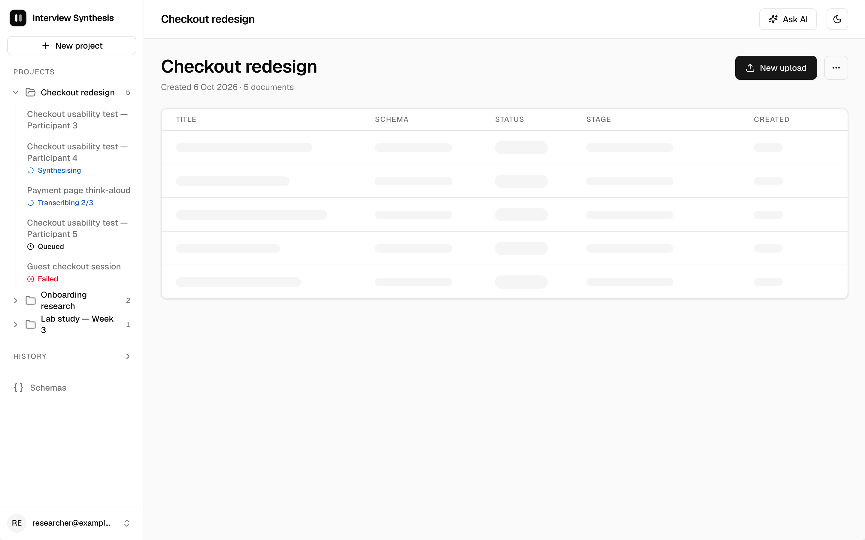
Project overview:
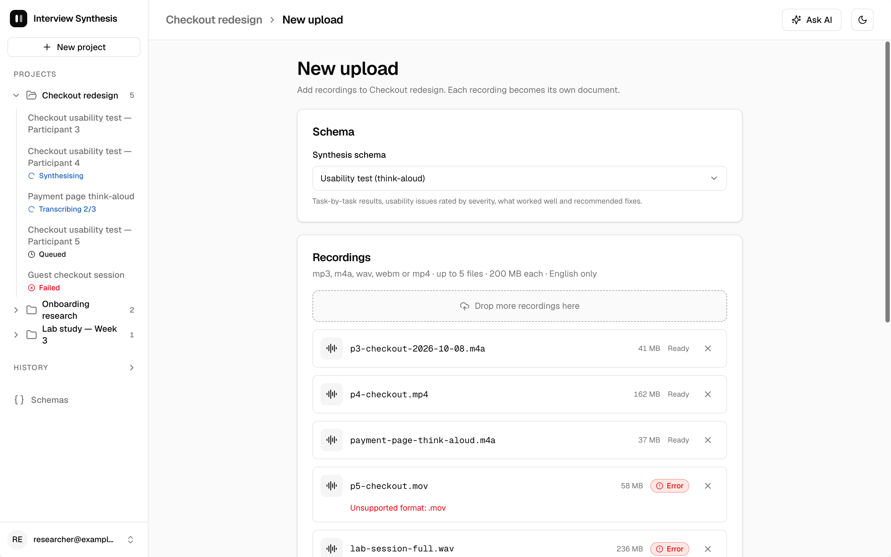
New upload:
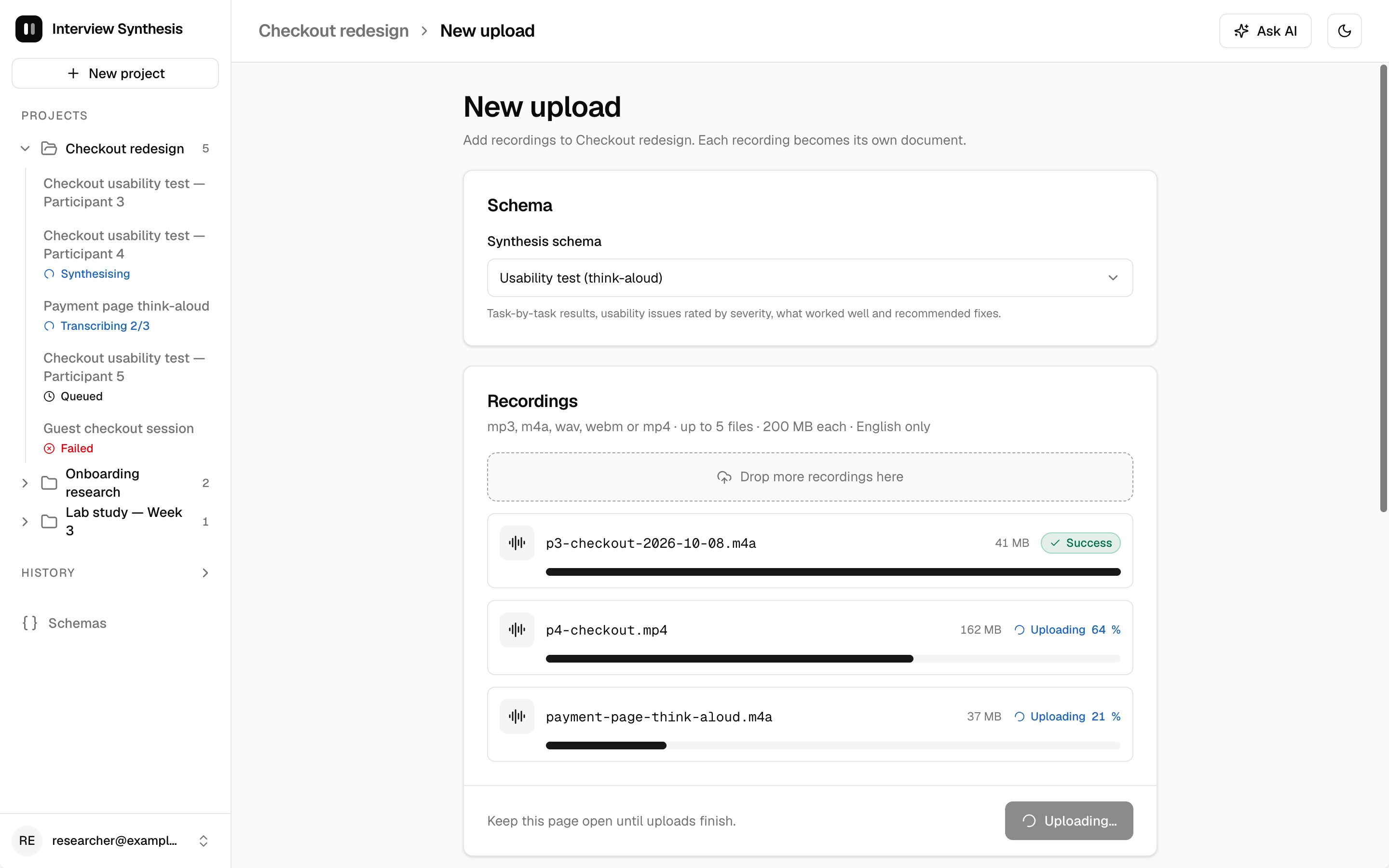
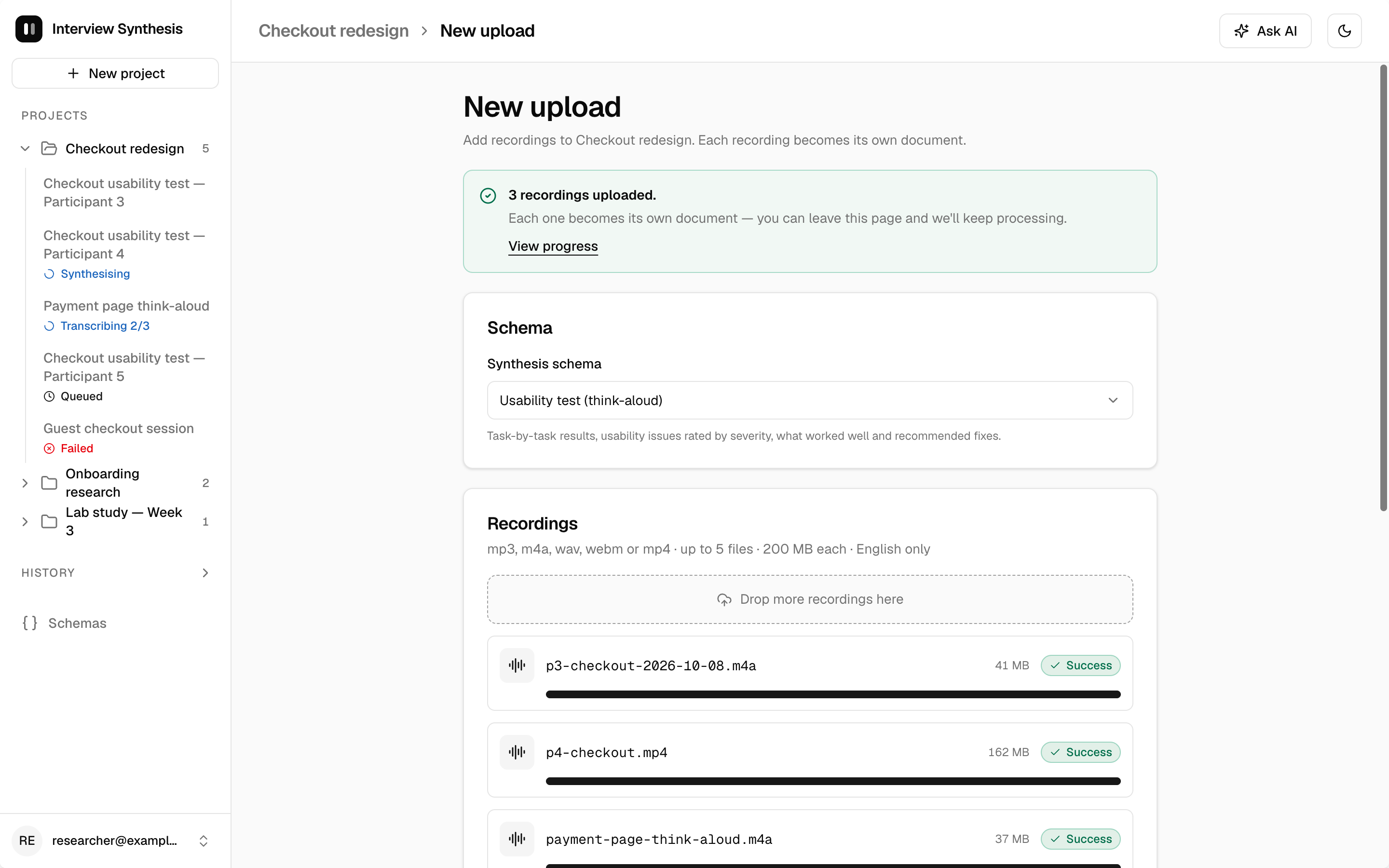
Job progress (document in progress):

Document view:
Schemas:
History:
AI chat panel:
Mobile:
Component sheet: